Watching someone else do or talk about computing is boring, as many rubbish and one good film of the past have proved.

Still from WarGames (1983), source: imdb
Better to do something practical and, here, the task is to evaluate if R is something you want or need to learn or not. Thus, this practical session is designed to show that:
1. It is easy to download and install R along with R-Studio, the interface you might use to work with R.
2. It is easy and efficient to load in and work with R.
3. Performing analyses makes intuitive sense.
4. Visualizing your data is way more effective than anywhere else – the plots are prettier and more informative.
In case you’re interested, I’ve got a more drawn out exposition of this point, see “Browse by category” menu, starting here:
Getting started in R – Why R?
Installation – R
How do you download and install R? Google “CRAN” and click on the download link, then follow the instructions (e.g. at “install R for the first time”).

Obviously, you will require administration rights though I believe you can download the installation file (.dmg in Mac) run it and then stick the application in your applications folder without the ned for full admin rights.
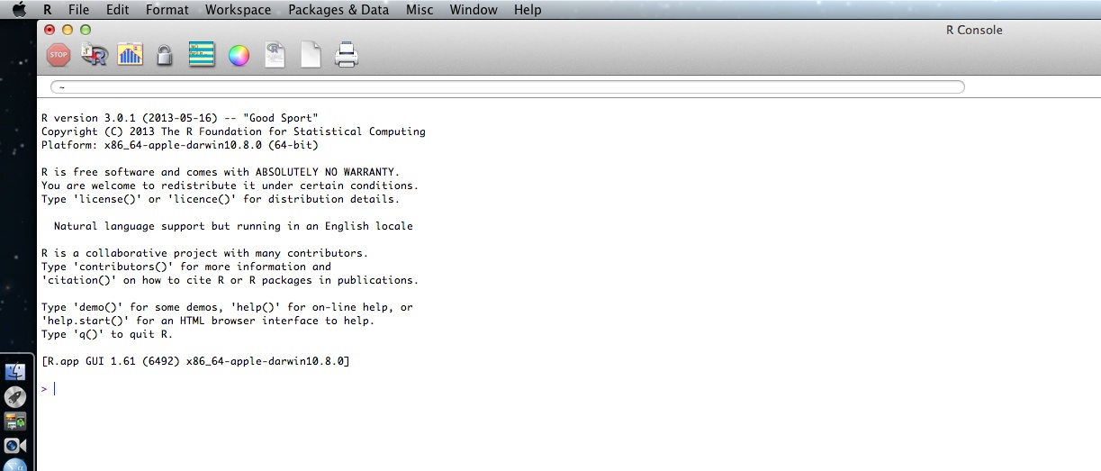
What you’ll get is the R statistical computing environment and you can work with R through the console. I find it easier to use the R-Studio interface, for reasons I’ll explain.
Installation – RStudio
I am repeating this post in summary:
Getting started – R-Studio, ggplot, installing packages and loading them for use
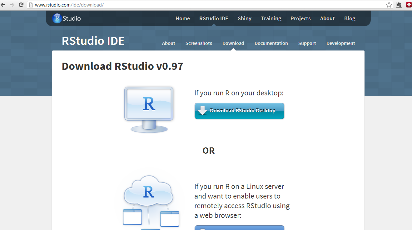
If you google “R-studio” you will get to this window:

Click on the “Download now” button and you will see this window:

Click on the “Download RStudio desktop” and you will see this window:

You can just click on the link to the installer recommended for your computer.
What happens next depends on whether you have administrative/root privileges on your computer.
I believe you can install R-studio without such rights using the zip/tarball dowload.
Having installed R and R-studio…
— in Windows you will see these applications now listed as newly installed programs at the start menu. Depending on what you said in the installation process, you might also have icons on your desktop.
— in Mac you should see RStudio in your applications folder and launchpad.
Click on the R-studio icon – it will pick up the R installation for you.
Now we are ready to get things done in R.
Start a new script in R-studio, install packages, draw a plot
Here, we are going to 1. start a new script, 2. install then load a library of functions (ggplot2) and 3. use it to draw a plot.
Depending on what you did at installation, you can expect to find shortcut links to R (a blue R) and to R-Studio (a shiny blue circle with an R) in the Windows start menu, or as icons on the desktop.
To get started, in Windows, double click (left mouse button) on the R-Studio icon.
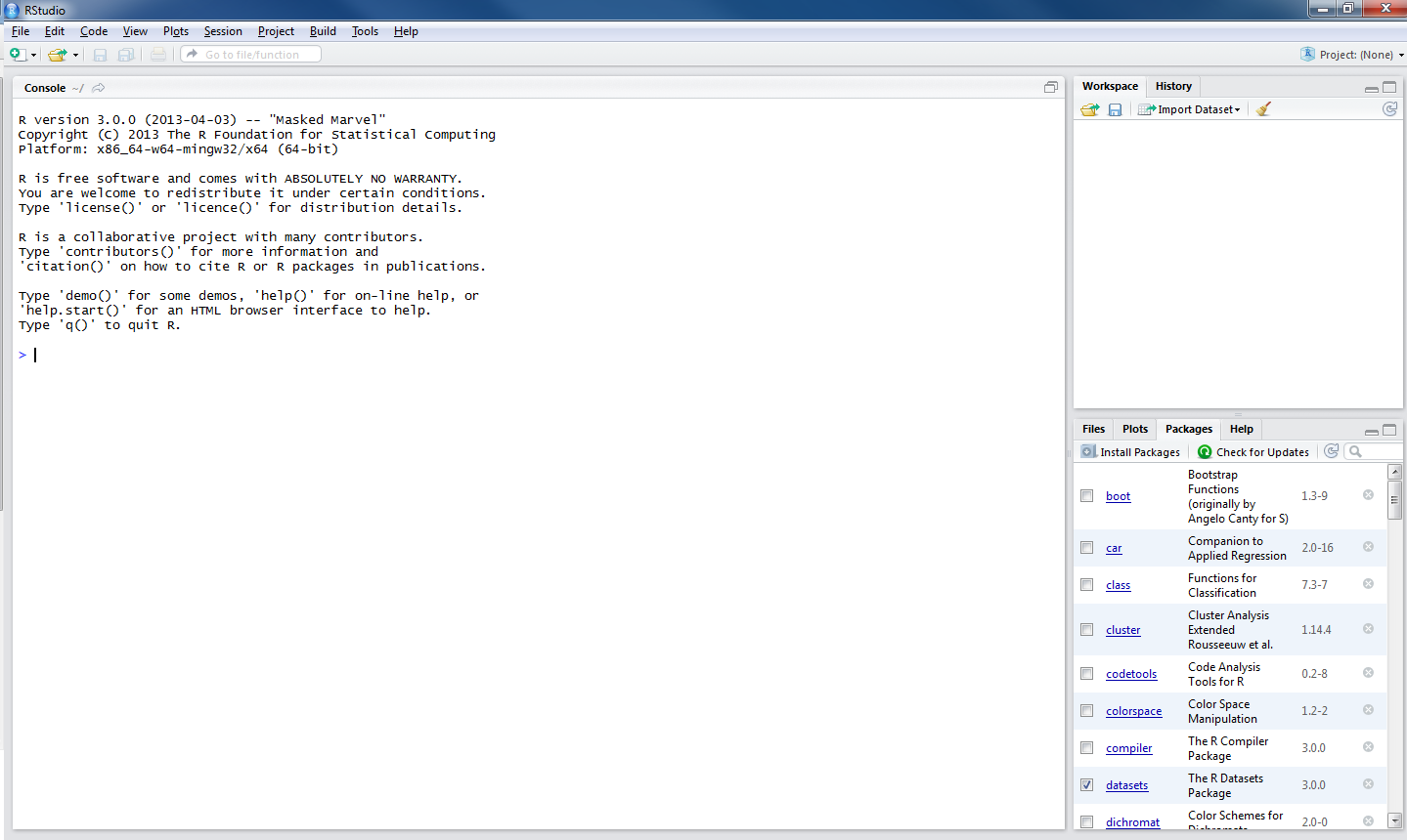
Maybe you’re now looking at this:

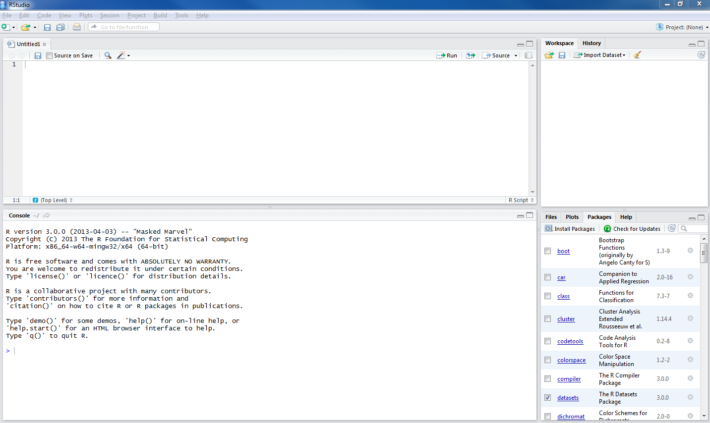
1. Start a new script
What you will need to do next is go to the file menu [top left of R-Studio window] and create a new R script:
–move the cursor to file – then – new – then – R script and then click on the left mouse button
or
— just press the buttons ctrl-shift-N at the same time — the second move is a keyboard shortcut for the first, I prefer keyboard short cuts to mouse moves
— to get this:

What’s next?
This circled bit you see in the picture below:

is the console.
It is what you would see if you open R directly, not using R-Studio.
You can type and execute commands in it but mostly you will see unfolding here what happens when you write and execute commands in the script window, circled below:

— The console reflects your actions in the script window.
If you look on the top right of the R-Studio window, you can see two tabs, Workspace and History: these windows (they can be resized by dragging their edges) also reflect what you do:
1. Workspace will show you the functions, data files and other objects (e.g. plots, models) that you are creating in your R session.
[Workspace — See the R introduction, and see the this helpful post by Quick-R — when you work with R, your commands result in the creation of objects e.g. variables or functions, and during an R session these objects are created and stored by name — the collection of objects currently stored is the workspace.]
2. History shows you the commands you execute as you execute them.
— I look at the Workspace a lot when using R-Studio, and no longer look at (but did once use) History much.
My script is my history.
2. Install then load a library of functions (ggplot2)
We can start by adding some capacity to the version of R we have installed. We install packages of functions that we will be using e.g. packages for drawing plots (ggplot2) or for modelling data (lme4).
[Packages – see the introduction and this helpful page in Quick-R — all R functions and (built-in) datasets are stored in packages, only when a package is loaded are its contents available]
Copy then paste the following command into the script window in R-studio:
install.packages("ggplot2", "reshape2", "plyr", "languageR",
"lme4", "psych")
Highlight the command in the script window …
— to highlight the command, hold down the left mouse button, drag the cursor from the start to the finish of the command
— then either press the run button …
[see the run button on the top right of the script window]
… or press the buttons CTRL-enter together, and watch the console show you R installing the packages you have requested.
Those packages will always be available to you, every time you open R-Studio, provided you load them at the start of your session.
[I am sure there is a way to ensure they are always loaded at the start of the session and will update this when I find that out.]
There is a 2-minute version of the foregoing laborious step-by-step, by ajdamico, here. N.B. the video is for installing and loading packages using the plain R console but applies equally to R-Studio.
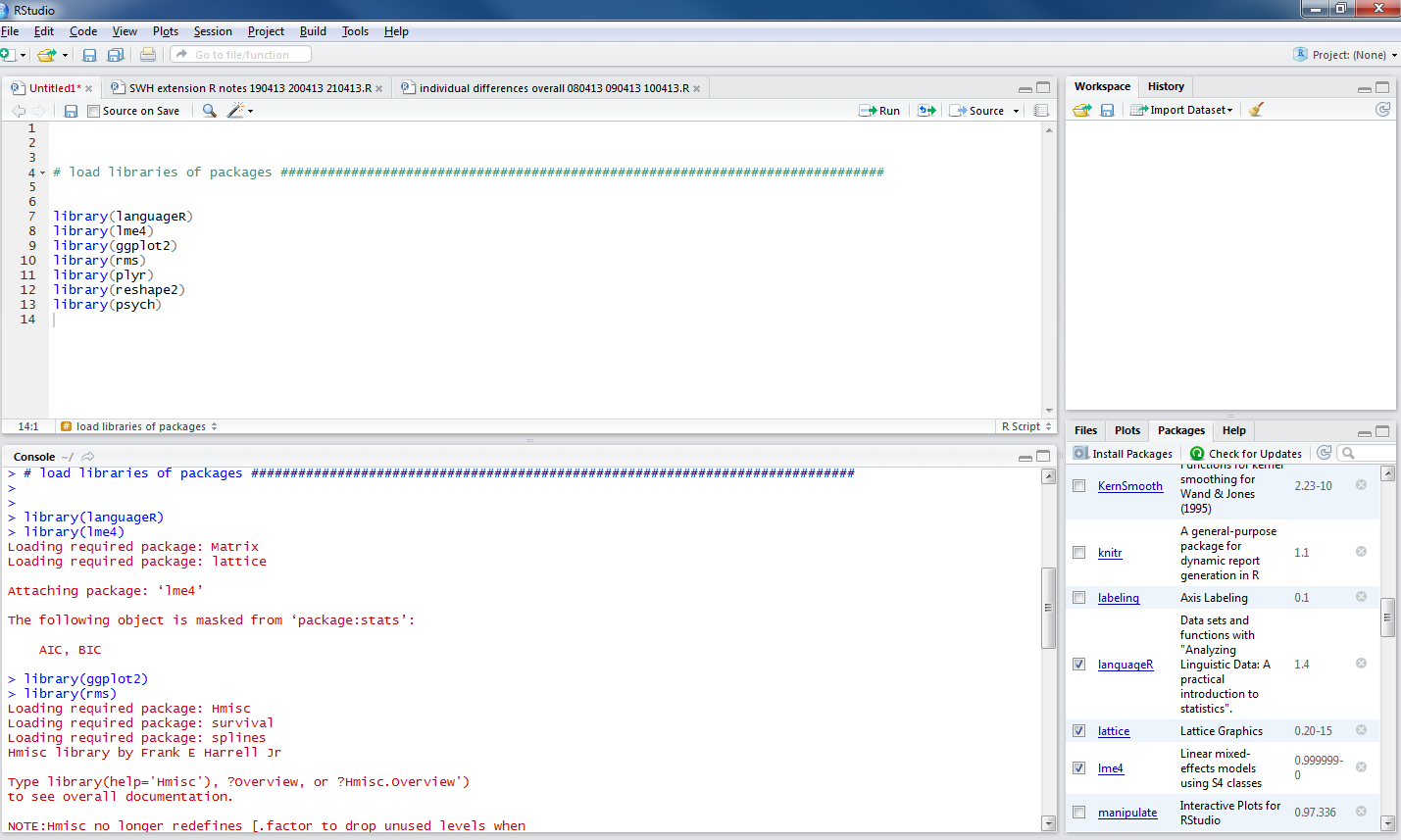
Having installed the packages, in the same session or in the next session, the first thing you need to do is load the packages for use by using the library() function:
library(languageR)
library(lme4)
library(ggplot2)
library(rms)
library(plyr)
library(reshape2)
library(psych)
— copy/paste or type these commands into the script, highlight and run them: you will see the console fill up with information about how the packages are being loaded:

Notice that the packages window on the bottom right of R-Studio now shows the list of packages have been ticked:

Let’s do something interesting now.
3. Use ggplot function to draw a plot
[In the following, I will use a simple example from the ggplot2 documentation on geom_point.]
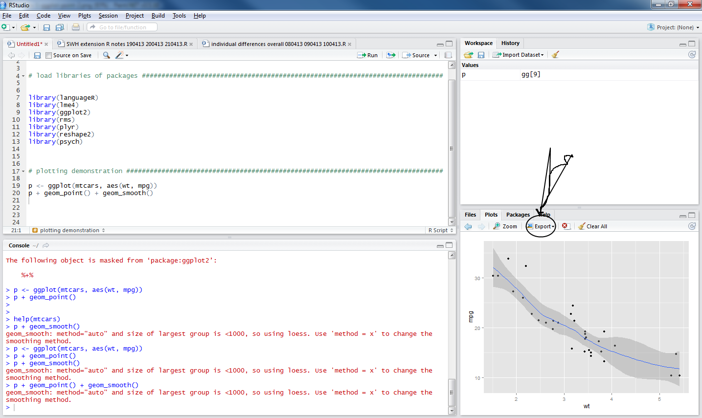
Copy the following two lines of code into the script window:
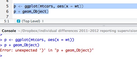
p <- ggplot(mtcars, aes(wt, mpg))
p + geom_point()
— run them and you will see this:

— notice that the plot window, bottom right, shows you a scatterplot.
How did this happen?
Look at the first line of code:
p <- ggplot(mtcars, aes(wt, mpg))
— it creates an object, you can see it listed in the workspace (it was not there before):

— that line of code does a number of things, so I will break it down piece by piece:
p <- ggplot(mtcars, aes(wt, mpg))
p <- ...
— means: create <- (assignment arrow) an object (named p, now in the workspace)
... ggplot( ... )
— means do this using the ggplot() function, which is provided by installing the ggplot2 package then loading (library(ggplot) the ggplot2 package of data and functions
... ggplot(mtcars ...)
— means create the plot using the data in the database (in R: dataframe) called mtcars
— mtcars is a dataframe that gets loaded together with functions like ggplot when you execute: library(ggplot2)
... ggplot( ... aes(wt, mpg))
— aes(wt,mpg) means: map the variables wt and mpg to the aesthetic attributes of the plot.
In the ggplot2 book (Wickham, 2009, e.g. pp 12-), the things you see in a plot, the colour, size and shape of the points in a scatterplot, for example, are aesthetic attributes or visual properties.
— with aes(wt, mpg) we are informing R(ggplot) that the named variables are the ones to be used to create the plot.
Now, what happens next concerns the nature of the plot we want to produce: a scatterplot representing how, for the data we are using, values on one variable relate to values on the other.
A scatterplot represents each observation as a point, positioned according to the value of two variables. As well as a horizontal and a vertical position, each point also has a size, a colour and a shape. These attributes are called aesthetics, and are the properties that can be perceived on the graphic.
(Wickham: ggplot2 book, p.29; emphasis in text)
— The observations in the mtcars database are information about cars, including weight (wt) and miles per gallon (mpg).
[see
http://127.0.0.1:29609/help/library/datasets/html/mtcars.html
in case you’re interested]
— This bit of the code asked the p object to include two attributes: wt and mpg.
— The aesthetics (aes) of the graphic object will be mapped to these variables.
— Nothing is seen yet, though the object now exists, until you run the next line of code.
The next line of code:
p + geom_point()
— adds (+) a layer to the plot, a geometric object: geom
— here we are asking for the addition of geom_point(), a scatterplot of points
— the variables mpg and wt will be mapped to the aesthetics, x-axis and y-axis position, of the scatterplot
The wonderful thing about the ggplot() function is that we can keep adding geoms to modify the plot.
— add a command to the second line of code to show the relationship between wt and mpg for the cars in the mtcars dataframe:
p <- ggplot(mtcars, aes(wt, mpg))
p + geom_point() + geom_smooth()
— here
+ geom_smooth()
adds a loess smoother to the plot, indicating the predicted miles per gallon (mpg) for cars, given the data in mtcars, given a car’s weight (wt).

[If you want to know what loess means – this post looks like a good place to get started.]
Notice that there is an export button on the top of the plots window pane, click on it and export the plot as a pdf.
Where does that pdf get saved to? Good question.
Extras
The really cool thing about drawing plots in R (if using ggplot2, especially) is that one can modify plots towards a target utility intuitively, over a series of steps:
So far, we have mapped car weight (wt) and miles per gallon (mpg) in the mtcars database to the x and y coordinates of the plot. Is there more in the data that we can bring out in the visualization?
You can check out what is in the database:
# what is in this database?
help(mtcars)
View(mtcars)
Maybe we want to bring the power of the cars into the picture because, presumably, heavier cars consume more petrol because they need to have more power (you tell me).
We can add power (hp) to the set of aesthetics and map it to further plot attributes e.g. colour or size:
# maybe it would be interesting to add information to the plot about
# horsepower
p <- ggplot(mtcars, aes(x = wt, y = mpg, colour = hp))
p + geom_point()
# maybe it would be interesting to add information to the plot about
# horsepower
p <- ggplot(mtcars, aes(x = wt, y = mpg, size = hp))
p + geom_point()
Next, I would like to edit the plot a bit for presentation:
i. add in a smoother but the wiggliness of the loess is not helping much;
ii. add a plot title and relabel the axes to make them more intelligible;
ii. modify the axis labelling because the labels are currently too small for a presentation;
iv. make the background white.
— of course, this is going to be easy and do-able in steps, as follows.
Notice that I change the format of the coding a little bit to make it easier to keep track of the changes.
# add the smoother back in, I don't think the wiggliness of the default loess helps much so modify the line fitting method
p <- ggplot(mtcars, aes(x = wt, y = mpg, size = hp, colour = hp))
p + geom_point() + geom_smooth(method = "lm")
# add a plot title and make the axis labels intelligible
p <- ggplot(mtcars, aes(x = wt, y = mpg, colour = hp, size = hp))
p <- p + geom_point() + geom_smooth(method = "lm") + labs(title = "Cars plot")
p <- p + xlab("Vehicle Weight") + ylab("Miles per Gallon")
p
# modify the label sizing -- modify sizes plot title, axis labels, axis tick value labels
p <- ggplot(mtcars, aes(x = wt, y = mpg, colour = hp, size = hp))
p <- p + geom_point() + geom_smooth(method = "lm") + labs(title = "Cars plot")
p <- p + xlab("Vehicle Weight") + ylab("Miles per Gallon")
p <- p + theme(plot.title = element_text(size = 80))
p <- p + theme(axis.text = element_text(size = 35))
p <- p + theme(axis.title.y = element_text(size = 45))
p <- p + theme(axis.title.x = element_text(size = 45))
p
# change the background so the plot is on white
p <- ggplot(mtcars, aes(x = wt, y = mpg, colour = hp, size = hp))
p <- p + geom_point() + geom_smooth(method = "lm") + labs(title = "Cars plot")
p <- p + xlab("Vehicle Weight") + ylab("Miles per Gallon")
p <- p + theme(plot.title = element_text(size = 80))
p <- p + theme(axis.text = element_text(size = 35))
p <- p + theme(axis.title.y = element_text(size = 45))
p <- p + theme(axis.title.x = element_text(size = 45))
p <- p + theme_bw()
p

On reflection, you might ask what we are adding by putting in colour and size modification to depict horse power. Decisions will be more sensible if we start using some real data.
Getting your data into R
Just as in other statistics applications e.g. SPSS, data can be entered manually, or imported from an external source. Here I will talk about: 1. loading files into the R workspace as dataframe object; 2. getting summary statistics for the variables in the dataframe; 3. and plotting visualizations of pairwise relationships in the data.
1. Loading files into the R workspace as dataframe object
Start by getting your data files
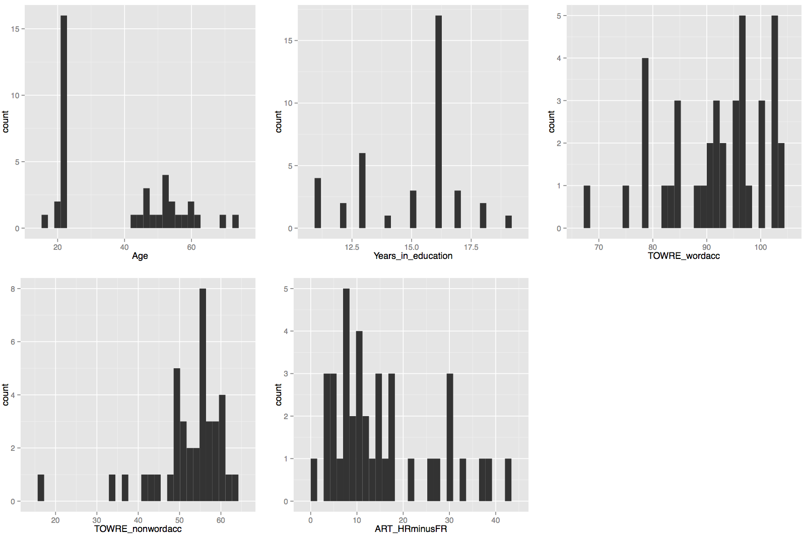
I often do data collection using paper-and-pencil standardized tests of reading ability and also DMDX scripts running e.g. a lexical decision task testing online visual word recognition. Typically, I end up with an excel spreadsheet file called subject scores 210413.xlsx and a DMDX output data file called lexical decision experiment 210413.azk. I’ll talk about the experimental data collection data files another time.
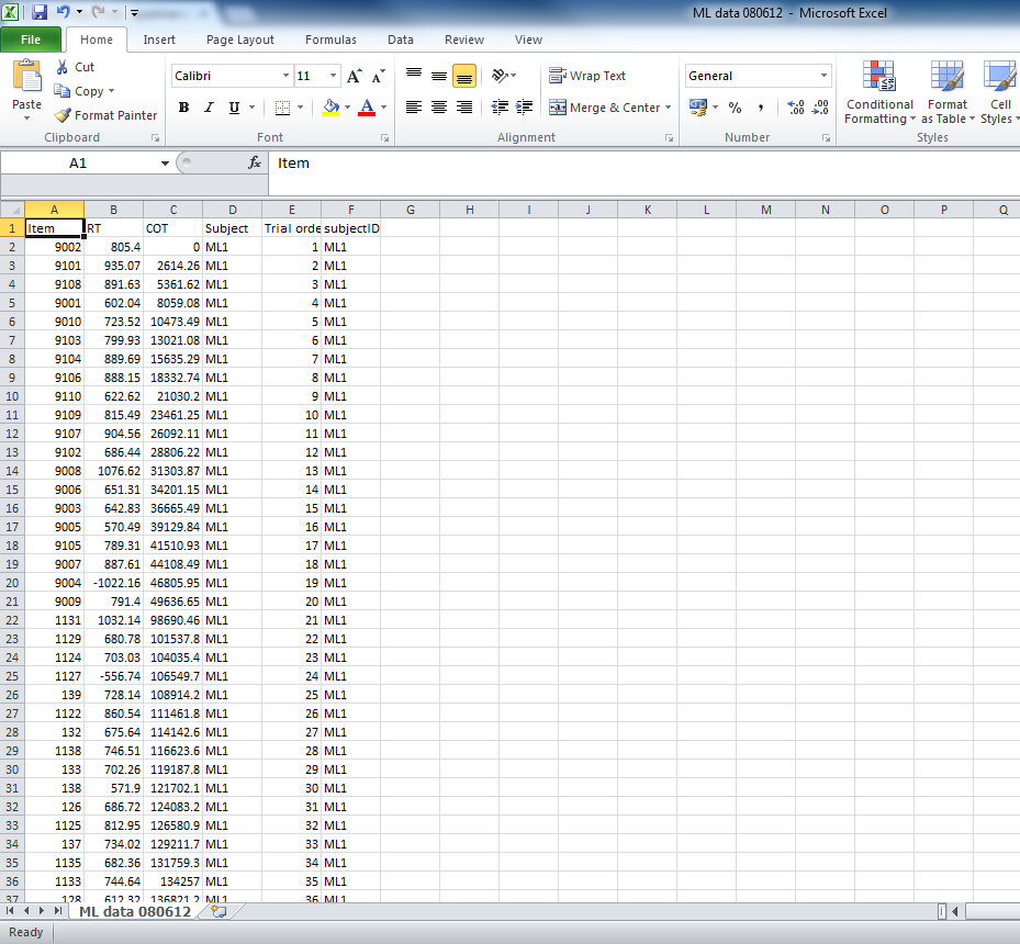
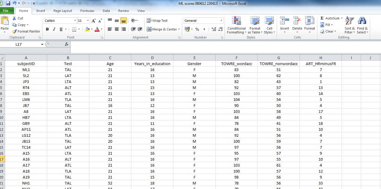
The paper and pencil stuff gets entered into the subject scores database by hand. Usually, the spreadsheets come with notes to myself on what was happening during testing. To prepare for analysis, though, I will often want just a spreadsheet showing columns and rows of data, where the columns are named sensibly (meaningful names, I can understand) with no spaces in either column names or in entries in data cells. Something that looks like this:

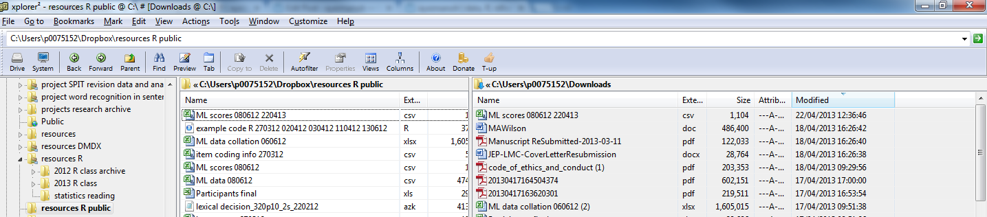
This is a screen shot of a file called: ML scores 080612 220413.csv
— which you can download here.
These data were collected in an experimental study of reading, the ML study.
The file is in .csv (comma separated values) format. I find this format easy to use in my workflow –collect data–tidy in excel–output to csv–read into R–analyse in R, but you can get any kind of data you can think of into R (SPSS .sav or .dat, .xlsx, stuff from the internet — no problem).
Let’s assume you’ve just downloaded the database and, in Windows, it has ended up in your downloads folder. I will make life easier for myself by copying the file into a folder whose location I know.
— I know that sounds simple but I often work with collaborators who do not know where their files are.
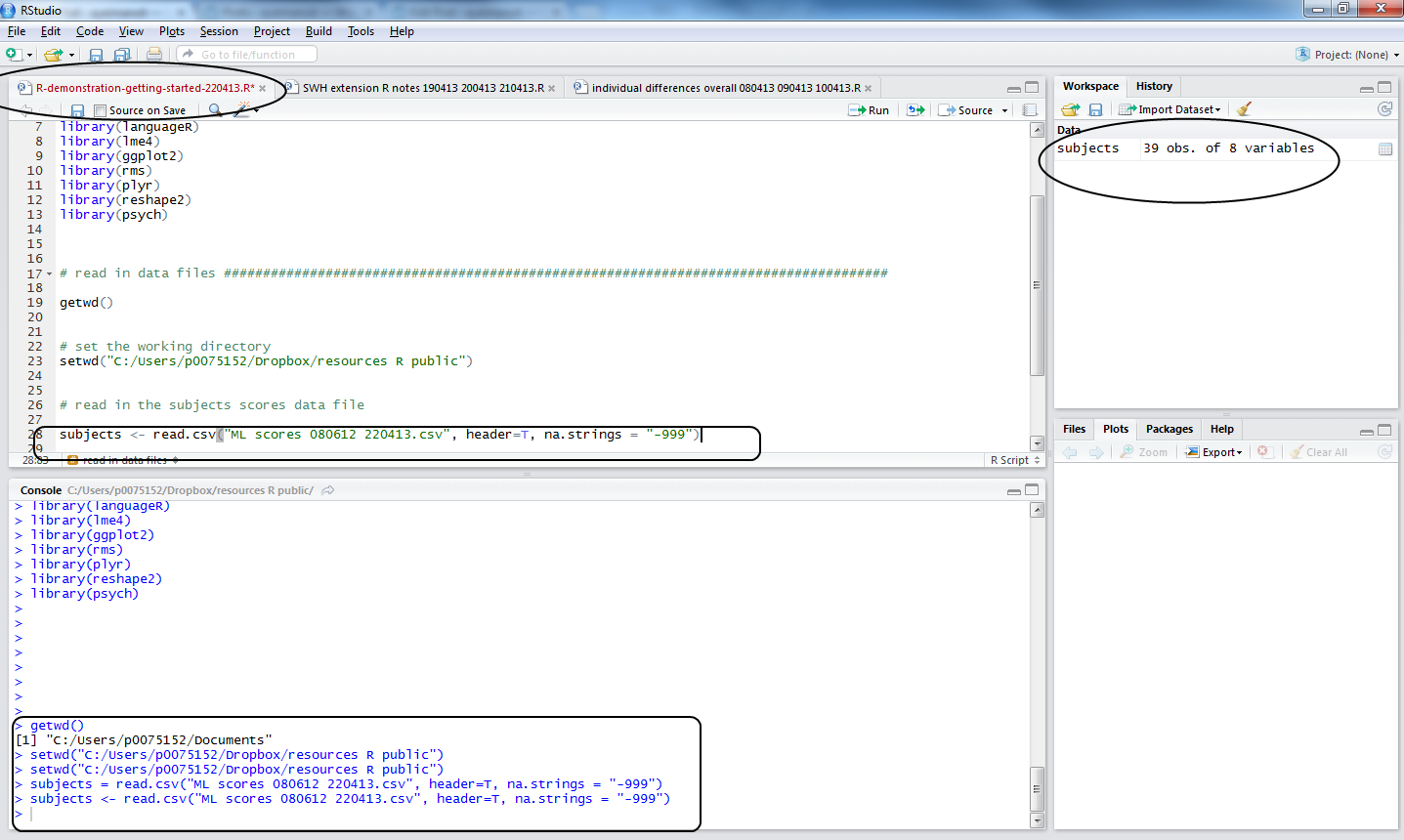
Read a data file into the R workspace
I have talked about the workspace before, here we are getting to load data into it using the functions setwd() and read.csv().
In R, you need to tell it where your data can be found, and where to put the outputs (e.g. pdfs of a plot). You need to tell it the working directory (see my advice earlier about folders): this is going to be the Windows folder where you put the data you wish to analyse.
For this example, the folder is:
C:\Users\p0075152\Dropbox\resources R public
[Do you know what this is – I mean, the equivalent, on your computer? If not, see the video above – or get a Windows for Dummies book or the like.]
What does R think the working directory currently is? You can find out, run the getwd() command:
getwd()
and you will likely get told this:
> getwd()
[1] “/Users/robdavies”
— with a different username, obviously.
The username folder is not where the data file is, so you set the working directory using setwd()
setwd("/Users/robdavies/Downloads")
— you need to:
— find the file in your downloads folder
— highlight the file in Mac Finder and use the Finder file menu getinfo option for the file to find the path to it
— copy that path information into the setwd() function call and run it
— typical errors include misspelling elements of the path, not putting it in “”
Load the data file using the read.csv() function
subjects <- read.csv("ML scores 080612 220413.csv", header=T, na.strings = "-999")
Notice:
1. subjects… — I am calling the dataframe something sensible
2. …<- read.csv(…) — this is the part of the code loading the file into the workspace
3. …(“ML scores 080612 220413.csv”…) — the file has to be named, spelled correctly, and have the .csv suffix given
4. …, header = T… — I am asking for the column names to be included in the subjects dataframe resulting from this function call
5. … na.strings = “-999” … — I am asking R to code -999 values, where they are found, as NA – in R, NA means Not Available i.e. a missing value.
Things that can go wrong here:
— you did not set the working directory to the folder where the file is
— you misspelled the file name
— either error will cause R to tell you the file does not exist (it does, just not where you said it was)
I recommend you try making these errors and getting the error message deliberately. Making errors is a good thing in R.
Note:
— coding missing values systematically is a good thing -999 works for me because it never occurs in real life for my reading experiments
— you can code for missing values in excel in the csv before you get to this stage
Let’s assume you did the command correctly, what do you see? This:

Notice:
1. in the workspace window, you can see the dataframe object, subjects, you have now created
2. in the console window, you can see the commands executed
3. in the script window, you can see the code used
4. the file name, top of the script window, went from black to red, showing a change has been made but not yet saved.
To save a change, keyboard shortcut is CTRL-S.
2. Getting summary statistics for the variables in the dataframe
It is worth reminding ourselves that R is, among other things, an object-oriented programming language. See this:
The entities that R creates and manipulates are known as objects. These may be variables, arrays of numbers, character strings, functions, or more general structures built from such components.
During an R session, objects are created and stored by name (we discuss this process in the next session). The R command
> objects()
(alternatively, ls()) can be used to display the names of (most of) the objects which are currently stored within R. The collection of objects currently stored is called the workspace.
[R introduction: http://cran.r-project.org/doc/manuals/r-release/R-intro.html#Data-permanency-and-removing-objects]
or this helpful video by ajdamico.
So, we have created an object using the read.csv() function. We know that object was a .csv file holding subject scores data. In R, in the workspace, it is an object that is a dataframe, a structure much like the spreadsheets in excel, SPSS etc.: columns are variables and rows are observations, with columns that can correspond to variables of different types (e.g. factors, numbers etc.) Most of the time, we’ll be using dataframes in our analyses.
You can view the dataframe by running the command:
view(subjects)
— or actually just clicking on the name of the dataframe in the workspace window in R-studio, to see:

Note: you cannot edit the file in that window, try it.
Now that we have created an object, we can interrogate it. We can ask what columns are in the subjects dataframe, how many variables there are, what the average values of the variables are, if there are missing values, and so on using an array of useful functions:
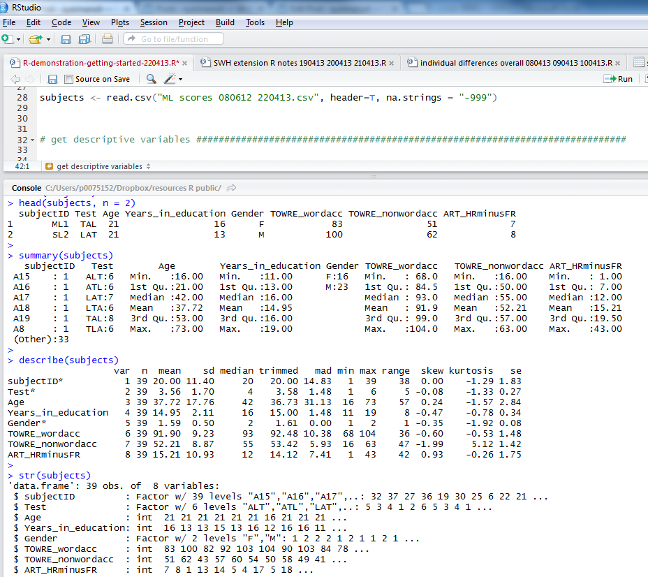
head(subjects, n = 2)

summary(subjects)

describe(subjects)

str(subjects)

psych::describe(subjects)

length(subjects)

length(subjects$Age)
Copy-paste these commands into the script window and run them, below is what you will see in the console:

Notice:
1. the head() function gives you the top rows, showing column names and data in cells; I asked for 2 rows of data with n = 2
2. the summary() function gives you: minimum, maximum, median and quartile values for numeric variables, numbers of observations with one or other levels for factors, and will tell you if there are any missing values, NAs
3. describe() (from the psych package) will give you means, SDs, the kind of thing you report in tables in articles
4. str() will tell you if variables are factors, integers etc.
If I were writing a report on this subjects data I would copy the output from describe() into excel, format it for APA, and stick it in a word document.
3. Plotting visualization of data and doing a little bit of modelling
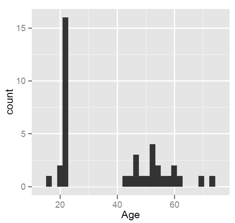
In a previous post, I went into how you can plot histograms of the data to examine the distribution of the variables, see here:
Getting started – working directories, loading data, and a bit more plotting
but for this post I want to stick to the focus on relationships between variables.
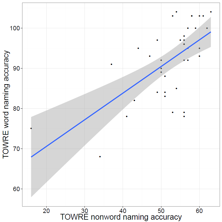
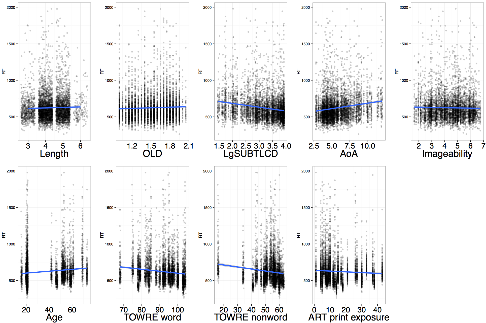
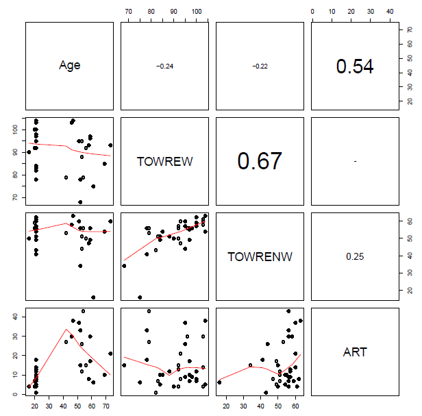
Let’s use what we learnt to examine visually the relationships between variables in the dataset. Here, our concern might be whether measures of reading performance, collected using the TOWRE (Torgesen et al., 1998) a test of word and non-word accuracy where participants are asked to read lists of words or non-words, of increasing difficulty, in 45 s, and the performance score is the number of words read correctly in that time.
I might expect to see that the ability to read aloud words correctly actually increases as: 1. people get older – increased word naming accuracy with increased age; 2. people read more – increased word naming accuracy with increased reading history (ART score); 3. people show increased ability to read aloud made-up words (pseudowords) or nonwords – increased word naming accuracy with increased nonword naming accuracy.
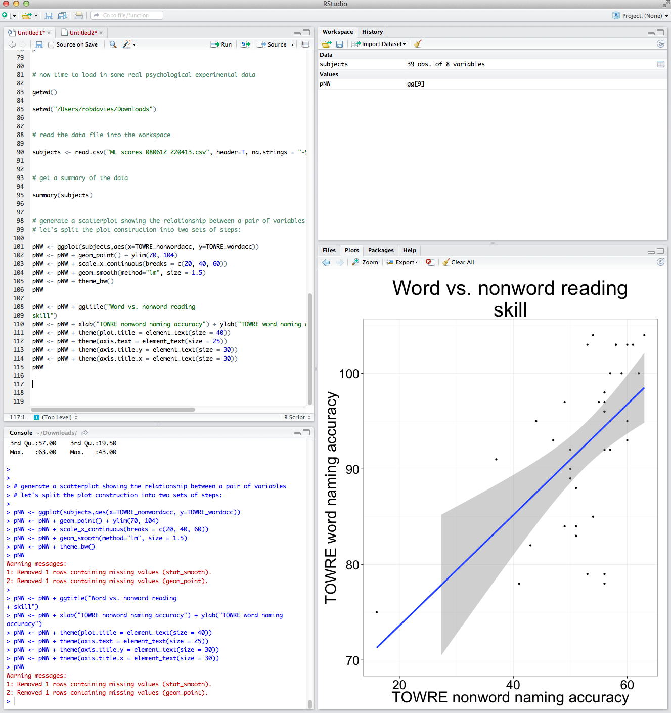
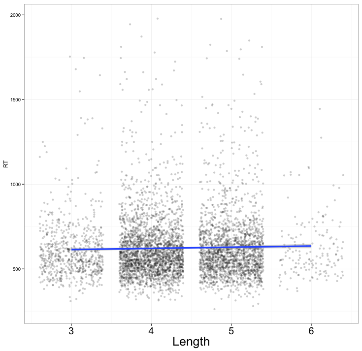
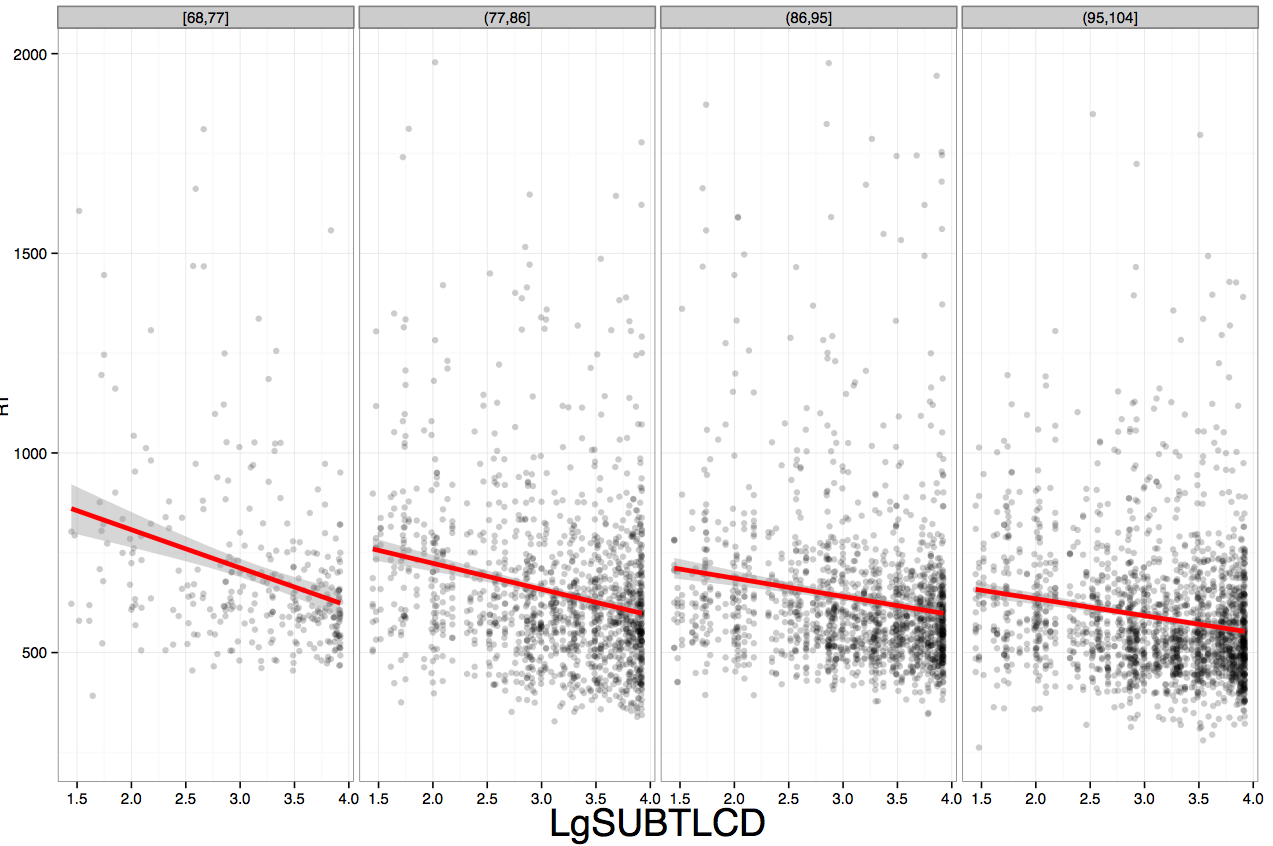
We can examine these relationships and, in this post, we will work on doing so through using scatter plots like that shown below.

What does the scatterplot tell us, and how can it be made?
Notice:
— if people are more accurate on nonword reading they are also often more accurate on word reading
— at least one person is very bad on nonword reading but OK on word reading
— most of the data we have for this group of ostensibly typically developing readers is up in the good nonword readers and good word readers zone.
I imposed a line of best fit indicating the relationship between nonword and word reading estimated using linear regression, the line in blue, as well as a shaded band to show uncertainty – confidence interval – over the relationship. You can see that the uncertainty increases as we go towards low accuracy scores on either measure. We will return to these key concepts in other posts.
For now, we will stick to showing the relationships between all the variables in our sample, modifying plots over a series of steps as follows:
[In what follows, I will be using the ggplot2 documentation that can be found online, and working my way through some of the options discussed in Winston Chang’s book: R Graphics Cookbook .]
Draw a scatterplot using default options
Let’s draw a scatterplot using geom_point(). Run the following line of code
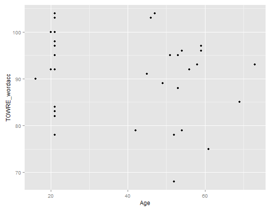
ggplot(subjects, aes(x = Age, y = TOWRE_wordacc)) + geom_point()
and you should see this in R-studio Plots window:

Notice:
— There might be no relationship between age and reading ability: how does ability vary with age here?
— Maybe the few older people, in their 60s, pull the relationship towards the negative i.e. as people get older abilities decrease.
Let’s imagine that we wanted to report a plot showing the relationship between word and nonword reading. We can modify the plot for presentation as we have done previously but we also add modifications to the axis labelling — fixing the axis limits and reducing the number of ticks to tidy the plot a bit.
# generate a scatterplot showing the relationship between a pair of variables
# let's split the plot construction into two sets of steps:

pNW <- ggplot(subjects,aes(x=TOWRE_nonwordacc, y=TOWRE_wordacc))
pNW <- pNW + geom_point() + ylim(70, 104)
pNW <- pNW + scale_x_continuous(breaks = c(20, 40, 60))
pNW <- pNW + geom_smooth(method="lm", size = 1.5)
pNW <- pNW + theme_bw()
pNW

pNW <- pNW + ggtitle("Word vs. nonword reading
skill")
pNW <- pNW + xlab("TOWRE nonword naming accuracy") + ylab("TOWRE word naming accuracy")
pNW <- pNW + theme(plot.title = element_text(size = 40))
pNW <- pNW + theme(axis.text = element_text(size = 25))
pNW <- pNW + theme(axis.title.y = element_text(size = 30))
pNW <- pNW + theme(axis.title.x = element_text(size = 30))
pNW
Notice:
— I am adding each change, one at a time, making for more lines of code; but I could and will be more succinct.
— I add the title with: + ggtitle(“Word vs. nonword reading skill”)
— I change the axis labels with: + xlab(“TOWRE nonword naming accuracy”) + ylab(“TOWRE word naming accuracy”)
— I fix the y-axis limits with: + ylim(70, 104)
— I change where the tick marks on the x-axis are with: + scale_x_continuous(breaks = c(20, 40, 60)) — there were too many before
— I modify the size of the axis labels for better readability with: + theme(axis.title.x = element_text(size=25), axis.text.x = element_text(size=20))
— I add a smoother i.e. a line showing a linear model prediction of y-axis values for the x-axis variable values with: + geom_smooth(method=”lm”, size = 1.5) — and I ask for the size to be increased for better readability
— And then I ask for the plot to have a white background with: + theme_bw()
All that will get you this:

A bit of modelling
Can we get some stats in here now?
You will have started to see signs about one feature of R: there are multiple different ways to do a thing. That’s also true of what we are going to do next and last, a regression model of the ML subject scores data to look at the predictors of word reading accuracy. We are going to use the lm() function call, it’s simple, but we could use ols().
# generate a scatterplot showing the relationship between a pair of variables
# let's split the plot construction into two sets of steps:

# let's do a little bit of regresion modeling

help(lm)

summary(subjects)

MLwords.lm <- lm(TOWRE_wordacc ~

Age + TOWRE_nonwordacc + ART_HRminusFR,

data = subjects)

summary(MLwords.lm)
Notice:
— The code specifying the model is written to produce a regression object
MLwords.lm <- lm(TOWRE_wordacc ~

Age + TOWRE_nonwordacc + ART_HRminusFR,

data = subjects)
— Run it and you will see a model object appear in the workspace window, top right of RStudio but you will only see the code being repeated in the console.
— R will only show you what you ask for.
— The model formula is written out the same way you might write a regression equation i.e. the code syntax matches the statistical formula convention. Obviously, this is not an accident.
— Looking ahead, specifying models for ANOVA, mixed effects models etc. all follow the same sort of structure — the code syntax matches the conceptual unity.
Running this code will get you:
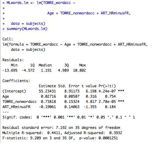
Thus, we see the same statistical output we would see anywhere else.
What have we learnt?
— starting a new script
— installing and loading packages
— creating a new plot
Vocabulary
functions
install.packages()
library()
ggplot()
critical terms
object
workspace
package
scatterplot
loess
aesthetics
Resources
You can download the .R code I used for the class here.
There is a lot more that you can do with plotting than I have shown here, see the technical help with examples you can run just by copying them into RStudio, here:
http://docs.ggplot2.org/current/
There’s a nice tutorial here:
http://www.r-bloggers.com/ggplot2-tutorial/
Reading
Baayen, R. H. (2008). Analyzing linguistic data. Cambridge University Press.
Castles, A., & Nation, K. (2006). How does orthographic learning happen? In S. Andrews (Ed.), From inkmarks to ideas: Challenges and controversies about word recognition and reading. Psychology Press.
Cohen, J., Cohen, P., West, S. G., & Aiken, L. S. (2003). Applied multiple regression/correlation analysis for the behavioural sciences (3rd. edition). Mahwah, NJ: Lawrence Erlbaum Associates.
Harm, M. W., & Seidenberg, M. S. (2004). Computing the meanings of words in reading: Cooperative division of labor between visual and phonological processes. Psychological Review, 111, 662-720.
Harrell Jr, F. J. (2001). Regression modelling strategies: With applications to linear models, logistic regression, survival analysis. New York, NY: Springer.
Masterson, J., & Hayes, M. (2007). Development and data for UK versions of an author and title recognition test for adults. Journal of Research in Reading, 30, 212-219.
Nation, K. (2008). Learning to read words. The Quarterly Journal of Experimental Psychology, 61, 1121-1133.
Rayner, K., Foorman, B. R., Perfetti, C. A., Pesetsky, D., & Seidenberg, M. S. (2001). How psychological science informs the teaching of reading. Psychological Science in the Public Interest, 2, 31-74.
Share, D. L. (1995). Phonological recoding and self-teaching: sine qua non of reading acquisition. Cognition, 55, 151-218.
Stanovich, K. E., & West, R. F. (1989). Exposure to print and orthographic processing. Reading Research Quarterly, 24, 402-433.
Torgesen, J. K., Wagner, R. K., & Rashotte, C. A. (1999). TOWRE Test of word reading efficiency. Austin,TX: Pro-ed.


 statistic is computed, and evaluated against the
  and the
  .
.

 and
and  — measures of the proportion of variance explained by the model.
 . Variances are additive while SDs are not so we typically work with variances. In asking the string of questions given in the foregoing paragraph, we are thinking about a problem that can be expressed like this: what part of Y variance is associated with X (this part will equal the variance of the estimated scores) and what part of Y variance is independent of X (the model error, equal to the variance of the discrepancies between estimated and observed Y)? If there is no relationship between X and Y, our best estimate of Y will be the mean of Y.

 however, I can think of no statistical reason for this number, while Baayen (2008) recommends using the condition number, kappa, as a diagnostic measure, based on Belsley et al.’s (1980) arguments that pairwise correlations do not reveal the real, underlying, structure of latent factors (i.e. principal components of which collinear variables are transformations or expressions).