
This post assumes you know how to set a working directory, load a data file, and run a ggplot() function call to create a histogram using geom_histogram, as discussed here.
What are going to do in this post is expand our plotting vocabulary in order to achieve three things:
1. split the data by gender;
2. show histograms for all variables in ML’s database at the same time;
3. output the plots as a pdf for report.
In what follows, I assume the subjects database is in the workspace, and that the ggplot2 package library has been loaded.
1. Split the data by gender
In Exploratory Data Analysis, we often wish to split a larger dataset into smaller subsets, showing a grid or trellis of small multiples – the same kind of plot, one plot per subset – arranged systematically to allow the reader (maybe you) to discern any patterns, or stand-out features, in the data. Much of what follows is cribbed from the ggplot2 book (Wickham, 2009; pp.115 – ).
There is not too much going on in the subjects database, but we can start simply by splitting the data into gender subsets.
In ggplot2, faceting is a mechanism for automatically laying out multiple plots on a page.
Faceting generates small multiples each showing a different subset of the data. The facet function takes two arguments, the variables(-s) to facet by – which we deal with here – and whether position scales should be global or local to the facet – which we can deal with another time.
You can ask ggplot2 to facet plots in two different ways:
1. use facet_grid to split the data by two variables
2. use facet_wrap to split it by one.
We have only got gender to play with, so we’ll use facet_wrap.
Let’s build on the plot we did in the last post:
pAge <- ggplot(subjects, aes(x=Age))
pAge + geom_histogram() + facet_wrap(~Gender)
Notice:
— all we have done is add …facet_wrap(~Gender)
— this asks ggplot to generate a ribbon of small multiples split by gender, here, resulting in two plots, one for males and one for females in the sample:
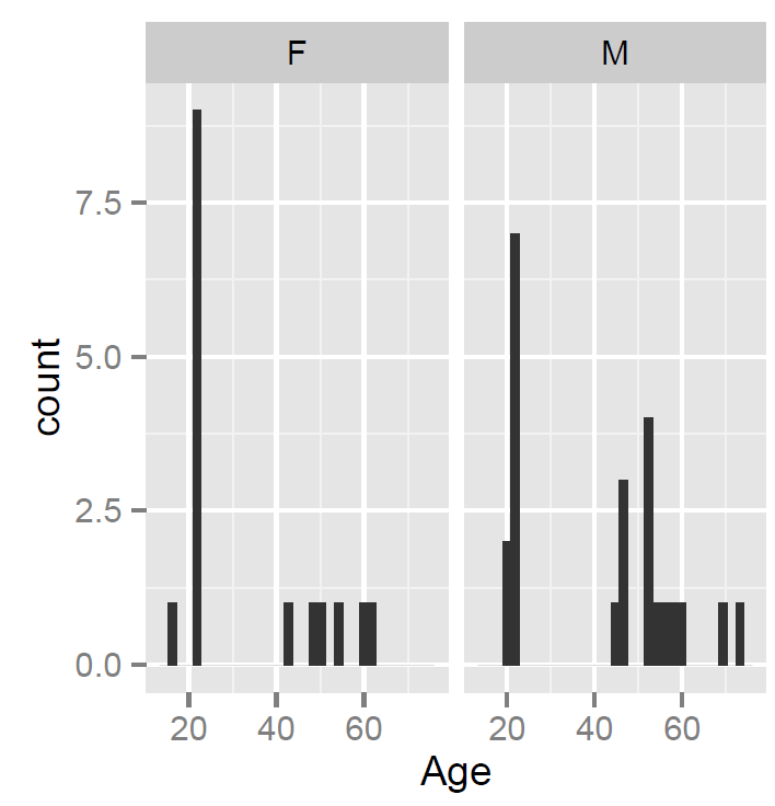
Notice:
— ML evidently tested many more females in their 20s and males in middle-age: psychology students are mostly female; the males are (I know) members of a club to which her father belonged.
2. Show histograms for all variables in ML’s database at the same time
The split by gender is nice. One day, we can use facetting more powerfully e.g. by showing data for every individual tested in a lexical decision task, to spot sample-wider patterns of individual differences in response.
For now, we will elaborate the plot a bit further, by plotting all variables in the subjects database on the same page, all split by gender. I will base what follows on ggplot book advice (pp. 151 – ). Wickham (2009) advises that arranging multiple plots on a single page involves using grid, an R graphics system, that underlies ggplot2.
We are going to create a faceted plot for each variable, and then assign them to places in a grid we shall also create. Copy-paste the following code in the script window to create the plots:
pAge <- ggplot(subjects, aes(x=Age))
pAge <- pAge + geom_histogram() + facet_wrap(~Gender)

pEd <- ggplot(subjects, aes(x=Years_in_education))
pEd <- pEd + geom_histogram() + facet_wrap(~Gender)

pw <- ggplot(subjects, aes(x=TOWRE_wordacc))
pw <- pw + geom_histogram() + facet_wrap(~Gender)

pnw <- ggplot(subjects, aes(x=TOWRE_nonwordacc))
pnw <- pnw + geom_histogram() + facet_wrap(~Gender)

pART <- ggplot(subjects, aes(x=ART_HRminusFR))
pART <- pART + geom_histogram() + facet_wrap(~Gender)
Notice:
— I have given each plot a different name. This will matter when we assign plots to places in a grid.
— I have changed the syntax a little bit: create a plot then add the layers to the plot; not doing this, ie sticking with the syntax as in the preceding examples, results in an error when we get to print the plots out to the grid; try it out – and wait for
>Error: No layers in plot
You will see the plot window in R-studio fill with plots as the code gets executed, each following plot replacing the earlier one in the script. You will also see the plots get listed as objects in the Workspace window.
What we will do is make a grid for the plots, using the grid.layout() function to set up a grid of viewports. We will specify how many rows and columns of plots we want. We draw each plot into its own position on the grid. We create a function to save typing, and then draw each plot in its place on the grid. [I am copying this almost verbatim from the ggplot book, indicating my limited understanding of the mechanics at work, here.]
We have five plots we want to arrange, so let’s ask for a grid of 2 x 3 plots ie two rows of three.
grid.newpage()

pushViewport(viewport(layout = grid.layout(2,3)))

vplayout <- function(x,y)
viewport(layout.pos.row = x, layout.pos.col = y)
Notice:
— Today, for the first time, running grid.newpage() resulted in the error:
Error: could not find function “grid.newpage”
— which can be fixed by running: library(grid)
— this is noteworthy because I would have thought that the grid() package would get loaded together with ggplot2(), anyway… I’ll keep my eye out for that one.
Having asked for the grid, we then print the plots out to the desired places, as follows:
print(pAge, vp = vplayout(1,1))
print(pEd, vp = vplayout(1,2))
print(pw, vp = vplayout(1,3))
print(pnw, vp = vplayout(2,1))
print(pART, vp = vplayout(2,2))
As R works through the print() function calls, you will see the Plots window in R-studio fill with plots getting added to the grid you specified.
3. Output the plots as a pdf for report
Let’s say we have constructed a wonderful plot. We now want to use it elsewhere, as a figure in a report or on a slide in a talk, or as an image in a web post. Naturally, this being R, you start by thinking about what you want, as you can have pretty much whatever that might be.
You can ask for two kinds of output, vector graphics (infinitely zoomable) or raster graphics (stored as an array of pixels, with one good viewing size). After a bad experience with figures for a paper, I now tend to output vector graphics i.e. pdfs – which integrate nicely in latex/beamer slides and can be pasted into word documents from a screen shot (I know, I’m sure there’s a better way). You can also use the ggsave() function but I never learnt that though I’m open to advice.
Wickham (2009; p. 151) recommends differing graphic formats for different tasks, e.g. png (72 dpi for the web); dpi = dots per inch i.e. resolution.
Most of the time, I output pdfs. You call the pdf() function – a disk-based graphics device -specifying the name of the file to be output, the width and height of the output in inches (don’t know why, but OK), print the plots, and close the device with dev.off(). You can use this code to do that.
pdf("ML-data-subjects-histograms-220413.pdf", width = 15, height = 10)

print(pAge, vp = vplayout(1,1))
print(pEd, vp = vplayout(1,2))
print(pw, vp = vplayout(1,3))
print(pnw, vp = vplayout(2,1))
print(pART, vp = vplayout(2,2))

dev.off()
Which results in a plot that looks like this:
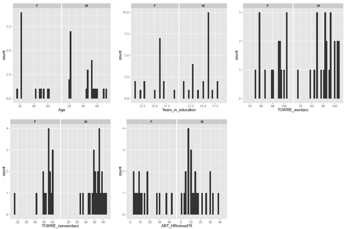
Notice:
— It looks like males and females in the sample are fairly matched on reading ability but differ on age, education and reading experience (ART).
— If it were a jpeg, you’d specify width and height in pixels (don’t ask me why, there is a reason but I forgot it).
What height-width ratio to use? I don’t know, try the golden ratio. Sometimes I remember to think about it but usually I just look, and adjust the code as required. Try it. Obviously, do not have the pdf of the plot open when running the code (try that and see what happens).
What have we learnt?
You can download the code to draw the plots in this post here. Obviously, you’ll need to go back a post to see how to load the the data which you can get here.
We have learnt how to create small multiples of plots in ggplot2 using facetting. This will come in much handier as our data gets more complicated. We have also learnt how to use grid() to plot multiple variables at once. And we have learnt how to output our plots as a pdf for later use.
Key vocabulary
graphics device
ggplot()
geom_histogram()
facet_wrap()
pdf()
grid()
print()

Pingback: Sunshine in Reykjavik in early May 1949-2012 | DataSmata