
This post will take a more in-depth look at the relationships between variables.
A key property of experimental data is that we measure attributes – characteristics of people, stimuli, and behaviour – and that those measurements (the numbers) vary. Numbers vary. That’s like saying ‘water is wet’. However, data analysis concerns the description and the explanation or prediction of that variation.
I feel like I’m channeling Andrew Gelman’s book with Deborah Nolan on teaching statistics, here.
Let’s examine the relationship between the item attribute variables, beginning by looking at how the item attribute numbers vary.
Variation in the values of item attributes
1. Let’s start a new .R script (see here): in R-Studio, keyboard shortcut CTRL-shift-N or cursor click File menu-new R script.
2. Download the files: get hold of the data, discussed previously here, by clicking on the links and downloading the files from my dropbox account:
We have .csv files holding:
1. data on the words and nonwords, variables common to both like word length;
2. data on word and nonword item coding, corresponding to item in program information, that will allow us to link these norms data to data collected during the lexical decision task;
3. data on just the words, e.g. age-of-acquisition, which obviously do not obtain for the nonwords.
3. Copy these files into a folder on your computer – we’ll characterize it as the working directory (see here) and I will be using a folder I have called resource R public:

Notice:
— I took a screenshot here of my Windows 7 windows explorer view of the folder. Things might look differently in different operating systems.
— In Windows, the address for this folder can be found by clicking on the down arrow in the top bar of the explorer window: C:\Users\p0075152\Dropbox\resources R public.
— Windows lists folder locations with addresses where locations are delimietd by “\” – in R, you need to change those slashes to “/”, see the code following.
4. To get the data files – the item norms .csv files – into R, I need to first set the working directory to this folder, and then run read() function calls, which I can do with this code (see here):
# set the working directory

setwd("C:/Users/p0075152/Dropbox/resources R public")

# read in the item norms data

item.norms <- read.csv(file="item norms 270312 050513.csv", head=TRUE,sep=",", na.strings = "-999")
word.norms <- read.csv(file="word norms 140812.csv", head=TRUE,sep=",", na.strings = "-999")
item.coding <- read.csv(file="item coding info 270312.csv", head=TRUE,sep=",", na.strings = "-999")
If you have put the files in the working directory that you then correctly specify (slashes forward in R, backward in Windows – address correctly given), and if the files are in that folder, and if you have correctly spelled the file names then you should see this:
Notice the dataframes are now listed in the workspace window in R-studio.
5. We will then need to load libraries of packages (like ggplot2) – packages that were previously installed – to make their functions available for use (see here) using the code:
# load libraries of packages

library(languageR)
library(lme4)
library(ggplot2)
library(grid)
library(rms)
library(plyr)
library(reshape2)
library(psych)
6. As before (e.g. here or here), I can start by inspecting the dataframes using convenient summary statistics functions.
# get summary statistics for the item norms

head(item.norms, n = 2)
summary(item.norms)
describe(item.norms)
str(item.norms)
length(item.norms)
length(item.norms$item_name)
7. We can then plot the distribution of the values in these variables to show how the items vary in each of the attributes: item length in letters; orthographic neighbourhood size; and bigram frequency.
By distribution, what I am talking about is how many items have one or other value on each variable. Are there many words or nonwords that are four letters in length, or that have one or more orthographic neighbours?
A convenient way to examine the distributions of the values associated with our items for each variable is to plot the variable values in histograms. We can use the same sort of code that we used to plot the distribution of variation in participant attributes, see here.
One concern that I have is that the item norms attributes have similar distributions for words and nonwords in my stimulus set. Remember that the item.norms database holds data on 160 words and 160 nonwords that were selected to be matched to the words. If the words and nonwords are matched, their distributions should look similar: the peaks of the distribution (i.e. where most items are on length or whatever) should be in about the same place. Let’s start by looking at the distributions using histograms, with the plots drawn to show words and nonwords separately side-by-side.
A couple of lines of code will show us the distribution of word and nonword lengths for our stimuli:
# plot the distributions of the item norms variables for words and nonwords separately

pLength <- ggplot(item.norms, aes(x=Length))
pLength <- pLength + geom_histogram() + facet_wrap(~item_type)
pLength
Will get you this:

A few more lines of code will get you plots for each variable, printed out as a grid, to show all variables at once, output to a pdf for report. (I’m actually only going to bother to plot item length, orthographic neighbourhood size, and mean bigram frequency; you can practice this process by adding plots for the other variables.)
# plot the distributions of the item norms variables for words and nonwords separately

pLength <- ggplot(item.norms, aes(x=Length))
pLength <- pLength + geom_histogram() + facet_wrap(~item_type)

pOrtho_N <- ggplot(item.norms, aes(x=Ortho_N))
pOrtho_N <- pOrtho_N + geom_histogram() + facet_wrap(~item_type)

pBG_Mean <- ggplot(item.norms, aes(x=BG_Mean))
pBG_Mean <- pBG_Mean + geom_histogram() + facet_wrap(~item_type)

# plot the distributions of all the variables at once, all split by item type

# print plots to a grid

# print the plots to places in the grid - plots prepared earlier

pdf("ML-data-items-histograms-040513.pdf", width = 10, height = 15)

grid.newpage()

pushViewport(viewport(layout = grid.layout(3,1)))

vplayout <- function(x,y)
 viewport(layout.pos.row = x, layout.pos.col = y)

print(pLength, vp = vplayout(1,1))
print(pOrtho_N, vp = vplayout(2,1))
print(pBG_Mean, vp = vplayout(3,1))

dev.off()
The pdf of the plots will get created in the working directory folder, and will show you this:

It looks like a did a pretty good job, even if I do say so myself, finding nonwords that are similar to the words on length, neighbourhood size, and bigram frequency.
The values on the item attribute variables vary such that the numbers of words that have lengths of 3, 4, 5 or 6 letters seem similar to the numbers of nonwords with these lengths. The same similarity in distributions appears to obtain for the other variables.
8. I find it a bit inconvenient having to look at two plots side-by-side to make the comparison between words and nonwords on variation in item attributes. It would be easier if I could superimpose one distribution on top of the other.
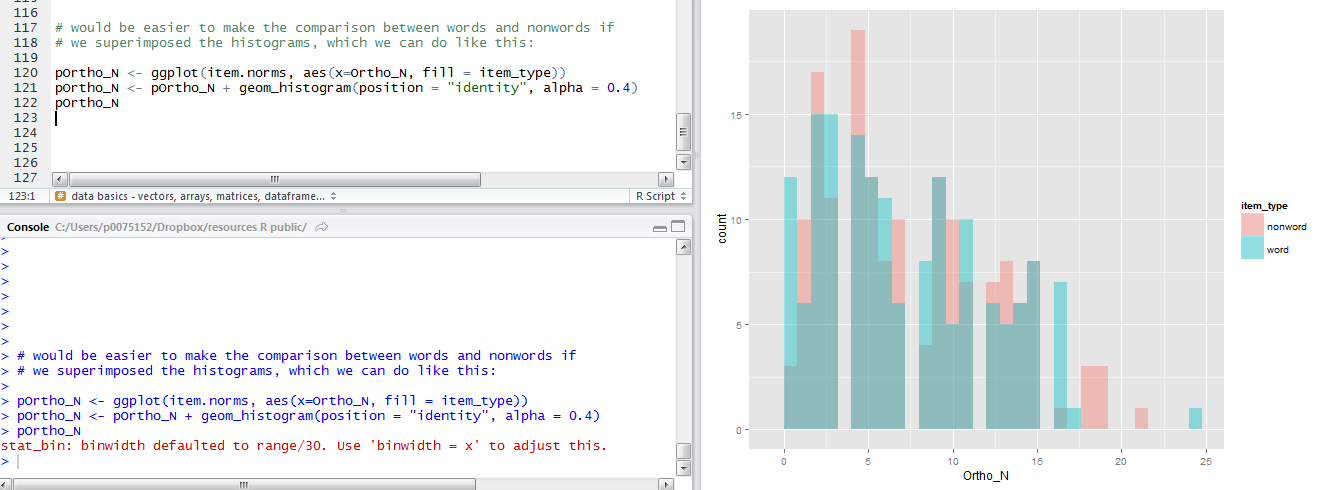
I could superimpose the histograms quite easily, mapping the item type to the colour of the histograms with code like this:
# would be easier to make the comparison between words and nonwords if
# we superimposed the histograms, which we can do like this:

pOrtho_N <- ggplot(item.norms, aes(x=Ortho_N, fill = item_type))
pOrtho_N <- pOrtho_N + geom_histogram(position = "identity", alpha = 0.4)
pOrtho_N
Notice:
— I repeat the plot name at the end to get it drawn within R-studio in the plot window
— I am mapping the item type (word or nonword) to the fill or colour of the bars in the histogram.
— I am superimposing the distribution plots with the argument position = “identity” in the geom_histogram() function call.
— I am making the histogram bars slightly transparent by modifying plot opacity with alpha = 0.4.
— And all that gets you this quite nice plot:
9. As it happens, I tend to prefer using density plots to examine data distributions.
Histograms and density plots both show the distributions of variables considered on their own. (See here for a nice tutorial: I’ll do my best to explain things in the following.)
In a histogram, the area of each bar is proportional to the frequency of a value in the variable being plotted.
A histogram shows you the frequency of occurrence of values for a variable, where values are grouped together in bins. Think about bins as divisions of the variable, values in the variable go from low to high numbers, and these values can be split into bins. You might have bins of values of a size equal to the total range of values (e.g. neighbourhood size ranges from 0 – 30) divided by 30, which here equals bins representing neighbourhood size increments of 1. Variable range divided by 30 is the ggplot2 default, and bin size can be changed. If you are plotting a histogram to show frequency counts, the height of the bars will equal the frequency of occurrence of values corresponding to that bin. You can see in the example that we have rather a lot of items with between 0 and 5 neighbours. The area covered by the histograms is equal to the number of observations: we have 160 word and 160 nonword observations for each variable.
Rather than showing the frequency count, we could opt to have the histogram show the frequency density of our variables. The frequency density is the frequency of occurrence of a set of values (a bin of values) divided by the width of variation in that set (the bin width). We make the space filled by all the bars equal to one, so that the height of each bar equals the proportion of observations having a value encompassed by the corresponding bin.
Where numbers vary continuously, using histograms to plot the distribution of values might be felt to be misleading. Splitting the numbers into bins is a choice we make, or, if we rely on defaults for the calculation of bin widths, a choice that R makes. It might be better, then, to estimate the probability for our data that each value in a variable occurs. Density plots can be understood as showing smoothed histograms.
A little bit of research shows that density estimation is a big topic, see here, and I am going to keep things simple – so that I only say what I understand. I find Dalgaard’s (2008) book nice and clear on this and am merely going to paraphrase him here:
The density for a continuous distribution is a measure of the relative probability of observing a value or getting a value close to x.The probability of getting a value in a particular interval is the area under the corresponding part of the curve.
Kernel density estimation (paraphrasing here) is a way to estimate the probability density function of a variable. You are estimating the probability of values in a population from your data sample. Density, remember, is how much or how how often a value or set of values occurs. So if we are estimating density we can do so using a kernel density estimator, combining the kernel (a positive function that integrates to one) and a smoothing parameter called the bandwidth. The larger the bandwidth, the more smoothing there is, and you can see this if you modify the bandwidth argument in a density plot.
That, I am afraid, is all I can find in my books so far. The honest direction, here, is given by Kabacoff (2011) who remarks that the mathematics of kernel density estimation is beyond the scope of our interest. But I regard this section as a to-be-continued entry, as I would like to understand things a bit better.
For now, let’s use the density plots to examine our variables, and leave understanding them more for another time.
You can understand the similarity of the histogram and density curve methods for examining the distribution of variables by superimposing one on top of the other. Here, I am adapting a solution given in Winston Chang’s (2012) R cookbook. The key point is that we are going to draw a histogram and a density plot of the same data distribution – how each variable varies – scaling the histogram so that it shows value density.
pOrtho_N <- ggplot(item.norms, aes(x=Ortho_N, y = ..density..))
pOrtho_N <- pOrtho_N + geom_histogram(fill = "aquamarine", colour = "grey60", size = .2)
pOrtho_N <- pOrtho_N + geom_density(size = 1.15)
pOrtho_N
If you run this code you will see this in the plot window:
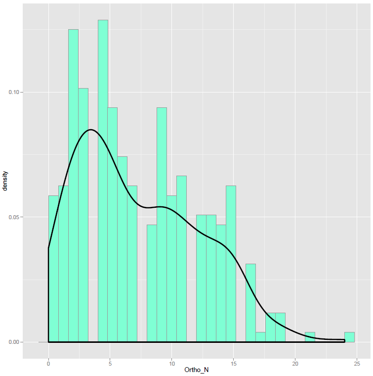
Notice:
— I mapped the density values for the variable to the y-axis for both the histogram and the density plot.
— I changed the colour of the fills and the borders of the bars for the histogram with the fill, colour and size arguments in the geom_histogram() function call.
— I also changed the size of the line drawn to show the density estimate, to make it bolder, using the size argument in the geom_density() call.
— You can see how the occurrence of different values in this variable, orthographic neighbourhood size, for my sample of words and nonwords, has a big bump around 0-5 neighbours, as shown in the peaks of both the histogram and density plots of the data distribution.
We can redraw the side-by-side histogram plots using superimposed density plots to show how words and nonwords vary on each item attribute variable.
# now draw a grid of density plots
# plot the distributions of the item norms variables for words and nonwords separately

pLength <- ggplot(item.norms, aes(x=Length, colour = item_type))
pLength <- pLength + geom_density()

pOrtho_N <- ggplot(item.norms, aes(x=Ortho_N, colour = item_type))
pOrtho_N <- pOrtho_N + geom_density()

pBG_Mean <- ggplot(item.norms, aes(x=BG_Mean, colour = item_type))
pBG_Mean <- pBG_Mean + geom_density()

# plot the distributions of all the variables at once, all split by item type

# print the plots to places in the grid - plots prepared earlier

pdf("ML-data-items-densities-040513-wide.pdf", width = 24, height = 8)

grid.newpage()

pushViewport(viewport(layout = grid.layout(1,3)))

vplayout <- function(x,y)
 viewport(layout.pos.row = x, layout.pos.col = y)

print(pLength, vp = vplayout(1,1))
print(pOrtho_N, vp = vplayout(1,2))
print(pBG_Mean, vp = vplayout(1,3))

dev.off()
Which will produce a pdf that looks like this:
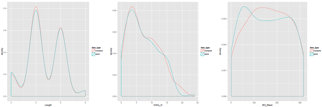
Notice:
— I adjusted the grid to show the density plots in a wide strip rather than a vertical one, because I think it looks better.
— It does not really make sense to present a density plot for a variable with discrete values, like Length, so I might prefer there to use a histogram instead.
What have we learnt?
(The code used to draw the plots in this post can be downloaded from here.)
We have examined how the items in our sample of words and nonwords vary in the item attributes.
We have looked at this variation in terms of the distribution of values in each variable.
We have examined distributions using both histograms and density plots, going a bit into what these plots represent.
Key vocabulary
geom_density()
geom_histogram()
Reading
Chang, W. (2013). R Graphics Cookbook. Sebastopol, CA: o’Reilly Media.
Dalgaard, P. (2008). Introductory statistics with R (2nd. Edition). Springer.
