
This post will focus exclusively on the relationships between pairs of variables. We will be looking at the item norms data, though you might want to practice the R procedures we deploy on the subjects data (see earlier posts here, here and here).
We will follow closely on the examination of variable distributions, that is, the characteristics of variation in items’ values on attribute variables like length in letters. We have previously discussed how to obtain the data here, how to draw histograms or density plots to examine variable distributions here, and how to compare the mean values of variables split (here) by item type, using the t-test, here.
What we are going to do here is to focus on the examination of whether – for any pair of variables – the variation in one relates to the variation in the other.
We will build on our previous work with scatterplots, which focused on the relationships between subject attribute variables (see here).
Visualizing the relationship between two variables
There is no point considering the relationship between two variables if values in the variables do not vary. We have had a look at the distribution of the item attribute variables, however, and we know that our items are pretty varied on length, orthographic neighbourhood size and bigram frequency.
Previous research (e.g. Baayen, Feldman, & Schreuder, 1997; Balota, Cortese, Sergent-Marshall, Spieler, & Yap, 2004; Weekes, 1997) shows how, most of the time, the length, orthographic neighbourhood size and the frequency of sub-lexical (we’ll focus on bigram) components of words correlate such that longer words have fewer neighbours and are composed of letters or letter clusters (e.g. bigrams) having lower average token frequency. As noted previously, this will make it tough to work out what the significant influence on reading performance might be, given a set of predictors that includes all these correlated variables. However, first, we’ll just concern ourselves with capturing the relationships between the variables.
We have seen how to produce a nice scatterplot showing the relationship between two variables, using code like this:
pdf("ML-data-item.norms-scatters-smoothers-edited-040513.pdf", width = 6, height = 6)

pln <- ggplot(item.norms,aes(x=Length, y=Ortho_N))
pln <- pln + geom_point() + ggtitle("Length x N-size")
pln <- pln + xlab("Item length in letters (jittered)") + ylab("Orthographic neighbourhood size")
pln <- pln + theme(axis.title.x = element_text(size=25), axis.text.x = element_text(size=20))
pln <- pln + theme(axis.title.y = element_text(size=25), axis.text.y = element_text(size=20))
pln <- pln + geom_smooth(method="lm", size = 1.5)
pln <- pln + theme_bw()
pln

dev.off()
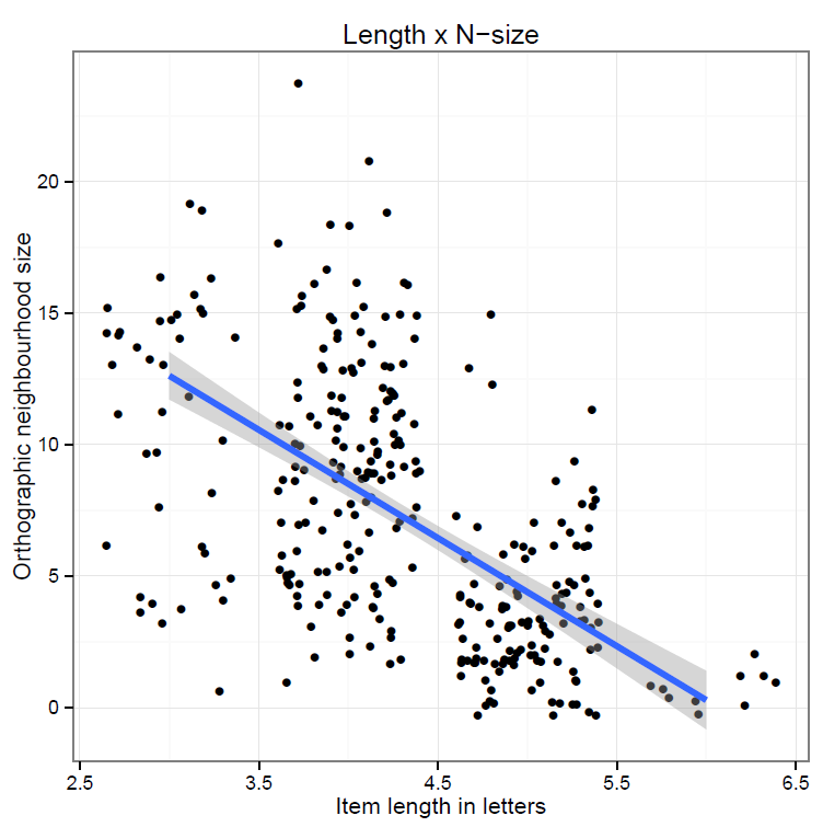
To create a scatterplot like this:

Which shows us that:
— Longer items have fewer neighbours: e.g. 3-letter items have between 3 and 20 neighbours, while 6-letter items have basically no neighbours.
— A number of items have exactly the same length and N-size values so the points are printed one on top of the other.
When we have observations being printed one on top of the other, or otherwise when we have crowds of points that obscure the pattern in a plot i.e. the relationship between two variables, we have overplotting (see Chang, 2013; Wickham, 2009, for comments and alternate solutions to overplotting).
Here, we can deal with the fact that we have a number of points that all have the same length by adding a bit of random noise to their positions on the x-axis and y-axis, jittering, something we can have done for us by calling the geom_jitter() function to draw the scatterplot, as in:
pdf("ML-data-item.norms-scatters-smoothers-jitter-040513.pdf", width = 6, height = 6)

pln <- ggplot(item.norms,aes(x=Length, y=Ortho_N))
pln <- pln + geom_jitter() + ggtitle("Length x N-size")
pln <- pln + xlab("Item length in letters") + ylab("Orthographic neighbourhood size")
pln <- pln + theme(axis.title.x = element_text(size=25), axis.text.x = element_text(size=20))
pln <- pln + theme(axis.title.y = element_text(size=25), axis.text.y = element_text(size=20))
pln <- pln + geom_smooth(method="lm", size = 1.5)
pln <- pln + theme_bw()
pln

dev.off()
which gives us this:
Notice:
— The relationship is still there.
— The points are scattered about their ‘raw’ data original positions.
— Not everyone likes jittering but I think a jittered plot is more useful than one without, where one of the variables has a discrete values distribution resulting in the impression (misleading) that there are only a few observations because they are all printed on top of each other.
Just while we’re fancying up our scatterplots, it is worthwhile looking at this:
http://www.r-bloggers.com/2d-plot-with-histograms-for-each-dimension-2013-edition/
— Which shows us how to present a scatterplot and density distribution plots for each the two variables being examined.
— This version of the scatterplot requires that the gridExtra() package is installed and that the library for that package is then loaded before the code can be run.
The code, adapted from that given by Michael Kuhn at the URL above, is:
pdf("ML-data-item.norms-scatters-smoothers-jitter-density-040513.pdf", width = 6, height = 6)

p <- ggplot(item.norms, aes(x=Length, y=Ortho_N, colour = item_type)) + geom_jitter()

p1 <- p + theme(legend.position = "none")

p2 <- ggplot(item.norms, aes(x=Length, group=item_type, colour=item_type))
p2 <- p2 + stat_density(fill = NA, position="dodge")
p2 <- p2 + theme(legend.position = "none", axis.title.x=element_blank(),
 axis.text.x=element_blank())

p3 <- ggplot(item.norms, aes(x=Ortho_N, group=item_type, colour=item_type))
p3 <- p3 + stat_density(fill = NA, position="dodge") + coord_flip()
p3 <- p3 + theme(legend.position = "none", axis.title.y=element_blank(),
 axis.text.y=element_blank())

g_legend<-function(a.gplot){
 tmp <- ggplot_gtable(ggplot_build(a.gplot))
 leg <- which(sapply(tmp$grobs, function(x) x$name) == "guide-box")
 legend <- tmp$grobs[[leg]]
 return(legend)
}

legend <- g_legend(p)

grid.arrange(arrangeGrob(p2, legend, p1, p3, widths=unit.c(unit(0.75, "npc"), unit(0.25, "npc")), heights=unit.c(unit(0.25, "npc"), unit(0.75, "npc")), nrow=2))

dev.off()
And it delivers this scatterplot with density plots figure:
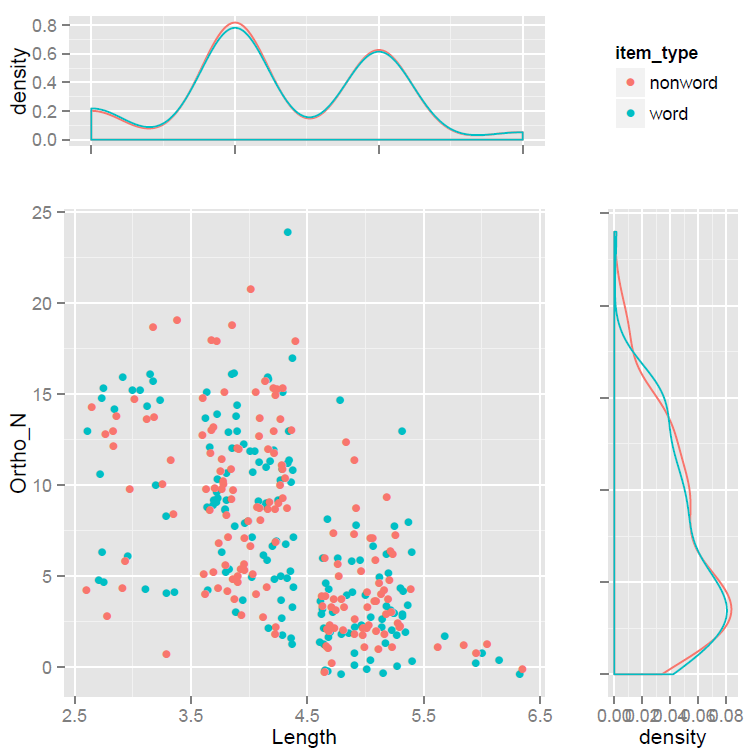
Which needs a bit of tidying up but is pretty awesome.
Notice:
— We simultaneously view the relationship between two variables and how these variables vary.
— Doing all this with a words vs. nonwords split.
— I don’t exactly understand everything in the code so will not explain it here but – I did understand it enough to adapt it for my own uses: if you compare my adaptation with Kuhn’s original, you should see what needs to be done to use it.
— How I would work out the function of the components would be by changing each, one by one, and seeing what resulted.
What have we learnt?
(The code for creating the plots drawn in this post can be found here.)
The key insight from drawing such plots is that for some pairs of variables variation in one, say, variation in length, is associated with variation in the other, say, orthographic neighbourhood size. There seems to be a systematic association. There are short and long items: that is what we mean by variation. On average, longer items have fewer neighbours: that is what we mean by systematic association. Of course, we will be testing this association formally using correlation, in a later post.
Key vocabulary
scatter plot
jitter
geom_jitter()
geom_point()
geom_density()
stat_density()
Reading
Baayen, R. H., Feldman, L. B., & Schreuder, R. (2006). Morphological influences on the recognition of monosyllabic monomorphemic words. Journal of Memory and Language, 55, 290-313.
Balota, D. A., Cortese, M. J., Sergent-Marshall, S. D., Spieler, D. H., & Yap, M. J. (2004). Visual word recognition of single-syllable words. Journal of Experimental Psychology: General, 133, 283-316.
Chang, W. (2013). R Graphics Cookbook. Sebastopol, CA: o’Reilly Media.
Weekes, B. S. (1997). Differential effects of number of letters on word and nonword naming latency. The Quarterly Journal Of Experimental Psychology, 510A 439-456.
Wickham, H. (2009). ggplot2: Elegant graphics for data analysis. Springer.
