
We got our data together in Part I of this workshop, eventually arriving at the collation of a single dataframe in ‘long format’ holding all our data on subject attributes, item attributes and behavioural responses to words in a lexical decision experiment. That collated database can be downloaded here.
The code we will be using in this post can be downloaded from here.
We should begin by examining the features of our collated dataset. We shall be familiarising ourselves with the distributions of the variables, looking for evidence of problems in the dataset, and doing transformation or othe operations to handle those problems.
Some of the problems are straightforward. We should look at the distributions of scores to check if any errors crept in to the dataset, miscoded or misrecorded observations. Other problems are a little more demanding both to understand and to diagnose and treat. The running example in this workshop requires a regression analysis in which we will be required to enter a number of variables as predictors, including variables characterizing word attributes like the frequency, length and imageability of words. The problem is that all these variables share or overlap in information because words that appear often in the language also tend to be short, easy to imagine, learnt earlier in life and so on. This means that we need to examine the extent to which our predictors cluster, representing overlapping information, and presenting potential problems for our analysis.
Much of what follows has been discussed in previous posts here on getting summary statistics and plotting histograms to examine variable distributions, here on plotting multiple histograms in a grid, see also here on histograms and density plots, here on plotting scatterplots to examine bivariate relationships, and here on checking variable clustering. This post constitutes an edited, shortened, version of those previous discussions.
Examine the variable distributions — summary statistics
I am going to assume you have already downloaded and read in the data files concerning subject and item or word attributes as well as the collated database merging the subject and item attribute data with the behavioural data (see Part I). What we are going to do now is look at the distributions of the key variables in those databases.
We can start simply by examining the sumaries for our variables. We want to focus on the variables that will go into our models, so variables like age or TOWRE word or non-word reading score, item length, word frequency, and lexical decision reaction time (RT) to words.
If you have successfully read the relevant data files into the R workspace then you should see them listed by the dataframe names (assigned when you performed the read.csv function calls) in the workspace window in RStudio (top right).
R provides a handy set of functions to allow you to examine your data (see e.g. Dalgaard, 2008):
head(subjects, n = 2)

summary(subjects)

describe(subjects)

str(subjects)

psych::describe(subjects)

length(subjects)

length(subjects$Age)
Here we are focusing on the data in the subject scores dataframe.
Copy-paste these commands into the script window and run them, below is what you will see in the console:
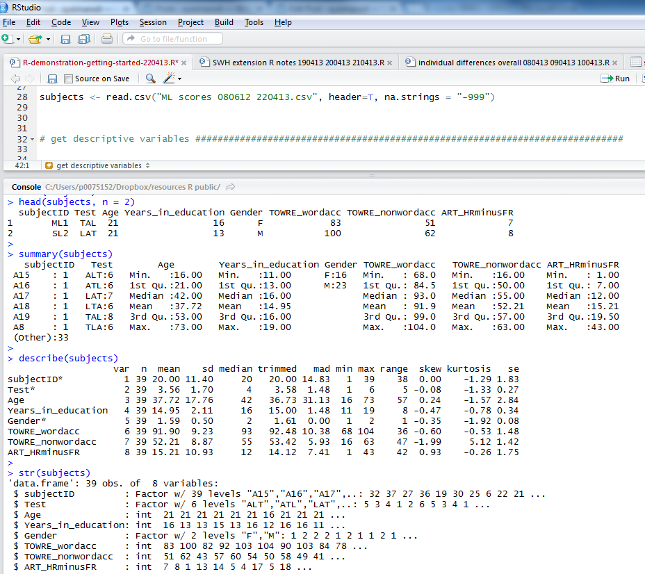
Notice:
1. the head() function gives you the top rows, showing column names and data in cells; I asked for 2 rows of data with n = 2
2. the summary() function gives you: minimum, maximum, median and quartile values for numeric variables, numbers of observations with one or other levels for factors, and will tell you if there are any missing values, NAs
3. psych::describe() (from the psych package) will give you means, SDs, the kind of thing you report in tables in articles
4. str() will tell you if variables are factors, integers etc.
If I were writing a report on this subjects data I would copy the output from describe() into excel, format it for APA, and stick it in a word document.
As an exercise, you might apply the same functions to the items or the full databases.
Notice the values and evaluate if they make sense to you. Examine, in particular, the treatment of factors and numeric variables.
Examine the variable distributions — plots
Summary statistics are handy, and required for report writing, but plotting distributions will raise awareness of problems in your dataset much more efficiently.
We will use ggplot to plot our variables, especially geom_histogram, see the documentation online.
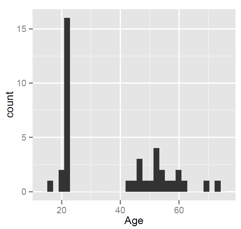
We are going to examine the distribution of the Age variable, age in years for ML’s participants, using the ggplot() function as follows:
pAge <- ggplot(subjects, aes(x=Age))
pAge + geom_histogram()
Notice:
— We are asking ggplot() to map the Age variable to the x-axis i.e. we are asking for a presentation of one variable.
If you copy-paste the code into the script window and run it three things will happen:
1. You’ll see the commands appear in the lower console window
2. You’ll see the pAge object listed in the upper right workspace window

Notice:
— When you ask for geom_histogram(), you are asking for a bar plot plus a statistical transformation (stat_bin) which assigns observations to bins (ranges of values in the variable)
— calculates the count (number) of observations in each bin
— or – if you prefer – the density (percentage of total/bar width) of observations in each bin
— the height of the bar gives you the count, the width of the bin spans values in the variable for which you want the count
— by default, geom_histogram will bin data to the range in values/30 but you can ask for more or less detail by specifying binwidth, this is what R means when it says:
>stat_bin: binwidth defaulted to range/30. Use 'binwidth = x' to
adjust this.
3. We see the resulting plot in the plot window, which we can export as a pdf:
Notice:
— ML tested many people in their 20s – no surprise, a student mostly tests students – plus a smallish number of people in middle age and older (parents, grandparents)
— nothing seems wrong with these data – given what we know about the sample.
We can move on to examine the distribution of multiple variables simultaneously by producing a grid of histograms, as follows. In Exploratory Data Analysis, we often wish to split a larger dataset into smaller subsets, showing a grid or trellis of small multiples – the same kind of plot, one plot per subset – arranged systematically to allow the reader (maybe you) to discern any patterns, or stand-out features, in the data. Much of what follows is cribbed from the ggplot2 book (Wickham, 2009; pp.115 – ; see also Chang, 2o13). Wickham (2009) advises that arranging multiple plots on a single page involves using grid, an R graphics system, that underlies ggplot2.
Copy-paste the following code in the script window to create the plots:
pAge <- ggplot(subjects, aes(x=Age))
pAge <- pAge + geom_histogram()

pEd <- ggplot(subjects, aes(x=Years_in_education))
pEd <- pEd + geom_histogram()

pw <- ggplot(subjects, aes(x=TOWRE_wordacc))
pw <- pw + geom_histogram()

pnw <- ggplot(subjects, aes(x=TOWRE_nonwordacc))
pnw <- pnw + geom_histogram()

pART <- ggplot(subjects, aes(x=ART_HRminusFR))
pART <- pART + geom_histogram()
Notice:
— I have given each plot a different name. This will matter when we assign plots to places in a grid.
— I have changed the syntax a little bit: create a plot then add the layers to the plot; not doing this, ie sticking with the syntax as in the preceding examples, results in an error when we get to print the plots out to the grid; try it out – and wait for the warning to appear in the console window.
We have five plots we want to arrange, so let’s ask for a grid of 2 x 3 plots ie two rows of three.
grid.newpage()

pushViewport(viewport(layout = grid.layout(2,3)))

vplayout <- function(x,y)
viewport(layout.pos.row = x, layout.pos.col = y)
Having asked for the grid, we then print the plots out to the desired places, as follows:
print(pAge, vp = vplayout(1,1))
print(pEd, vp = vplayout(1,2))
print(pw, vp = vplayout(1,3))
print(pnw, vp = vplayout(2,1))
print(pART, vp = vplayout(2,2))
As R works through the print() function calls, you will see the Plots window in R-studio fill with plots getting added to the grid you specified.
You can get R to generate an output file holding the plot as a .pdf or as a variety of alternatively formatted files.
Wickham (2009; p. 151) recommends differing graphic formats for different tasks, e.g. png (72 dpi for the web); dpi = dots per inch i.e. resolution.
Most of the time, I output pdfs. You call the pdf() function – a disk-based graphics device -specifying the name of the file to be output, the width and height of the output in inches (don’t know why, but OK), print the plots, and close the device with dev.off(). You can use this code to do that.
I can wrap everything up in a single sequence of code bracketed by commands to generate a pdf:
pdf("ML-data-subjects-histograms-061113.pdf", width = 15, height = 10)

pAge <- ggplot(subjects, aes(x=Age))
pAge <- pAge + geom_histogram()

pEd <- ggplot(subjects, aes(x=Years_in_education))
pEd <- pEd + geom_histogram()

pw <- ggplot(subjects, aes(x=TOWRE_wordacc))
pw <- pw + geom_histogram()

pnw <- ggplot(subjects, aes(x=TOWRE_nonwordacc))
pnw <- pnw + geom_histogram()

pART <- ggplot(subjects, aes(x=ART_HRminusFR))
pART <- pART + geom_histogram()

grid.newpage()

pushViewport(viewport(layout = grid.layout(2,3)))

vplayout <- function(x,y)
viewport(layout.pos.row = x, layout.pos.col = y)

print(pAge, vp = vplayout(1,1))
print(pEd, vp = vplayout(1,2))
print(pw, vp = vplayout(1,3))
print(pnw, vp = vplayout(2,1))
print(pART, vp = vplayout(2,2))

dev.off()
Which results in a plot that looks like this:
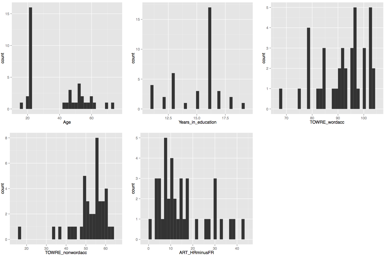
There is nothing especially concerning about these distributions though the bimodal nature of the age distribution is something worth remembering if age turns out to be a significant predictor of reading reaction times.
Further moves
Histograms are not always the most useful approach to visualizing data distributions. What if you wanted to compare two distributions overlaid on top of each other e.g. distributions of variables that should be similar? It is worth considering density plots, see here.
Exploring data and acting on what we find
Let’s consider an aspect of the data that, when revealed by a distribution plot (but was also evident when we looked at the summary statistics), will require action.
I am talking about what we see if we plot a histogram of the RT distribution using the following code. If we copy this into RStudio and run it:
pRT <- ggplot(RTs.norms.subjects, aes(x=RT))
pRT + geom_histogram()
We get this:
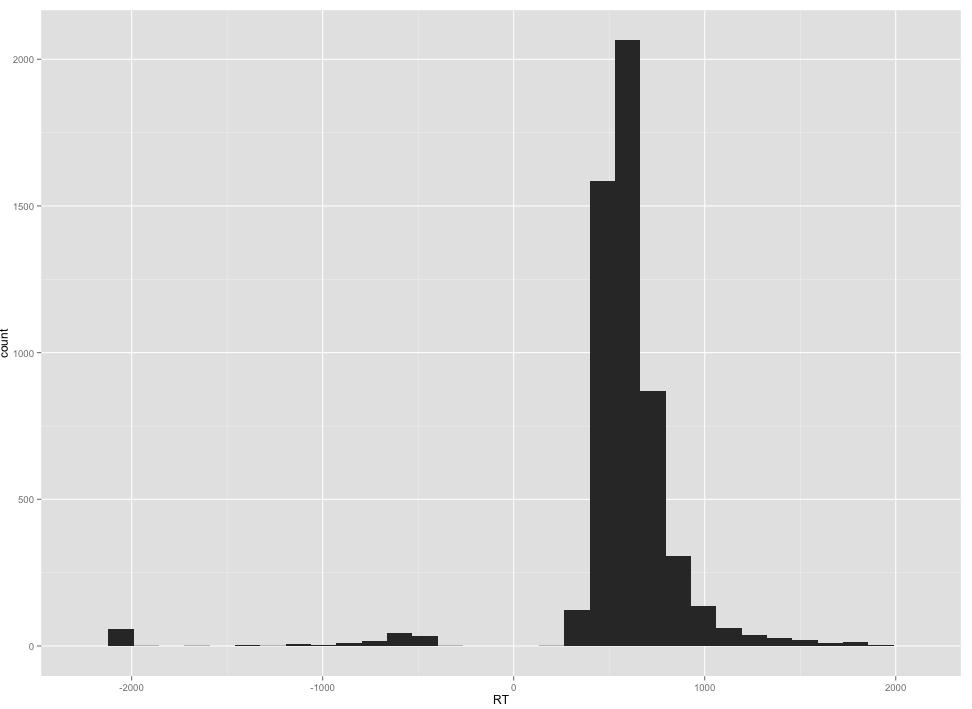
Notice that there are a number of negative RTs. That is. of course, impossible but makes sense if you know that DMDX, the application used to collect lexical decision responses, encodes RTs for errors as negative RTs.
Notice also that even if we ignore the -RT values, the RT distribution is, as usual, highly skewed.
Data transformations I/II
We can remove the error -RT observations by subsetting the full collated database, filtering out all observations correspondong to errors to create a new ‘correct responses only’ database. We can also log transform the RTs for correct responses in that same new database. We can do this in a few lines of code in the script as follows:
# the summary shows us that there are negative RTs, which we can remove by subsetting the dataframe
# by setting a condition on rows

nomissing.full <- RTs.norms.subjects[RTs.norms.subjects$RT > 0,]

# inspect the results

summary(nomissing.full)

# how many errors were logged?

# the number of observations in the full database i.e. errors and correct responses is:

length(RTs.norms.subjects$RT)

# > length(RTs.norms.subjects$RT)
# [1] 5440

# the number of observations in the no-errors database is:

length(nomissing.full$RT)

# so the number of errors is:

length(RTs.norms.subjects$RT) - length(nomissing.full$RT)

# > length(RTs.norms.subjects$RT) - length(nomissing.full$RT)
# [1] 183

# is this enough to conduct an analysis of response accuracy? we can have a look but first we will need to create
# an accuracy coding variable i.e. where error = 0 and correct = 1

RTs.norms.subjects$accuracy <- as.integer(ifelse(RTs.norms.subjects$RT > 0, "1", "0"))

# we can create the accuracy variable, and run the glmm but, as we will see, we will get an error message, false
# convergence likely due to the low number of errors


# I will also transform the RT variable to the log base 10 (RT), following convention in the field, though
# other transformations are used by researchers and may have superior properties

nomissing.full$logrt <- log10(nomissing.full$RT)
Notice:
— You can see that there were a very small number of errors recorded in the experiment, less than 200 errors out of 5000+ trials. This is a not unusual error rate, I think, for a dataset collected with typically developing adult readers.
— I am starting to use the script file not just to hold lines of code to perform the analysis, not just to hold the results of analyses that I might redo, but also to comment on what I am seeing as I work.
— The ifelse() function is pretty handy, and I have started using it more and more.
— Here, I can break down what is happening step by step:-
1. RTs.norms.subjects$accuracy <- — creates a vector that gets added to the existing dataframe columns, that vector has elements corresponding to the results of a test on each observation in the RT column, a test applied using the ifelse() function, a test that results in a new vector with elements in the correct order for each observation.
2. as.integer() — wraps the ifelse() function in a function call that renders the output of ifelse() as a numeric integer vector; you will remember from a previous post how one can use is.[datatype]() and as.[datatype]() function calls to test or coerce, respectively, the datatype of a vector.
3. ifelse(RTs.norms.subjects$RT > 0, “1”, “0”) — uses the ifelse() function to perform a test on the RT vector such that if it is true that the RT value is greater than 0 then a 1 is returned, if it is not then a 0 is returned, these 1s and 0s encode accuracy and fill up the new vector being created, one element at a time, in an order corresponding to the order in which the RTs are listed.
I used to write notes on my analyses on paper, then in a word document (using CTRL-F that will be more searchable), to ensure I had a record of what I did.
Check predictor collinearity
The next thing we want to do is to examine the extent to which our predictors cluster, representing overlapping information, and presenting potential problems for our analysis. We can do this stage of our analysis by examining scatterplot matrices and calculating the condition number for our predictors. Note that I am going to be fairly lax here, by deciding in advance that I will use some predictors but not others in the analysis to come. (If I were being strict, I would have to find and explain theory-led and data-led reasons for including the predictors that I do include.)
Note that we will first run some code to define a function that will allow us to create scatterplot matrices, furnished by William Revelle on his web-site (see URL below):
#code taken from part of a short guide to R
#Version of November 26, 2004
#William Revelle
# see: http://www.personality-project.org/r/r.graphics.html

panel.cor <- function(x, y, digits=2, prefix="", cex.cor)
{
usr <- par("usr"); on.exit(par(usr))
par(usr = c(0, 1, 0, 1))
r = (cor(x, y))
txt <- format(c(r, 0.123456789), digits=digits)[1]
txt <- paste(prefix, txt, sep="")
if(missing(cex.cor)) cex <- 0.8/strwidth(txt)
text(0.5, 0.5, txt, cex = cex * abs(r))
}
We can then run the following code:
# we can consider the way in which potential predictor variables cluster together

summary(nomissing.full)

# create a subset of the dataframe holding just the potential numeric predictors
# NB I am not bothering, here, to include all variables, e.g. multiple measures of the same dimension

nomissing.full.pairs <- subset(nomissing.full, select = c(

"Length", "OLD", "BG_Mean", "LgSUBTLCD", "brookesIMG", "AoA_Kup_lem", "Age",
"TOWRE_wordacc", "TOWRE_nonwordacc", "ART_HRminusFR"

))

# rename those variables that need it for improved legibility

nomissing.full.pairs <- rename(nomissing.full.pairs, c(

brookesIMG = "IMG", AoA_Kup_lem = "AOA",

TOWRE_wordacc = "TOWREW", TOWRE_nonwordacc = "TOWRENW", ART_HRminusFR = "ART"

))


# subset the predictors again by items and person level attributes to make the plotting more sensible

nomissing.full.pairs.items <- subset(nomissing.full.pairs, select = c(

"Length", "OLD", "BG_Mean", "LgSUBTLCD", "IMG", "AOA"

))

nomissing.full.pairs.subjects <- subset(nomissing.full.pairs, select = c(

"Age", "TOWREW", "TOWRENW", "ART"

))


# draw a pairs scatterplot matrix

pdf("ML-nomissing-full-pairs-items-splom-061113.pdf", width = 8, height = 8)

pairs(nomissing.full.pairs.items, lower.panel=panel.smooth, upper.panel=panel.cor)

dev.off()

# draw a pairs scatterplot matrix

pdf("ML-nomissing-full-pairs-subjects-splom-061113.pdf", width = 8, height = 8)

pairs(nomissing.full.pairs.subjects, lower.panel=panel.smooth, upper.panel=panel.cor)

dev.off()

# assess collinearity using the condition number, kappa, metric

collin.fnc(nomissing.full.pairs.items)$cnumber
collin.fnc(nomissing.full.pairs.subjects)$cnumber

# > collin.fnc(nomissing.full.pairs.items)$cnumber
# [1] 46.0404
# > collin.fnc(nomissing.full.pairs.subjects)$cnumber
# [1] 36.69636
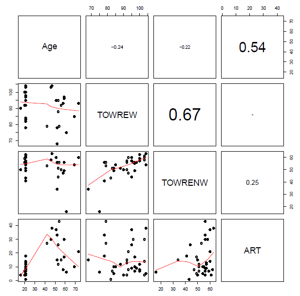
You will see when you run this code that the set of subject attribute predictors (see below) …
… and the set of item attribute predictors (see below) …
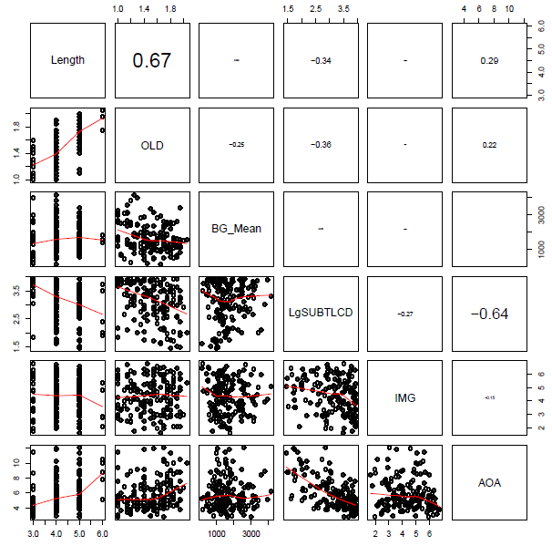
… include some quite strongly overlapping variables, distinguished by high correlation coefficients.
I was advised, when I started doing regression analyses, that a rule-of-thumb one can happily use when examining bivariate i.e. pairwise correlations between predictor variables is that there is no multicollinearity to worry about if there are no coefficients greater than 
If we calculate the condition number for, separately, the subject predictors and the item predictors, we get values of 30+ in each case. Baayen (2008) comments that (if memory serves) a condition number higher than 12 indicates a dangerous level of multicollinearity. However, Cohen et al. (2003) comment that while 12 or so might be a risky kappa there are no strong statistical reasons for setting the thresholds for a ‘good’ or a ‘bad’ condition number; one cannot apply the test thoughtlessly. That said, 30+ does not look good.
The condition number is based around Principal Components Analysis (PCA) and I think it is worth considering the outcome of such an analysis over predictor variables when examining the multicollinearity of those variables. PCA will often show that set of several item attribute predictors will often relate quite strongly to a set of maybe four orthogonal components: something to do with frequency/experience; something relating to age or meaning; something relating to word length and orthographic similarity; and maybe some thing relating to sublexical unit frequency. However, as noted previously, Cohen et al. (2003) provide good arguments for being cautious about performing a principal components regression in response to a state of high collinearity among your predictors, including problems relating to the interpretability of findings.
Data transformations II/II: Center variables on their means
One perhaps partial means to alleviate the collinearity indicated may be to center predictor variables on their means.
Centering variables is helpful, also, for the interpretation of effects where 0 on the raw variables is not meaningful e.g. noone has an age of 0 years, no word has a length of 0 letters. With centered variables, if there is an effect then one can say that for unit increase in the predictor variable (where 0 for the variable is now equal to the mean for the sample, because of centering), there is a change in the outcome, on average, equal to the coefficient estimated for the effect.
Centering variables is helpful, especially, when we are dealing with interactions. Cohen et al. (2003) note that the collinearity between predictors and interaction terms is reduced (this is reduction of nonessential collinearity, due to scaling) if predictors are centered. Note that interactions are represented by the multiplicative product of their component variables. You will often see an interaction represented as “age x word length effects”, the “x” reflects the fact that for the interaction of age by length effects the interaction term is entered in the analysis as the product of the age and length variables. In addition, centering again helps with the interpretation of effects because if an interaction is significant then one must interpret the effect of one variable in the interaction while taking into account the other variable (or variables) involved in the interaction (Cohen et al., 2003; see, also, Gelman & Hill, 2007). As that is the case, if we center our variables and the interaction as well as the main effects are significant, say, in our example, the age, length and age x length effects, then we might look at the age effect and interpret it by reporting that for unit change in age the effect is equal to the coefficient while the effect of length is held constant (i.e. at 0, its mean).
As you would expect, you can center variables in R very easily, we will use one method, which is to employ the scale() function, specifying that we want variables to be centered on their means, and that we want the results of that operation to be added to the dataframe as centered variables. Note that by centering on their means, I mean we take the mean for a variable and subtract it from each value observed for that variable. We could center variables by standardizing them, where we both subtract the mean and divide the variable by its standard deviation (see Gelman & Hill’s 2007, recommendations) but we will look at that another time.
So, I center variables on their means, creating new predictor variables that get added to the dataframe with the following code:
# we might center the variables - looking ahead to the use of interaction terms - as the centering will
# both reduce nonessential collinearity due to scaling (Cohen et al., 2003) and help in the interpretation
# of effects (Cohen et al., 2003; Gelman & Hill, 2007 p .55) ie if an interaction is sig one term will be
# interpreted in terms of the difference due to unit change in the corresponding variable while the other is 0

nomissing.full$cLength <- scale(nomissing.full$Length, center = TRUE, scale = FALSE)
nomissing.full$cBG_Mean <- scale(nomissing.full$BG_Mean, center = TRUE, scale = FALSE)
nomissing.full$cOLD <- scale(nomissing.full$OLD, center = TRUE, scale = FALSE)
nomissing.full$cIMG <- scale(nomissing.full$brookesIMG, center = TRUE, scale = FALSE)
nomissing.full$cAOA <- scale(nomissing.full$AoA_Kup_lem, center = TRUE, scale = FALSE)
nomissing.full$cLgSUBTLCD <- scale(nomissing.full$LgSUBTLCD, center = TRUE, scale = FALSE)

nomissing.full$cAge <- scale(nomissing.full$Age, center = TRUE, scale = FALSE)
nomissing.full$cTOWREW <- scale(nomissing.full$TOWRE_wordacc, center = TRUE, scale = FALSE)
nomissing.full$cTOWRENW <- scale(nomissing.full$TOWRE_nonwordacc, center = TRUE, scale = FALSE)
nomissing.full$cART <- scale(nomissing.full$ART_HRminusFR, center = TRUE, scale = FALSE)

# subset the predictors again by items and person level attributes to make the plotting more sensible

nomissing.full.c.items <- subset(nomissing.full, select = c(

"cLength", "cOLD", "cBG_Mean", "cLgSUBTLCD", "cIMG", "cAOA"

))

nomissing.full.c.subjects <- subset(nomissing.full, select = c(

"cAge", "cTOWREW", "cTOWRENW", "cART"

))

# assess collinearity using the condition number, kappa, metric

collin.fnc(nomissing.full.c.items)$cnumber
collin.fnc(nomissing.full.c.subjects)$cnumber

# > collin.fnc(nomissing.full.c.items)$cnumber
# [1] 3.180112
# > collin.fnc(nomissing.full.c.subjects)$cnumber
# [1] 2.933563
Notice:
— I check the condition numbers for the predictors after centering and it appears that they are significantly reduced.
— I am not sure that that reduction can possibly be the end of the collinearity issue, but I shall take that result and run with it, for now.
— I also think that it would be appropriate to examine collinearity with both the centered variables and the interactions involving those predictors but that, too, can be left for another time.
Write the file out as a csv so that we do not have to repeat ourselves
write.csv(nomissing.full, file = "RTs.norms.subjects nomissing.full 061113.csv", row.names = FALSE)
What have we learnt?
In this post, we learnt about:
— How to inspect the dataframe object using functions like summary() or describe().
— How to plot histograms to examine the distributions of variables.
— How to use grid() to plot multiple variables at once.
— How to output our plots as a pdf for later use.
— How to subset dataframes conditionally.
— How to log transform variables.
— How to create a variable conditionally dependent on values in another variable.
Key vocabulary
working directory
workspace
object
dataframe
NA, missing value
csv
histogram
graphics device
ggplot()
geom_histogram()
geom_density()
facet_wrap()
pdf()
grid()
print()
log10()
ifelse()
Reading
Baayen, R. H. (2008). Analyzing linguistic data. Cambridge University Press.
Belsley, D. A., Kuh, E., & Welsch, R. E. (1980). Regression diagnostics: Identifying influential data and sources of collinearity. New York: Wiley.
Chang, W. (2013). R Graphics Cookbook. Sebastopol, CA: o’Reilly Media.
Cohen, J., Cohen, P., West, S. G., & Aiken, L. S. (2003). Applied multiple regression/correlation analysis for the behavioural sciences (3rd. edition). Mahwah, NJ: Lawrence Erlbaum Associates.
Dalgaard, P. (2008). Introductory statistics with R (2nd. Edition). Springer.
Gelman, A., & Hill, J. (2007). Data analysis using regression and multilevel/hierarchical models. New York,NY: Cambridge University Press.
Wickham, H. (2009). ggplot2: Elegant graphics for data analysis. Springer.
