In a previous post, we used merge() to create a joint database holding a large set of data on the attributes of the 160 words presented in a lexical decision experiment whose completion I supervised a while ago.
I would like to use these variables to examine the reading behaviour – here, visual word recognition measured in lexical decision – of the participant sample examined in a series of previous posts (starting here).
As noted here and here, a concern over the use of word attribute variables is that everything seems to correlate with everything else, which could cause problems for our analyses. So what I would like to do is begin by examining the correlations among the item attribute variables that are available to me.
It might be worth looking at the slides I prepared earlier on correlations, here:
https://speakerdeck.com/robayedavies/r-class-correlations
— the materials in these slides are based on Howell (2002) and Cohen, Cohen, Aiken and West (2003), in particular.
We have seen, previously, how to examine the way in which one particular variable might be related or relate to a set of other variables, when we looked at the subjects data here, and when we previously looked at the items data here.
I won’t repeat that exercise because when we are looking at item attributes we typically wish to know how everything relates to everything else, due to our concern with collinearity.
See Baayen et al. (2006) for an interesting, and illuminating, analysis of the way in which the age-of-acquisition, imageability or subjective rated frequency of a word can be predicted by these and other lexical variables
At this point, what we want to do is simply examine the relationship of all variables with all other variables.
We will focus, here, on the set of 160 words that were presented to participants in ML’s lexical decision study.
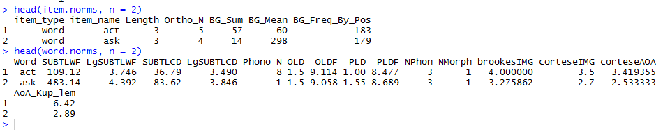
Get the data
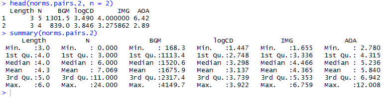
Having previously compiled the item word attributes data to a single new database (downloadable here) from the item.norms and word.norms dataframes, we can just load that to our workspace as follows:
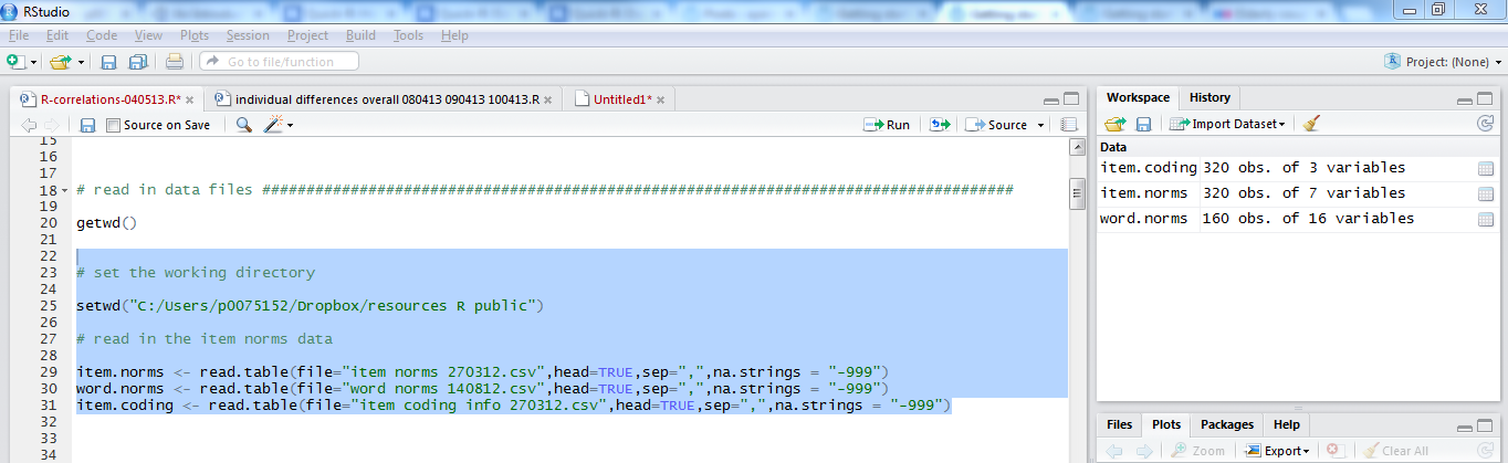
# set the working directory

setwd("C:/Users/p0075152/Dropbox/resources R public")

# read in the item norms data

item.norms <- read.csv(file="item norms 270312 050513.csv", head=TRUE,sep=",", na.strings = "-999")
word.norms <- read.csv(file="word norms 140812.csv", head=TRUE,sep=",", na.strings = "-999")
item.coding <- read.csv(file="item coding info 270312.csv", head=TRUE,sep=",", na.strings = "-999")
# read in the merged new dataframe
item.words.norms <- read.csv(file="item.words.norms 050513.csv", head=TRUE,sep=",", na.strings = "NA")
Notice:
— In the read.csv() function call for inputting the item.words.norms dataframe, I switched the na.strings = argument to na.strings = “NA”.
— If I had not done this, R would treat the Cortese imageability and AOA variables as factors because those columns include both numbers and strings; the NA strings were written in the item.words.norms .csv output due to missing values on these attributes for some items. (These data were collected and made available by Cortese and colleagues, see, for reports on how the ratings were collected: Cortese & Fuggett, 2004; Cortese & Khanna, 2008) .
— The presence of “NA” character strings in the imageability or AOA columns ensures that these variables get treated as factors. You will recall that vectors are allowed to have data of one type only: R sees the NAs and classes the vectors as of type factor.
Visualizing the relationships between many variables simultaneously
What I would like to do next is to create what is called a scatterplot matrix, see here and here for some online resources. Winston Chang’s (2013) R Graphics Cookbook has nice tips also.
A scatterplot matrix is a useful way to visualize the relationships between all possible pairs of variables in a set of predictors. In my experience, it does not work very well for large (n > 5) sets of variables but has a nice impact when it does work well.
Define a scatterplot matrix function
I like the plots produced by a function shared by William Revelle here:
http://www.personality-project.org/r/r.graphics.html
You have to start by defining a function to draw the plot:
#code taken from part of a short guide to R
#Version of November 26, 2004
#William Revelle
# see: http://www.personality-project.org/r/r.graphics.html

panel.cor <- function(x, y, digits=2, prefix="", cex.cor)
{
 usr <- par("usr"); on.exit(par(usr))
 par(usr = c(0, 1, 0, 1))
 r = (cor(x, y))
 txt <- format(c(r, 0.123456789), digits=digits)[1]
 txt <- paste(prefix, txt, sep="")
 if(missing(cex.cor)) cex <- 0.8/strwidth(txt)
 text(0.5, 0.5, txt, cex = cex * abs(r))
}
Subset the variables for plotting
You then need to create a subset of the variables from your dataframe. You don’t want to include factors (at least for this plot), and we do not want to try to create a matrix with too many plots in it. We can use the knowledge about subsetting developed in a previous post to do the subsetting as follows.
norms.pairs <- subset(item.words.norms, select = c(

 "Length", "Ortho_N", "BG_Mean", "LgSUBTLCD", "brookesIMG", "AoA_Kup_lem"

 ))
Notice:
— Variable names are given in a vector c() call, with names in “”.
— I am separating out the lines on which the parts of the function call appear for, to me, improved readability: first line gives the main bits; second line gives the arguments; last line wraps it up with the matching parentheses.
Rename the variables for readability
I am going to need to have the names a bit more concise, to improve readability in the scatterplot matrix. So I will use the rename() function demonstrated previously.
norms.pairs.2 <- rename(norms.pairs, c(

 Ortho_N = "N", BG_Mean = "BGM", LgSUBTLCD = "logCD", brookesIMG = "IMG", AoA_Kup_lem = "AOA"

))
All of which will deliver a dataframe that we can feed into the scatterplot matrix function:

Notice:
— In renaming the pairs dataframe variables, I created a new dataframe and appended the .2 for me this is just good housekeeping: it helps to ensure I am not overwriting stuff I might want at a later time i.e. original versions of data.
Feed the pairs dataframe into the pairs plot or scatterplot matrix function
Now we can just run the function to get the scatterplot matrix as:
pdf("ML-item-norms-words-pairs-050513.pdf", width = 8, height = 8)

pairs(norms.pairs.2, lower.panel=panel.smooth, upper.panel=panel.cor)

dev.off()
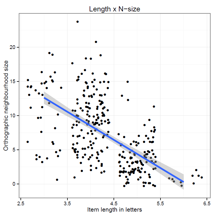
which gives you this:
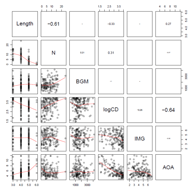
Notice:
— The printout size of the correlation coefficient is scaled by its value.
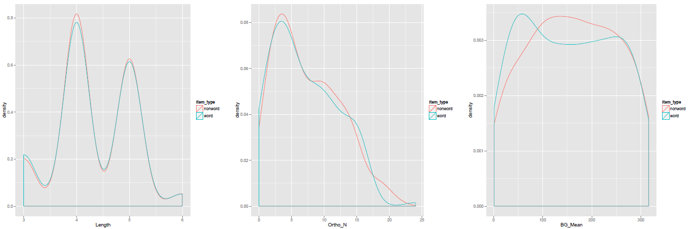
— We can see the correlations between Length and neighbourhood (N) and between frequency (logCD) and age-of-acquisition (AOA) illustrated both in terms of the Pearson’s correlation coefficients, r, in the upper panels, and visually as a scatterplot with a LOESS smoother in the lower panels.
— Note the scatterplot corresponding to the correlation coefficient is the one opposite it in the grid.
Correlation table
Conventionally, while scatterplot matrices are nice (the combination of information is enlightening), reports in journals include tables of correlations.
Again, a kind R-user (named myowelt) provided the code I need to produce a table, and posted it here.
Note that you will need to have the Hmisc or rms packages installed, and the corresponding libraries loaded, to get this function to work.
You can copy and paste this into the R script window, then run the code to define the function we will use to then generate a table of correlation coefficients (Pearson’s r) with stars to indicate significance and everything.
corstarsl <- function(x){
 require(Hmisc)
 x <- as.matrix(x)
 R <- rcorr(x)$r
 p <- rcorr(x)$P

 ## define notions for significance levels; spacing is important.
 mystars <- ifelse(p < .001, "***", ifelse(p < .01, "** ", ifelse(p < .05, "* ", " ")))

 ## trunctuate the matrix that holds the correlations to two decimal
 R <- format(round(cbind(rep(-1.11, ncol(x)), R), 2))[,-1]

 ## build a new matrix that includes the correlations with their apropriate stars
 Rnew <- matrix(paste(R, mystars, sep=""), ncol=ncol(x))
 diag(Rnew) <- paste(diag(R), " ", sep="")
 rownames(Rnew) <- colnames(x)
 colnames(Rnew) <- paste(colnames(x), "", sep="")

 ## remove upper triangle
 Rnew <- as.matrix(Rnew)
 Rnew[upper.tri(Rnew, diag = TRUE)] <- ""
 Rnew <- as.data.frame(Rnew)

 ## remove last column and return the matrix (which is now a data frame)
 Rnew <- cbind(Rnew[1:length(Rnew)-1])
 return(Rnew)
}
Notice:
— myowelt points out that you can use the xtables package to generate latex tables for a latex report.
— He also points out that much of the code was adapted from a nabble thread (follow the link above to go to the source then).
Having defined the correlations table function, we just feed the normative dataframe into it to get the result we want:
corstarsl(norms.pairs.2)
which delivers this:
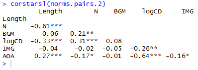
If you’re not writing in latex then you can paste this into a .txt file in notepad or something, open that in excel, format it for APA style, copy and paste the result into a word as a bitmap.
Cluster analysis diagrams
Correlation tables and scatterplot matrices are not the only way to examine the correlation structure of a set of variables.
In reading Baayen (2008; see, also, Baayen, Feldman, & Schreuder, 2006), I found that we can also examine a set of predictors in terms of clusters of variables.
Baayen (2008) notes that the Design package provides a function for visualizing clusters of variables, varclus(). I think that if you have rms package installed and the library loaded then that will bring the Design function package functions with it.
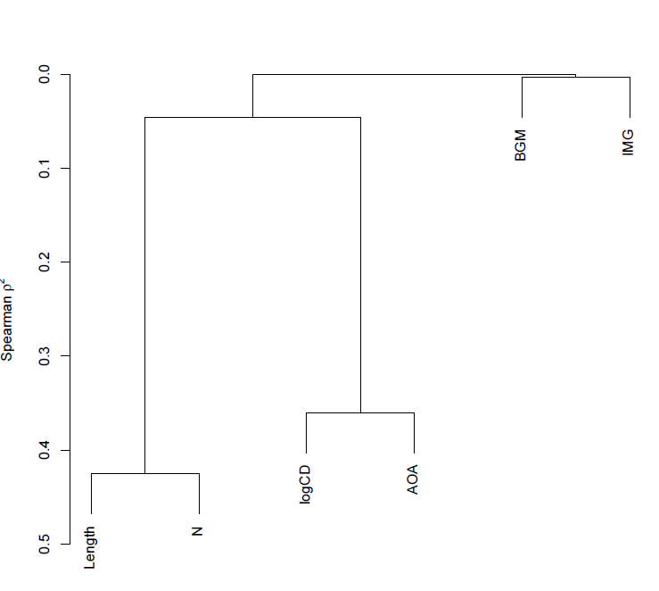
Paraphrasing Baayen (2008; p. 182-183): The varclus() function performs a hierarchical cluster analysis, using the square of Spearman’s rank correlation (a non-parametric correlation) as a similarity metric to obtain a more robust insight into the correlation structure of a set of variables.
We can run the function call very easily, as:
pdf("ML-item-norms-words-varclus-050513.pdf", width = 8, height = 8)

plot(varclus(as.matrix(norms.pairs.2)))

dev.off()
which gets you this:

Notice:
— The y-axis corresponds to Spearman’s rho squared – the similarity measure.
— We know, given the foregoing, that length and neighbourhood are very similar to each but not very similar to anything else, likewise, logCD frequency and AoA are very similar to each other but not similar to anything else.
— Imageability and bigram frequency are not much related to anything.
— The diagram reflects these observations faithfully.
— The higher in the tree, the less similar you are – that is how I would interpret the relative placing of the splits i.e. the points at which the tree branches.
Note:
1. Hierarchical cluster analysis is a family of techniques for clustering data and displaying that clustering in a tree diagram.
2. These techniques take a distance object as input.
3. There are many different ways to form clusters.
I think that what we talking about here is: First, get a table of correlations. Use Spearman’s for robust estimation of correlations (robust to, say, the possibility that variables are not normally distributed). We can take the correlation between two variables as a measure of the distance between them i.e. similarity. As correlations can be negative or positive and we want distances to run in one direction only, we square the correlations. Convert the correlation matrix into a distance object (I am reading Baayen, 2008; p. 140, and I am not sure what that involves). One can then examine clustering by a number of different methods. One, divisive clustering, starts with all data points in a cluster then successively partitions clusters into smaller clusters. Another, agglomerative clustering, implemented in the hclust() function which, I think, is the basis for varclus(), begins with single data points which are then stuck together into successively larger groups.
What we are looking at, when we look at a tree diagram showing a clustering analysis, then, is a set of variables split by their relative similarity.
This is definitely a placeholder for further research.
What I would like to find out is whether we can use techniques like this to sort participants into clusters according to their scores in the various measures of individual differences that we use.
Diagnosing when the correlation of variables is a problem – collinearity and the condition number
As noted previously, we are considering the relationships between variables because we are concerned with the problems associated with high levels of intercorrelation.
I would read both Baayen (2008) and Cohen, Cohen, Aiken, & West (2003) on multicollinearity (see also Belsley et al., 1980), for a start.
Cohen et al. (2003) describe a set of problems, grouped under the term multicollinearity, that arise from high levels of correlation between predictors. In regression analysis, we assume that each predictor can potentially add to the prediction of the outcome or dependent variable. As one of the predictors (or independent variables) becomes increasingly correlated with the other predictors, it will have increasingly less unique information that can contribute to the prediction of the outcome variable. This cause a variety of problems when the correlation of one predictor with the others becomes very high:
1. The regression coefficients – the estimates of effects of the variables – can change in direction and in size i.e. in sign and magnitude, making them difficult to interpret. We are talking, here, about inconsistency or instability of effects estimates between analyses (maybe with differing predictor sets) and studies, I think.
2. As predictors become increasingly correlated, the estimate of individual regression coefficients becomes increasingly unreliable. Small changes in the data, adding or deleting a few observations, can result in large changes in the results of regression analyses.
To understand the problem, look back at the scatterplots we have drawn and consider the relationships between the variables that we have shown. To take a (to me) classic example (see e.g. Zevin & Seidenberg, 2002), if we examine the effect of frequency or of AoA on reading behaviour, given the strong relationship between these variables, which is the variable that ‘truly’ is affecting reading? In terms of regression analysis, if you have both frequency and AoA as predictors, given their overlap, the shared information, how will you be able to distinguish the contribution of one or the other? What will it take for AoA or frequency or both to be observed to effect behaviour?
Cohen et al. (2003) note that in cross-sectional research, serious multicollinearity most commonly occurs when multiple measures of the same or similar constructs are used as the predictors in a regression; in my work, consider measures of word and nonword reading ability, or measures of word frequency and word AoA. In longitudinal research, serious multicollinearity often occurs when similar measures collected at previous time points are used to predict participant performance at some later time point.
If this makes you think that multicollinearity is going to be a problem for you all the time, I think that that would be correct – except where you can orthogonalize predictors through the manipulation of conditions.
How can we diagnose multicollinearity?
Again, repeating Cohen et al. (2003; pp. 419 -) [the following is mostly copied, with some paraphrase, and plenty of elision, as a placeholder for a thought-through explanation]:
The Variance Inflation Factor (VIF) provides an index of the amount that variance of each regression coefficient is increased compared to a situation in which all predictors are uncorrelated.
…
The condition number, kappa, is defined in terms of the decomposition of a correlation matrix into orthogonal i.e. uncorrelated components. The correlation matrix of predictors can be decomposed into a set of orthogonal dimensions (i.e. Principal Components Analysis). When this analysis is performed on the correlation matrix of k predictors, a set of k eigenvalues or characteristic roots of the matrix is produced. The proportion of the variance in the predictors accounted for by each orthogonal dimension is lambda divided by k, where lambda is the eigenvalue. As the predictors become increasingly correlated, increasingly more of the variance in the predictors is associated with one dimension, and the value of the largest eigenvalue is correspondingly greater than the value of the smallest. At the maximum, all the variance in the predictors is accounted for by one dimension. The condition number is defined as the square root of the ratio of the largest eigenvalue compared to the smallest eigenvalue.
Baayen’s languageR package furnishes the collin.fnc() function for calculating the condition number for a set of predictors:
collin.fnc(norms.pairs.2)$cnumber
The result returned is 44.8 or so, which indicates a level of collinearity greater than that set as risky e.g. by Baayen (2008).
Cohen et al. (2003) comment that condition numbers greater than 30 are taken to reflect risky levels of multicollinearity but that there is no strong statistical rationale for such a threshold.
They advise that multicollinearity indices are no substitute for basic checks: outliers may affect multicollinearity; we should compare results of analyses with and without collinear predictors and examine changes in direction or size of observed effects; and we should take into account situations where multicollinearity may occur due to scaling – use of dummy coding variables – and therefore might not be so problematic.
It would be tempting to calculate the condition number, and address values of kappa through one or more remedies, but that, in sum, will not suffice.
Cohen et al. (2003) note that there are four potential solutions to multicollinearity, which we shall examine in later posts:
— We could combine variables e.g. through averaging across a set of predictors that all reflect some underlying construct.
— We could delete variables, though the choice for deletion will be worrisome.
— We could collect more data.
— Ridge regression where a constant is added to the variance of each predictor.
— Principal components regression, a method I have myself used (see e.g. Baayen et al., 2006; see Baayen, 2008, for a how-to guide), where Principal Components Analysis is used to derive a set of orthogonal i.e. uncorrelated dimensions or components from a set of collinear predictors. Cohen et al. (2003) note that these components are only rarely interpretable. Regression on principal components is limited to regression equations that are linear in the variables – no interactions or polynomial terms (Cohen et al., 2003, cite Cronbach, 1987) – though Baayen et al. (2006) report a regression involving principal components and including nonlinear terms.
I suspect, also, that Principal Components regression will work for some studies with large stimulus sets but will be biased for studies with smallish (n < 1000) stimulus sets.
I note, also, that Baayen et al. (2006) use Principal Components regression but also examine regressions where they use residualized predictors. Here, if you can predict one variable from the others (i.e. for a set of collinear predictors), you first perform a regression and get the residuals – that part of the predictor’s variance that is not predicted by the other predictors i.e. is orthogonal to them, you then use such residualized predictors in your analysis.
Do not imagine that your problems would be solved by splitting your items into selected item sets according to some factorial design, in which you get variation in one dimension e.g. frequency while controlling for variation in all other attributes. Balota et al. (2004) lay out very clearly how factorial (stimulus selection) designs in psycholinguistics experiments can be associated with a constellation of problems. Cohen (1983) explains very clearly the cost in loss of statistical sensitivity of dichotomizing continuous variables (if there’s an effect, you might be reducing your chances of observing it to something like a coin flip). Better, I think, to run a regression style study and take the multicollinearity on the chin: diagnose, check, treat, analyse, check.
Note, finally, that Cohen et al. (2003) distinguish essential from nonessential from essential multicollinearity (after Marquardt, 1980, cited in Cohen et al., 2003), a distinction relevant especially to analyses involving polynomial and interaction terms. Nonessential collinearity, due to scaling, can be removed through centering predictors, and we shall look at this again.
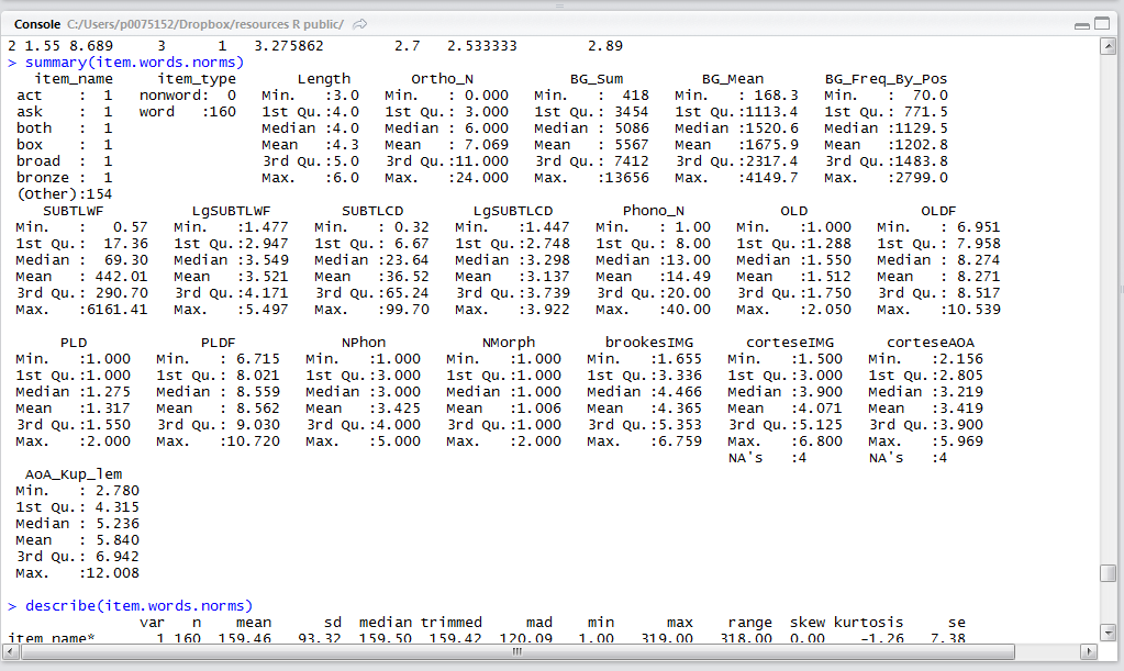
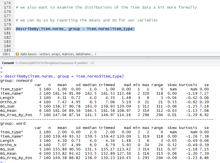
What have we learnt?
(The code for these analyses can be found here.)
We have learnt how to examine the correlations between all pairs among a set of variables.
Using the scatterplot matrix, the correlation table, and the variance clustering tree diagram to show the correlations.
Using the condition number to make a diagnosis of collinearity.
We have discussed what multicollinearity means, how to diagnose it, and some potential means to remedy it.
Key vocabulary
correlation
multicollinearity
clustering
Principal Components Analysis
regression
ridge regression
Principal Components regression
scatterplot matrix
condition number, kappa
varclus()
collin.fnc()
corstarsl()
Reading
Baayen, R. H. (2008). Analyzing linguistic data. Cambridge University Press.
Baayen, R. H., Feldman, L. B., & Schreuder, R. (2006). Morphological influences on the recognition of monosyllabic monomorphemic words. Journal of Memory and Language, 55, 290-313.
Balota, D., Cortese, M. J., Sergent-Marshall, S. D., Spieler, D., & Yap, M. (2004). Visual word recognition of single-syllable words. Journal of Experimental Psychology: General, 133, 283-316.
Belsley, D. A., Kuh, E., & Welsch, R. E. (1980). Regression diagnostics: Identifying influential data and sources of collinearity. New York: Wiley.
Chang, W. (2013). R Graphics Cookbook. Sebastopol, CA: o’Reilly Media.
Cohen, J. (1983). The cost of dichotomization. Applied Psychological Measurement, 7, 249-253.
Cohen, J., Cohen, P., West, S. G., & Aiken, L. S. (2003). Applied multiple regression/correlation analysis for the behavioural sciences (3rd. edition). Mahwah, NJ: Lawrence Erlbaum Associates.
Cortese, M.J., & Fugett, A. (2004). Imageability Ratings for 3,000 Monosyllabic Words. Behavior Methods and Research, Instrumentation, & Computers, 36, 384-387.
Cortese, M.J., & Khanna, M.M. (2008). Age of Acquisition Ratings for 3,000 Monosyllabic Words. Behavior Research Methods, 40, 791-794.
Howell, D. C. (2002). Statistical methods for psychology (5th. Edition). Pacific Grove, CA: Duxbury.
Zevin, J. D., & Seidenberg, M. S. (2002). Age of acquisition effects in word reading and other tasks. Journal of Memory and Language, 47, 1-29.