This post assumes that you have installed and are able to load the ggplot2 package, that you have been able to download the ML subject scores database and can read it in to have it available as a dataframe in the workspace, and that you have already tried out some plotting using ggplot2.
Here we are going to work on: 1. examining the relationship between pairs of variables using scatterplots 2. modifying the appearance of the scatterplots for presentation.
While doing these things – mostly achieving the presentation of relationships between variables – we should also consider what statistical insights the plots teach us.
1. Variation in the values of subject scores
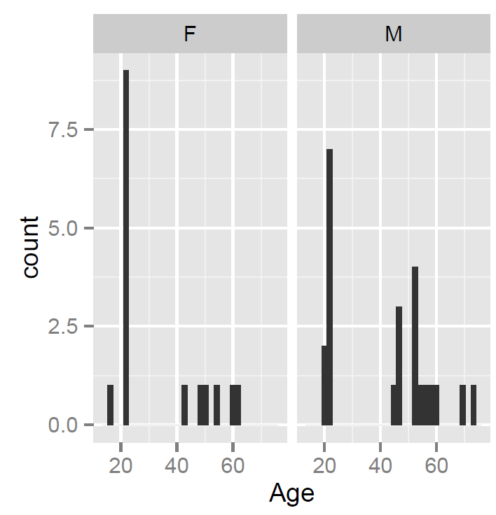
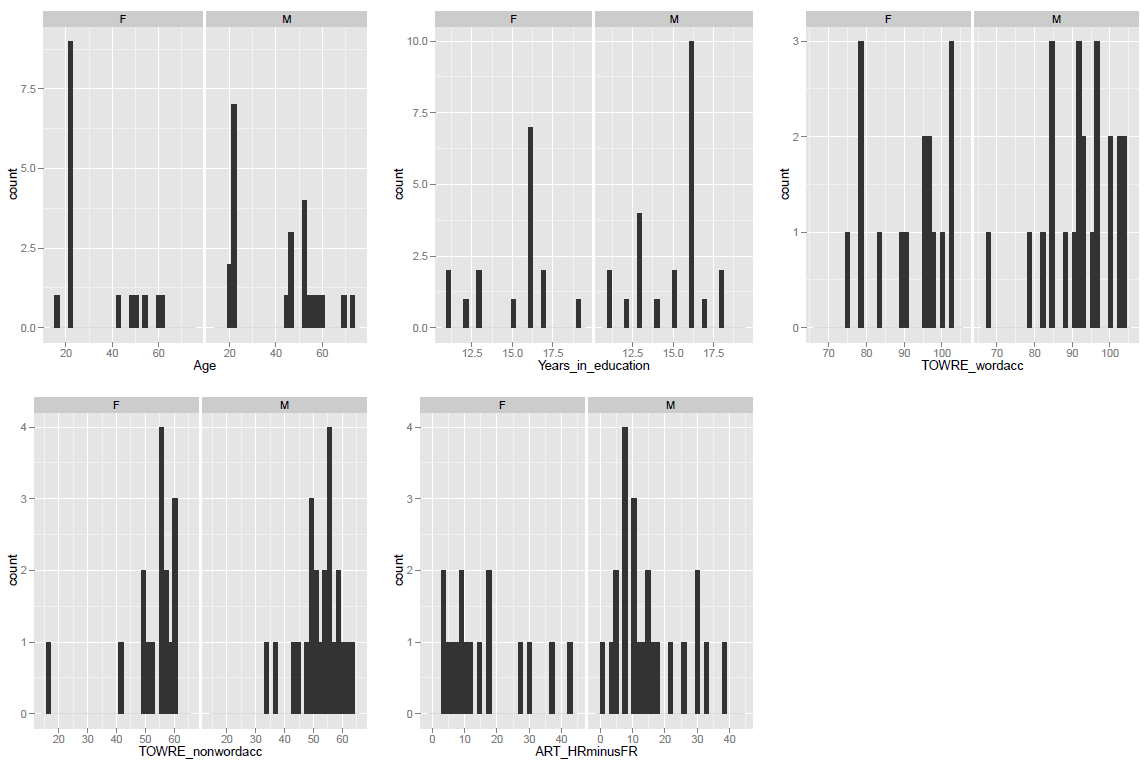
We know that the participants tested in the ML study of reading varied on measures of gender, age, reading skill (we used the TOWRE test of ability, Torgesen, Wagner & Rashotte, 1999) and print exposure, a proxy for reading history (measured using the ART, Masterson & Hayes, 2007; Stanovich & West, 1989). What does the observation that participants varied mean?
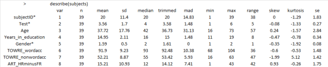
In previous posts, we have seen how to use R to get a sense of the average for and spread of values on these measures for our sample, and we have seen how to show the distribution of values using histograms:
— using the function call: describe(subjects) to get the mean and standard deviation etc.
— using the ggplot code discussed previously to get some histograms

What these numbers and these histograms show us is that participants in the sample varied broadly (from 20 years to 60+ years) in age, though most of the middle-aged people in the sample were male, also that measures of reading ability – TOWRE word and non-word naming accuracy – tended to vary around the top end of the range. Most people tested got at least three quarters of the items in each test correct, most of them did much better then that.
2. How do the variables relate to each other?
Let’s suppose that we are concerned about the relationship between two variables. How is variation in the values of one variable associated with change (or not) in the values of the other variable?
I might expect to see that the ability to read aloud words correctly actually increases as: 1. people get older – increased word naming accuracy with increased age; 2. people read more – increased word naming accuracy with increased reading history (ART score); 3. people show increased ability to read aloud made-up words (pseudowords) or nonwords – increased word naming accuracy with increased nonword naming accuracy.
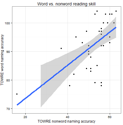
We can examine these relationships and, in this post, we will work on doing so through using scatter plots like that shown below.

What does the scatterplot tell us, and how can it be made?
Notice:
— if people are more accurate on nonword reading they are also often more accurate on word reading
— at least one person is very bad on nonword reading but OK on word reading
— most of the data we have for this group of ostensibly typically developing readers is up in the good nonword readers and good word readers zone.
I imposed a line of best fit indicating the relationship between nonword and word reading estimated using linear regression, the line in blue, as well as a shaded band to show uncertainty – confidence interval – over the relationship. You can see that the uncertainty increases as we go towards low accuracy scores on either measure. We will return to these key concepts, in other posts.
For now, we will stick to showing the relationships between all the variables in our sample, modifying plots over a series of steps as follows:
[In what follows, I will be using the ggplot2 documentation that can be found online, and working my way through some of the options discussed in Winston Chang’s book: R Graphics Cookbook which I just bought.]
Draw a scatterplot using default options
Let’s draw a scatterplot using geom_point(). Run the following line of code
ggplot(subjects, aes(x = Age, y = TOWRE_wordacc)) + geom_point()
and you should see this in R-studio Plots window:

Notice:
— There might be no relationship between age and reading ability: how does ability vary with age here?
— Maybe the few older people, in their 60s, pull the relationship towards the negative i.e. as people get older abilities decrease.
Distinguish groups by colour
Maybe I’m curious if gender has a role here. Is the potential age effect actually a gender effect? Get the scatterplot to show males and females observations in different colours using the following line of code:
ggplot(subjects, aes(x = Age, y = TOWRE_wordacc, colour = Gender)) + geom_point()
— All I did was to add …colour = Gender … to the specification of what data variables must be mapped to what aesthetic features: x position for a point is mapped to age; y position to reading ability; and now colour of point is mapped to gender, to give us:

Notice:
— Males and females in the sample are now distinguished by colour.
— I do not see that the relationship between age and ability is modified systematically by the gender of the person.
— Maybe there is a different important variable: I would expect people who read more (and so have higher scores on the print exposure measure, the ART) to be better readers.
Distinguish variation in a continuous third variable by size
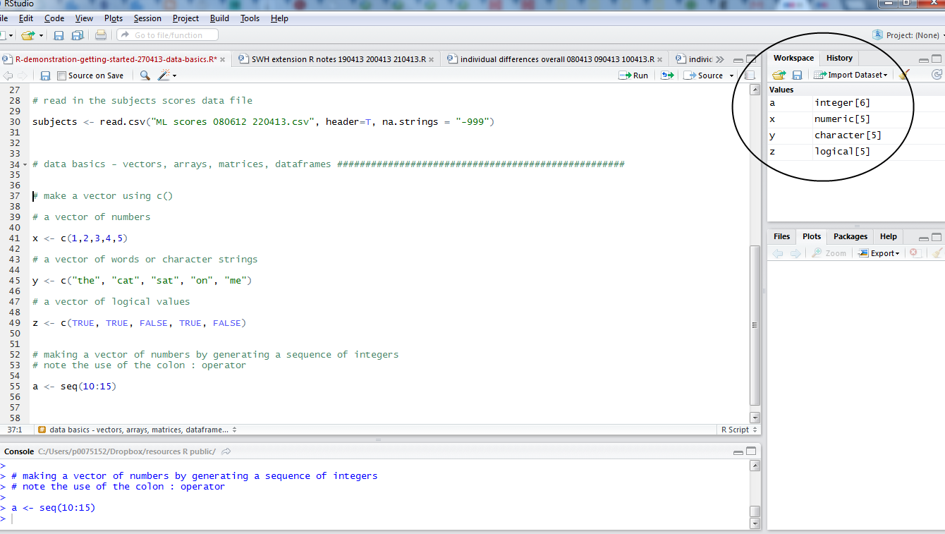
Group is a factor with two levels, male (coded as M in the dataframe) and female (F).
[See any introductory R or statistics book, e.g. Kabacoff’s “R in Action”, on which I draw to explain the following.]
Nominal variables are categorical (one thing or the other), e.g. gender. Ordinal variables are also categorical but imply order, e.g. agreement (disagree, agree, agree very much), though you cannot say that they imply amount because e.g. I cannot say if agree very much is twice the agree as disagree, patently that would be nonsense, but I can say that more agreement is there. Continuous variables can take any value between some range and imply order and amount. We can distinguish gender as a factor and word naming accuracy or age as continuous variables.
I am not sure how helpful it would be to vary colour of points by e.g. reading experience but we can do it:
ggplot(subjects, aes(x = Age, y = TOWRE_wordacc, colour =
ART_HRminusFR)) + geom_point()
— and while the plot looks nice, really, can you use the information added meaningfully?

Notice:
— Higher ART scores are lighter and mostly appear in the older participants, not all of whom are among the better readers.
What about modifying point size in association with print exposure ART score?
Try this:
ggplot(subjects, aes(x = Age, y = TOWRE_wordacc, size =
ART_HRminusFR)) + geom_point()

Notice:
— It is clearer – hence, more useful – who’s scored higher on the print exposure measure.
N.B. I think there are data on how people perceive variation in colour vs. other dimensions and on the associated utility of varying such dimensions for data visualization (maybe work based on Cleveland’s experiments) and I will look them up some time.
— I get the feeling that print exposure is not going to help explain how reading ability varies for this sample.
Feelings are nice but let’s examine statistical relationships
I am going to start getting serious about this dataset. I want to look at all the relationships between word naming accuracy, reading ability, and all the other measures I have available, printing a grid of plots, as done previously. I am then going to impose an indication of the predicted relationship, given the data, between reading ability and the other variables.
First, the lattice of plots. We can combine our scatterplot code with the grid plotting code we used in an earlier post.
# produce a lattice of plots showing the relationship between word reading accuracy and the # other variables in this sample
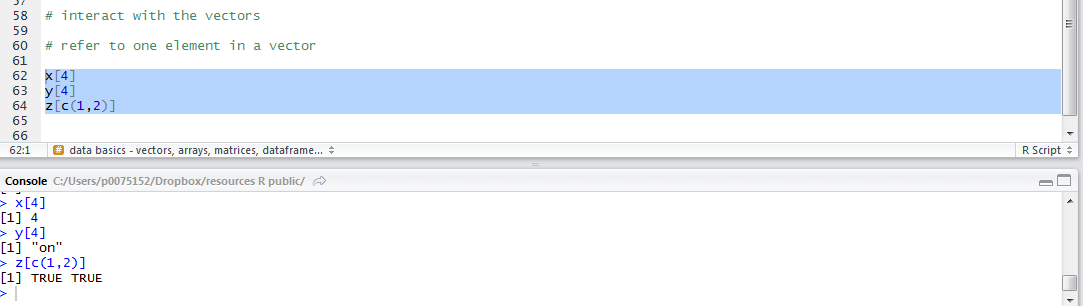
# make plots
page <- ggplot(subjects, aes(x = Age, y = TOWRE_wordacc))
page <- page + geom_point()
page
pNW <- ggplot(subjects, aes(x = TOWRE_nonwordacc, y = TOWRE_wordacc))
pNW <- pNW + geom_point()
pNW
pART <- ggplot(subjects, aes(x = ART_HRminusFR, y = TOWRE_wordacc))
pART <- pART + geom_point()
pART
# print to pdf
pdf("ML-data-subjects-scatters-230413.pdf", width = 12, height = 4)
grid.newpage()
pushViewport(viewport(layout = grid.layout(1,3)))
vplayout <- function(x,y)
viewport(layout.pos.row = x, layout.pos.col = y)
print(page, vp = vplayout(1,1))
print(pNW, vp = vplayout(1,2))
print(pART, vp = vplayout(1,3))
dev.off()
Notice:
— I am using # to comment on my code as I write it. R will ignore a line of text following the # (not a sentence, a line) e.g if you write: dothis() # a function that does this, R will execute dothis() and ignore “a function that does this”.
That code produces a pdf of the lattice of plots:

Notice:
— The age variable is really split between a bunch of 20s and a bunch of 40+s, the latter more widely spread than the former.
— I can see a relationship between word and nonword reading ability, which makes sense, but nothing else here.
Let’s see what relationship is indicated by a fitted regression model’s predictions for each pair of variables.
Modifying the code by : 1. adding the specification of a smoother using stat_smooth(), with 2. the addition of an argument to that function call asking for the smoother to be drawn using a linear model method.
Think of the smoother as a line showing the prediction of what the values on the y-axis variable – here, word naming ability – would be given the variation observed in the values of the x-axis variable – here, age, nonword naming ability, and print exposure. In these plots, each x-y relationship is considered separately, and we are assuming that the relationships are monotonic. We will get back to what these things mean later. Take a conceptual shortcut, we are asking: is reading ability predicted by age, nonword naming or reading history? We are examining: is that relationship of a kind where a unit increase in the x-axis variable is associated with a change in the values of the y-axis variable where the rate of the change is the same for all values of x?
For now, we focus on the plotting, and the code for adding lines indicating the relationship between word naming and age, nonword naming and print exposure is as follows:
# make plots

page <- ggplot(subjects, aes(x = Age, y = TOWRE_wordacc)) + geom_point() + stat_smooth(method=lm)

pNW <- ggplot(subjects, aes(x = TOWRE_nonwordacc, y = TOWRE_wordacc)) + geom_point() + stat_smooth(method=lm)

pART <- ggplot(subjects, aes(x = ART_HRminusFR, y = TOWRE_wordacc)) + geom_point() + stat_smooth(method=lm)

# print to pdf, opening device

pdf("ML-data-subjects-scatters-smoothers-230413.pdf", width = 12, height = 4)

# make grid

grid.newpage()

pushViewport(viewport(layout = grid.layout(1,3)))

vplayout <- function(x,y)
 viewport(layout.pos.row = x, layout.pos.col = y)

# print preprepared plots to grid

print(page, vp = vplayout(1,1))
print(pNW, vp = vplayout(1,2))
print(pART, vp = vplayout(1,3))

# turn device off

dev.off()
Which gets you this:

Notice:
— As guessed earlier, increases in ART print exposure score are equally likely to be associated with an increase or a decrease in the word reading accuracy of participants – changes in print exposure do not predict or explain changes in reading ability.
— In contrast, people who score higher on the nonword reading test also score higher on the word reading test – variation in nonword naming ability do predict values in nonword naming ability.
— In between, I suspect that differences in age do not predict differences in word reading ability, if we were to take out the odd-looking older less able readers in the sample; but we will look at how we do that another time.
Statistics are nice but let’s polish the plots for presentation
You are starting to see the grey background of ggplot2 plots all over the media now, as more data-analysis-savvy organizations start to incorporate R into their work. However, let’s imagine that we wanted to report the plots in a paper and that we cannot ask people to print and copy plots with grey backgrounds. Imagine also that we wanted to change the titles and labelling of the plots to something more self-explanatory.
We can set the title of the graph using the ggtitle() function.
I want the range of the y-axis to be the same for all the plots – it will make them easier to compare – and I will use a scale function to do that.
I also think we could do with making the axis labels more meaningful, and I will use label functions to do that.
Lastly, we want to change the background to white from grey using the theme_bw() function.
First, I will illustrate these changes with one plot, in the following lines of code.
pNW <- ggplot(subjects,aes(x=TOWRE_nonwordacc, y=TOWRE_wordacc))
pNW <- pNW + geom_point() + ggtitle("Word vs. nonword reading
skill")
pNW <- pNW + xlab("TOWRE nonword naming accuracy") + ylab("TOWRE
word naming accuracy")
pNW <- pNW + ylim(70, 104)
pNW <- pNW + scale_x_continuous(breaks = c(20, 40, 60))
pNW <- pNW + theme(axis.title.x = element_text(size=25),
axis.text.x = element_text(size=20))
pNW <- pNW + theme(axis.title.y = element_text(size=25),
axis.text.y = element_text(size=20))
pNW <- pNW + geom_smooth(method="lm", size = 1.5)
pNW <- pNW + theme_bw()
pNW
Notice:
— I am adding each change, one at a time, making for more lines of code; but I could and will be more succinct.
— I first add the scatterplot points then the title with: + geom_point() + ggtitle(“Word vs. nonword reading skill”)
— I then change the axis labels with: + xlab(“TOWRE nonword naming accuracy”) + ylab(“TOWRE word naming accuracy”)
— I fix the y-axis limits with: + ylim(70, 104)
— I change where the tick marks on the x-axis are with: + scale_x_continuous(breaks = c(20, 40, 60)) — there were too many before
— I modify the size of the axis labels for better readability with: + theme(axis.title.x = element_text(size=25), axis.text.x = element_text(size=20))
— I add a smoother i.e. a line showing a linear model prediction of y-axis values for the x-axis variable values with: + geom_smooth(method=”lm”, size = 1.5) — and I ask for the size to be increased for better readability
— And then I ask for the plot to have a white background with: + theme_bw()
All that gets you this:
Next, we will redo the grid of plots, this time modified to improve readability, and also code concision, as follows.
# edited appearance - all plots in a word naming vs other variables grid of plots

# first create the plots

pNW <- ggplot(subjects,aes(x=TOWRE_nonwordacc, y=TOWRE_wordacc))
pNW <- pNW + geom_point() + ggtitle("Word vs. nonword reading
 skill")
pNW <- pNW + scale_y_continuous(name = "TOWRE word naming
 accuracy", limits = c(70, 104))
pNW <- pNW + scale_x_continuous(name = "TOWRE nonword naming
 accuracy", breaks = c(20, 40, 60))
pNW <- pNW + theme(axis.title.x = element_text(size=25),
 axis.text.x = element_text(size=20))
pNW <- pNW + theme(axis.title.y = element_text(size=25),
 axis.text.y = element_text(size=20))
pNW <- pNW + geom_smooth(method="lm", size = 1.5)
pNW <- pNW + theme_bw()


page <- ggplot(subjects,aes(x=Age, y=TOWRE_wordacc))
page <- page + geom_point() + ggtitle("Word reading vs. age")
page <- page + scale_y_continuous(name = "TOWRE word naming
 accuracy", limits = c(70, 104))
page <- page + scale_x_continuous(name = "Age (years)")
page <- page + theme(axis.title.x = element_text(size=25),
 axis.text.x = element_text(size=20))
page <- page + theme(axis.title.y = element_text(size=25),
 axis.text.y = element_text(size=20))
page <- page + geom_smooth(method="lm", size = 1.5)
page <- page + theme_bw()


pART <- ggplot(subjects,aes(x=ART_HRminusFR, y=TOWRE_wordacc))
pART <- pART + geom_point() + ggtitle("Word reading skill vs.
 print exposure")
pART <- pART + scale_y_continuous(name = "TOWRE word naming
 accuracy", limits = c(70, 104))
pART <- pART + scale_x_continuous(name = "ART score")
pART <- pART + theme(axis.title.x = element_text(size=25),
 axis.text.x = element_text(size=20))
pART <- pART + theme(axis.title.y = element_text(size=25),
 axis.text.y = element_text(size=20))
pART <- pART + geom_smooth(method="lm", size = 1.5)
pART <- pART + theme_bw()

# print to pdf

# open pdf device, naming file to be output

pdf("ML-data-subjects-scatters-smoothers-edited-230413.pdf", width = 12, height = 4)

# create grid

grid.newpage()

pushViewport(viewport(layout = grid.layout(1,3)))

vplayout <- function(x,y)
 viewport(layout.pos.row = x, layout.pos.col = y)

# orubt device to grid

print(page, vp = vplayout(1,1))
print(pNW, vp = vplayout(1,2))
print(pART, vp = vplayout(1,3))

# close device

dev.off()
All of which will get you this nice-looking and informative grid of plots:

Notice:
— There are many more things we could do in these plots, including:
1. Using different methods to generate the smoother, e.g. loess.
2. Add a line showing not the prediction of y-axis word naming on x-axis variable (age, nonword naming, ART) i.e. the bivariate relationship but the prediction of word naming on all variables considered together i.e. the multiple regression model predictions, using the function predict().
3. Add annotations to the plot e.g. variance explained by the model whose predictions we show, the R-squared.
4. Add vertical and horizontal lines that indicate the mean value for x-axis or y-axis variables.
5. Add marginal rugs to show the 1-D distribution of each variable.
6. Labelling specific points, sets of points, or all points.
What have we learnt?
The code used to generate the plots, and given as examples here, can be downloaded from here.
We have examined the distribution of single variables and learnt about variation in values.
We have then combined data from pairs of variables to examine, visually, the relationship between differences in the values of one variable and differences in the values of another.
We have seen how to edit the appearance of the plots to suit out needs.
key vocabulary
stat_smooth()
theme()
theme_bw()
stat_[x or y]_continuous()
ggtitle()
element()
References
Masterson, J., & Hayes, M. (2007). Development and data for UK versions of an author and title recognition test for adults. Journal of Research in Reading, 30, 212-219.
Stanovich, K. E., & West, R. F. (1989). Exposure to print and orthographic processing. Reading Research Quarterly, 24, 402-433.
Torgesen, J. K., Wagner, R. K., & Rashotte, C. A. (1999). TOWRE Test of word reading efficiency. Austin,TX: Pro-ed.


Getting started – drawing a scatterplot, with a linear regression smoother, edited title, label and theme, for report
This post assumes that you have installed and are able to load the ggplot2 package, that you have been able to download the ML subject scores database and can read it in to have it available as a dataframe in the workspace, and that you have already tried out some plotting using ggplot2.
Here we are going to work on: 1. examining the relationship between pairs of variables using scatterplots 2. modifying the appearance of the scatterplots for presentation.
While doing these things – mostly achieving the presentation of relationships between variables – we should also consider what statistical insights the plots teach us.
1. Variation in the values of subject scores
We know that the participants tested in the ML study of reading varied on measures of gender, age, reading skill (we used the TOWRE test of ability, Torgesen, Wagner & Rashotte, 1999) and print exposure, a proxy for reading history (measured using the ART, Masterson & Hayes, 2007; Stanovich & West, 1989). What does the observation that participants varied mean?
In previous posts, we have seen how to use R to get a sense of the average for and spread of values on these measures for our sample, and we have seen how to show the distribution of values using histograms:
— using the function call: describe(subjects) to get the mean and standard deviation etc.
— using the ggplot code discussed previously to get some histograms
What these numbers and these histograms show us is that participants in the sample varied broadly (from 20 years to 60+ years) in age, though most of the middle-aged people in the sample were male, also that measures of reading ability – TOWRE word and non-word naming accuracy – tended to vary around the top end of the range. Most people tested got at least three quarters of the items in each test correct, most of them did much better then that.
2. How do the variables relate to each other?
Let’s suppose that we are concerned about the relationship between two variables. How is variation in the values of one variable associated with change (or not) in the values of the other variable?
I might expect to see that the ability to read aloud words correctly actually increases as: 1. people get older – increased word naming accuracy with increased age; 2. people read more – increased word naming accuracy with increased reading history (ART score); 3. people show increased ability to read aloud made-up words (pseudowords) or nonwords – increased word naming accuracy with increased nonword naming accuracy.
We can examine these relationships and, in this post, we will work on doing so through using scatter plots like that shown below.
What does the scatterplot tell us, and how can it be made?
Notice:
— if people are more accurate on nonword reading they are also often more accurate on word reading
— at least one person is very bad on nonword reading but OK on word reading
— most of the data we have for this group of ostensibly typically developing readers is up in the good nonword readers and good word readers zone.
I imposed a line of best fit indicating the relationship between nonword and word reading estimated using linear regression, the line in blue, as well as a shaded band to show uncertainty – confidence interval – over the relationship. You can see that the uncertainty increases as we go towards low accuracy scores on either measure. We will return to these key concepts, in other posts.
For now, we will stick to showing the relationships between all the variables in our sample, modifying plots over a series of steps as follows:
[In what follows, I will be using the ggplot2 documentation that can be found online, and working my way through some of the options discussed in Winston Chang’s book: R Graphics Cookbook which I just bought.]
Draw a scatterplot using default options
Let’s draw a scatterplot using geom_point(). Run the following line of code
and you should see this in R-studio Plots window:
Notice:
— There might be no relationship between age and reading ability: how does ability vary with age here?
— Maybe the few older people, in their 60s, pull the relationship towards the negative i.e. as people get older abilities decrease.
Distinguish groups by colour
Maybe I’m curious if gender has a role here. Is the potential age effect actually a gender effect? Get the scatterplot to show males and females observations in different colours using the following line of code:
— All I did was to add …colour = Gender … to the specification of what data variables must be mapped to what aesthetic features: x position for a point is mapped to age; y position to reading ability; and now colour of point is mapped to gender, to give us:
Notice:
— Males and females in the sample are now distinguished by colour.
— I do not see that the relationship between age and ability is modified systematically by the gender of the person.
— Maybe there is a different important variable: I would expect people who read more (and so have higher scores on the print exposure measure, the ART) to be better readers.
Distinguish variation in a continuous third variable by size
Group is a factor with two levels, male (coded as M in the dataframe) and female (F).
[See any introductory R or statistics book, e.g. Kabacoff’s “R in Action”, on which I draw to explain the following.]
Nominal variables are categorical (one thing or the other), e.g. gender. Ordinal variables are also categorical but imply order, e.g. agreement (disagree, agree, agree very much), though you cannot say that they imply amount because e.g. I cannot say if agree very much is twice the agree as disagree, patently that would be nonsense, but I can say that more agreement is there. Continuous variables can take any value between some range and imply order and amount. We can distinguish gender as a factor and word naming accuracy or age as continuous variables.
I am not sure how helpful it would be to vary colour of points by e.g. reading experience but we can do it:
— and while the plot looks nice, really, can you use the information added meaningfully?
Notice:
— Higher ART scores are lighter and mostly appear in the older participants, not all of whom are among the better readers.
What about modifying point size in association with print exposure ART score?
Try this:
Notice:
— It is clearer – hence, more useful – who’s scored higher on the print exposure measure.
N.B. I think there are data on how people perceive variation in colour vs. other dimensions and on the associated utility of varying such dimensions for data visualization (maybe work based on Cleveland’s experiments) and I will look them up some time.
— I get the feeling that print exposure is not going to help explain how reading ability varies for this sample.
Feelings are nice but let’s examine statistical relationships
I am going to start getting serious about this dataset. I want to look at all the relationships between word naming accuracy, reading ability, and all the other measures I have available, printing a grid of plots, as done previously. I am then going to impose an indication of the predicted relationship, given the data, between reading ability and the other variables.
First, the lattice of plots. We can combine our scatterplot code with the grid plotting code we used in an earlier post.
# produce a lattice of plots showing the relationship between word reading accuracy and the # other variables in this sample # make plots page <- ggplot(subjects, aes(x = Age, y = TOWRE_wordacc)) page <- page + geom_point() page pNW <- ggplot(subjects, aes(x = TOWRE_nonwordacc, y = TOWRE_wordacc)) pNW <- pNW + geom_point() pNW pART <- ggplot(subjects, aes(x = ART_HRminusFR, y = TOWRE_wordacc)) pART <- pART + geom_point() pART # print to pdf pdf("ML-data-subjects-scatters-230413.pdf", width = 12, height = 4) grid.newpage() pushViewport(viewport(layout = grid.layout(1,3))) vplayout <- function(x,y) viewport(layout.pos.row = x, layout.pos.col = y) print(page, vp = vplayout(1,1)) print(pNW, vp = vplayout(1,2)) print(pART, vp = vplayout(1,3)) dev.off()Notice:
— I am using # to comment on my code as I write it. R will ignore a line of text following the # (not a sentence, a line) e.g if you write: dothis() # a function that does this, R will execute dothis() and ignore “a function that does this”.
That code produces a pdf of the lattice of plots:
Notice:
— The age variable is really split between a bunch of 20s and a bunch of 40+s, the latter more widely spread than the former.
— I can see a relationship between word and nonword reading ability, which makes sense, but nothing else here.
Let’s see what relationship is indicated by a fitted regression model’s predictions for each pair of variables.
Modifying the code by : 1. adding the specification of a smoother using stat_smooth(), with 2. the addition of an argument to that function call asking for the smoother to be drawn using a linear model method.
Think of the smoother as a line showing the prediction of what the values on the y-axis variable – here, word naming ability – would be given the variation observed in the values of the x-axis variable – here, age, nonword naming ability, and print exposure. In these plots, each x-y relationship is considered separately, and we are assuming that the relationships are monotonic. We will get back to what these things mean later. Take a conceptual shortcut, we are asking: is reading ability predicted by age, nonword naming or reading history? We are examining: is that relationship of a kind where a unit increase in the x-axis variable is associated with a change in the values of the y-axis variable where the rate of the change is the same for all values of x?
For now, we focus on the plotting, and the code for adding lines indicating the relationship between word naming and age, nonword naming and print exposure is as follows:
# make plots page <- ggplot(subjects, aes(x = Age, y = TOWRE_wordacc)) + geom_point() + stat_smooth(method=lm) pNW <- ggplot(subjects, aes(x = TOWRE_nonwordacc, y = TOWRE_wordacc)) + geom_point() + stat_smooth(method=lm) pART <- ggplot(subjects, aes(x = ART_HRminusFR, y = TOWRE_wordacc)) + geom_point() + stat_smooth(method=lm) # print to pdf, opening device pdf("ML-data-subjects-scatters-smoothers-230413.pdf", width = 12, height = 4) # make grid grid.newpage() pushViewport(viewport(layout = grid.layout(1,3))) vplayout <- function(x,y) viewport(layout.pos.row = x, layout.pos.col = y) # print preprepared plots to grid print(page, vp = vplayout(1,1)) print(pNW, vp = vplayout(1,2)) print(pART, vp = vplayout(1,3)) # turn device off dev.off()Which gets you this:
Notice:
— As guessed earlier, increases in ART print exposure score are equally likely to be associated with an increase or a decrease in the word reading accuracy of participants – changes in print exposure do not predict or explain changes in reading ability.
— In contrast, people who score higher on the nonword reading test also score higher on the word reading test – variation in nonword naming ability do predict values in nonword naming ability.
— In between, I suspect that differences in age do not predict differences in word reading ability, if we were to take out the odd-looking older less able readers in the sample; but we will look at how we do that another time.
Statistics are nice but let’s polish the plots for presentation
You are starting to see the grey background of ggplot2 plots all over the media now, as more data-analysis-savvy organizations start to incorporate R into their work. However, let’s imagine that we wanted to report the plots in a paper and that we cannot ask people to print and copy plots with grey backgrounds. Imagine also that we wanted to change the titles and labelling of the plots to something more self-explanatory.
We can set the title of the graph using the ggtitle() function.
I want the range of the y-axis to be the same for all the plots – it will make them easier to compare – and I will use a scale function to do that.
I also think we could do with making the axis labels more meaningful, and I will use label functions to do that.
Lastly, we want to change the background to white from grey using the theme_bw() function.
First, I will illustrate these changes with one plot, in the following lines of code.
pNW <- ggplot(subjects,aes(x=TOWRE_nonwordacc, y=TOWRE_wordacc)) pNW <- pNW + geom_point() + ggtitle("Word vs. nonword reading skill") pNW <- pNW + xlab("TOWRE nonword naming accuracy") + ylab("TOWRE word naming accuracy") pNW <- pNW + ylim(70, 104) pNW <- pNW + scale_x_continuous(breaks = c(20, 40, 60)) pNW <- pNW + theme(axis.title.x = element_text(size=25), axis.text.x = element_text(size=20)) pNW <- pNW + theme(axis.title.y = element_text(size=25), axis.text.y = element_text(size=20)) pNW <- pNW + geom_smooth(method="lm", size = 1.5) pNW <- pNW + theme_bw() pNWNotice:
— I am adding each change, one at a time, making for more lines of code; but I could and will be more succinct.
— I first add the scatterplot points then the title with: + geom_point() + ggtitle(“Word vs. nonword reading skill”)
— I then change the axis labels with: + xlab(“TOWRE nonword naming accuracy”) + ylab(“TOWRE word naming accuracy”)
— I fix the y-axis limits with: + ylim(70, 104)
— I change where the tick marks on the x-axis are with: + scale_x_continuous(breaks = c(20, 40, 60)) — there were too many before
— I modify the size of the axis labels for better readability with: + theme(axis.title.x = element_text(size=25), axis.text.x = element_text(size=20))
— I add a smoother i.e. a line showing a linear model prediction of y-axis values for the x-axis variable values with: + geom_smooth(method=”lm”, size = 1.5) — and I ask for the size to be increased for better readability
— And then I ask for the plot to have a white background with: + theme_bw()
All that gets you this:
Next, we will redo the grid of plots, this time modified to improve readability, and also code concision, as follows.
# edited appearance - all plots in a word naming vs other variables grid of plots # first create the plots pNW <- ggplot(subjects,aes(x=TOWRE_nonwordacc, y=TOWRE_wordacc)) pNW <- pNW + geom_point() + ggtitle("Word vs. nonword reading skill") pNW <- pNW + scale_y_continuous(name = "TOWRE word naming accuracy", limits = c(70, 104)) pNW <- pNW + scale_x_continuous(name = "TOWRE nonword naming accuracy", breaks = c(20, 40, 60)) pNW <- pNW + theme(axis.title.x = element_text(size=25), axis.text.x = element_text(size=20)) pNW <- pNW + theme(axis.title.y = element_text(size=25), axis.text.y = element_text(size=20)) pNW <- pNW + geom_smooth(method="lm", size = 1.5) pNW <- pNW + theme_bw() page <- ggplot(subjects,aes(x=Age, y=TOWRE_wordacc)) page <- page + geom_point() + ggtitle("Word reading vs. age") page <- page + scale_y_continuous(name = "TOWRE word naming accuracy", limits = c(70, 104)) page <- page + scale_x_continuous(name = "Age (years)") page <- page + theme(axis.title.x = element_text(size=25), axis.text.x = element_text(size=20)) page <- page + theme(axis.title.y = element_text(size=25), axis.text.y = element_text(size=20)) page <- page + geom_smooth(method="lm", size = 1.5) page <- page + theme_bw() pART <- ggplot(subjects,aes(x=ART_HRminusFR, y=TOWRE_wordacc)) pART <- pART + geom_point() + ggtitle("Word reading skill vs. print exposure") pART <- pART + scale_y_continuous(name = "TOWRE word naming accuracy", limits = c(70, 104)) pART <- pART + scale_x_continuous(name = "ART score") pART <- pART + theme(axis.title.x = element_text(size=25), axis.text.x = element_text(size=20)) pART <- pART + theme(axis.title.y = element_text(size=25), axis.text.y = element_text(size=20)) pART <- pART + geom_smooth(method="lm", size = 1.5) pART <- pART + theme_bw() # print to pdf # open pdf device, naming file to be output pdf("ML-data-subjects-scatters-smoothers-edited-230413.pdf", width = 12, height = 4) # create grid grid.newpage() pushViewport(viewport(layout = grid.layout(1,3))) vplayout <- function(x,y) viewport(layout.pos.row = x, layout.pos.col = y) # orubt device to grid print(page, vp = vplayout(1,1)) print(pNW, vp = vplayout(1,2)) print(pART, vp = vplayout(1,3)) # close device dev.off()All of which will get you this nice-looking and informative grid of plots:
Notice:
— There are many more things we could do in these plots, including:
1. Using different methods to generate the smoother, e.g. loess.
2. Add a line showing not the prediction of y-axis word naming on x-axis variable (age, nonword naming, ART) i.e. the bivariate relationship but the prediction of word naming on all variables considered together i.e. the multiple regression model predictions, using the function predict().
3. Add annotations to the plot e.g. variance explained by the model whose predictions we show, the R-squared.
4. Add vertical and horizontal lines that indicate the mean value for x-axis or y-axis variables.
5. Add marginal rugs to show the 1-D distribution of each variable.
6. Labelling specific points, sets of points, or all points.
What have we learnt?
The code used to generate the plots, and given as examples here, can be downloaded from here.
We have examined the distribution of single variables and learnt about variation in values.
We have then combined data from pairs of variables to examine, visually, the relationship between differences in the values of one variable and differences in the values of another.
We have seen how to edit the appearance of the plots to suit out needs.
key vocabulary
stat_smooth()
theme()
theme_bw()
stat_[x or y]_continuous()
ggtitle()
element()
References
Masterson, J., & Hayes, M. (2007). Development and data for UK versions of an author and title recognition test for adults. Journal of Research in Reading, 30, 212-219.
Stanovich, K. E., & West, R. F. (1989). Exposure to print and orthographic processing. Reading Research Quarterly, 24, 402-433.
Torgesen, J. K., Wagner, R. K., & Rashotte, C. A. (1999). TOWRE Test of word reading efficiency. Austin,TX: Pro-ed.