Getting started – working directories, loading data, and a bit more plotting

For this post, I am going to assume that you know about files, folders and directories on your computer. In Windows (e.g. in XP and 7), you should be familiar with Windows Explorer. If you are not, this series of videos e.g. here on Windows Explorer should get you to where you understand: the difference between a file and a folder; file types; the navigation, file folder directory; how to get the details view of files in folders; how to sort e.g. by name or date in folders. N.B. the screenshots of folders in the following will look different to you compared to Windows Explorer as it normally appears in Windows 7. That is because I use xplorer2, as I find it easier to move stuff around.

Just as in other statistics applications e.g. SPSS, data can be entered manually, or imported from an external source. Here I will talk about: 1. loading files into the R workspace as dataframe object; 2. getting summary statistics for the variables in the dataframe; 3. and plotting visualization of data distributions that will be helpful to making sense of the dataframe.

1. Loading files into the R workspace as dataframe object

Start by getting your data files

I often do data collection using paper-and-pencil standardized tests of reading ability and also DMDX scripts running e.g. a lexical decision task testing online visual word recognition. Typically, I end up with an excel spreadsheet file called subject scores 210413.xlsx and a DMDX output data file called lexical decision experiment 210413.azk. I’ll talk about the experimental data collection data files another time.

The paper and pencil stuff gets entered into the subject scores database by hand. Usually, the spreadsheets come with notes to myself on what was happening during testing. To prepare for analysis, though, I will often want just a spreadsheet showing columns and rows  of data, where the columns are named sensibly (meaningful names, I can understand) with no spaces in either column names or in entries in data cells. Something that looks like this:

R-2-1-csv

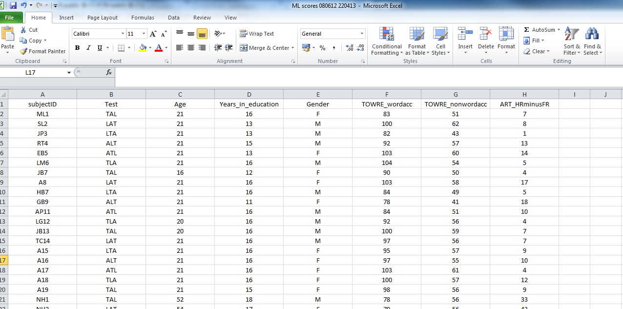
This is a screen shot of a file called: ML scores 080612 220413.csv

— which you can download here.

These data were collected in an experimental study of reading, the ML study.

The file is in .csv (comma separated values) format. I find this format easy to use in my workflow –collect data–tidy in excel–output to csv–read into R–analyse in R, but you can get any kind of data you can think of into R (SPSS .sav or .dat, .xlsx, stuff from the internet — no problem).

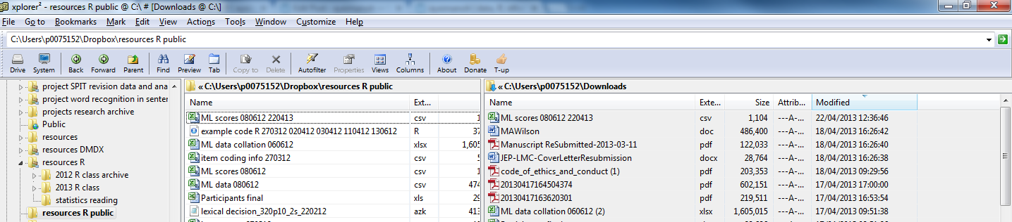
Let’s assume you’ve just downloaded the database and, in Windows, it has ended up in your downloads folder. I will make life easier for myself by copying the file into a folder whose location I know.

— I know that sounds simple but I often work with collaborators who do not know where their files are.

I’ll just copy the file from the downloads folder into a folder I called R resources public:

R-2-1-folders

Advice to you

Your lives, and my life, if I am working with you, will be easier if you are systematic and consistent about your folders: if I am supervising you, I expect to see an experiment for each folder, and in that sub-folders for – stimulus set selection; data collection script and materials; raw data files; (tidied) collated data; and analysis.

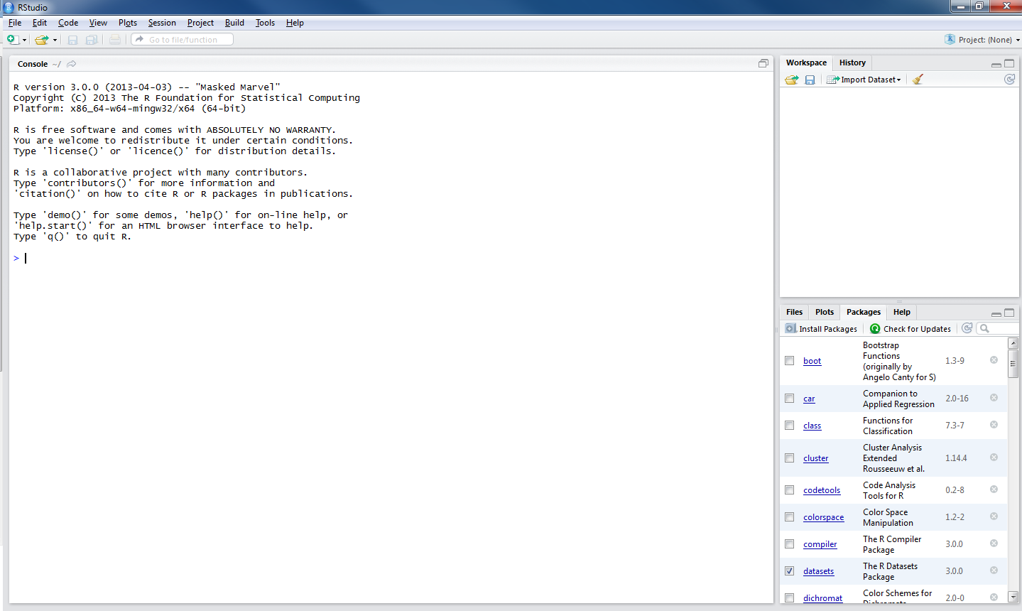
Read a data file into the R workspace

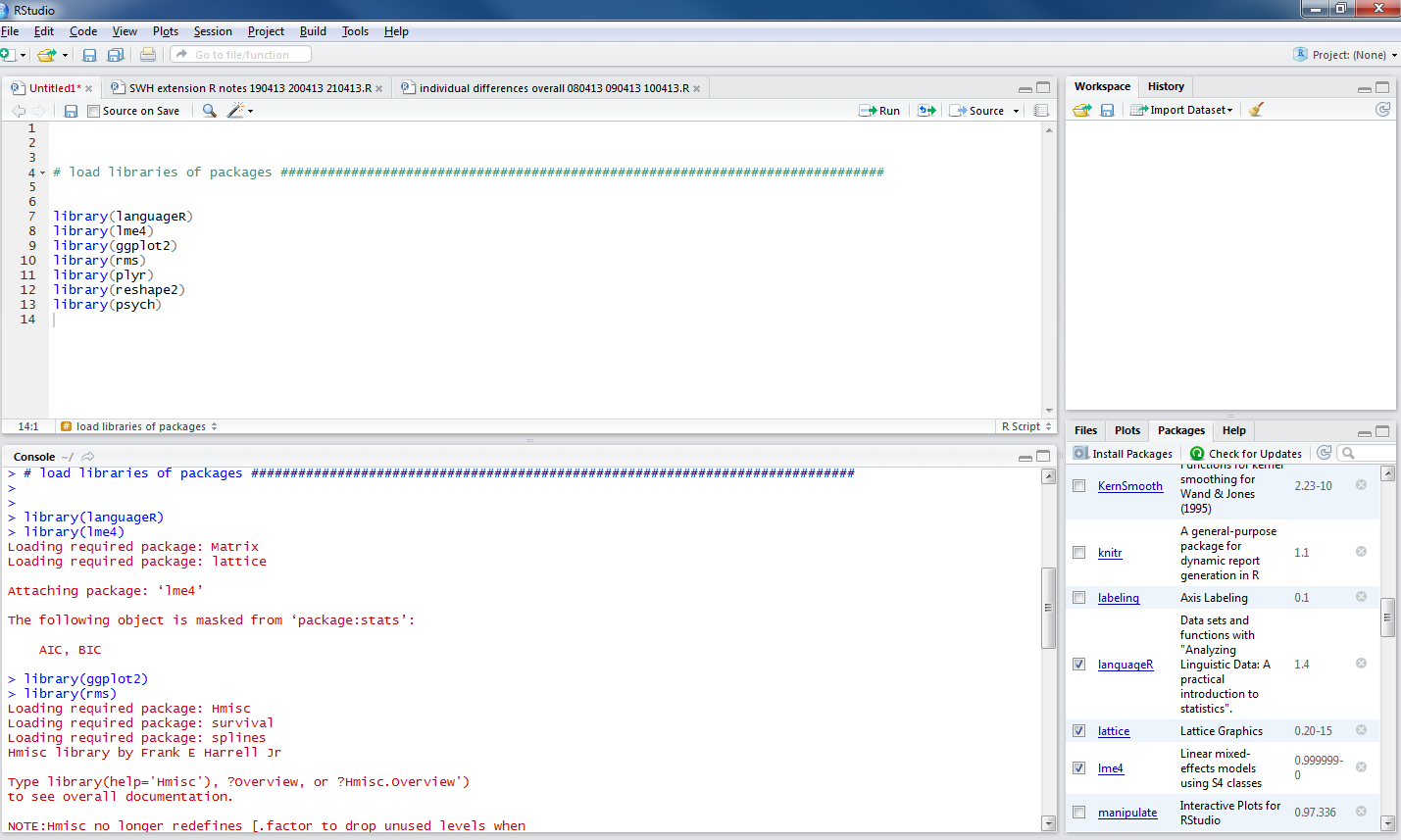
I have talked about the workspace before, here we are getting to load data into it using the functions setwd() and read.csv().

In R, you need to tell it where your data can be found, and where to put the outputs (e.g. pdfs of a plot). You need to tell it the working directory (see my advice earlier about folders): this is going to be the Windows folder where you put the data you wish to analyse.

For this example, the folder is:

C:\Users\p0075152\Dropbox\resources R public

[Do you know what this is – I mean, the equivalent, on your computer? If not, see the video above – or get a Windows for Dummies book or the like.]

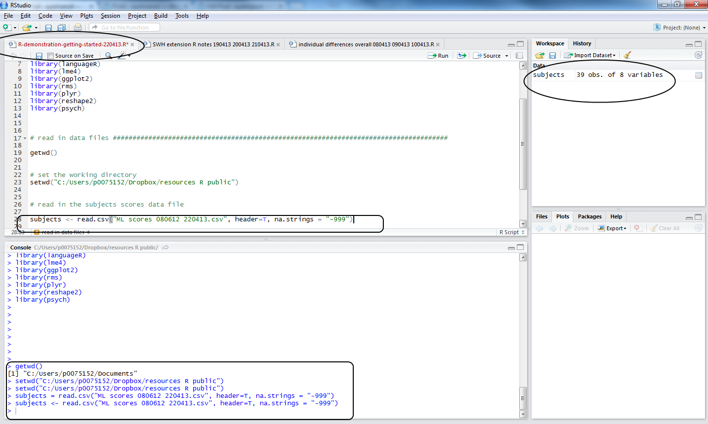
What does R think the working directory currently is? You can find out, run the getwd() command:


getwd()

and you will likely get told this:


> getwd()
[1] "C:/Users/p0075152/Documents"

The Documents folder is not where the data file is, so you set the working directory using setwd()


setwd("C:/Users/p0075152/Dropbox/resources R public")

Notice: 1. the address in explorer will have all the slashes facing backwards but “\” in R is a special operator, escape so 2. the address given in setwd() has all slashes facing forward 3. the address is in “” and 4. of course if you spell this wrong R will give you an error message. I tend to copy the address from Windows Explorer, and change the slashes by hand in the R script.

Load the data file using the read.csv() function


subjects <- read.csv("ML scores 080612 220413.csv", header=T, na.strings = "-999")

Notice:

1. subjects… — I am calling the dataframe something sensible

2. …<- read.csv(…) — this is the part of the code loading the file into the workspace

3. …(“ML scores 080612 220413.csv”…) — the file has to be named, spelled correctly, and have the .csv suffix given

4. …, header = T… — I am asking for the column names to be included in the subjects dataframe resulting from this function call

5. … na.strings = “-999” … — I am asking R to code -999 values, where they are found, as NA – in R, NA means Not Available i.e. a missing value.

Things that can go wrong here:

— you did not set the working directory to the folder where the file is

— you misspelled the file name

— either error will cause R to tell you the file does not exist (it does, just not where you said it was)

I recommend you try making these errors and getting the error message deliberately. Making errors is a good thing in R.

Note:

— coding missing values systematically is a good thing -999 works for me because it never occurs in real life for my reading experiments

— you can code for missing values in excel in the csv before you get to this stage

Let’s assume you did the command correctly, what do you see? This:

R-2-1-readcsv

Notice:

1. in the workspace window, you can see the dataframe object, subjects, you have now created

2. in the console window, you can see the commands executed

3. in the script window, you can see the code used

4. the file name, top of the script window, went from black to red, showing a change has been made but not yet saved.

To save a change, keyboard shortcut is CTRL-S.

2. Getting summary statistics for the variables in the dataframe

It is worth reminding ourselves that R is, among other things, an object-oriented programming language. See this:

The entities that R creates and manipulates are known as objects. These may be variables, arrays of numbers, character strings, functions, or more general structures built from such components.

During an R session, objects are created and stored by name (we discuss this process in the next session). The R command

     > objects()

(alternatively, ls()) can be used to display the names of (most of) the objects which are currently stored within R. The collection of objects currently stored is called the workspace.

[R introduction: http://cran.r-project.org/doc/manuals/r-release/R-intro.html#Data-permanency-and-removing-objects]

or this helpful video by ajdamico.

So, we have created an object using the read.csv() function. We know that object was a .csv file holding subject scores data. In R, in the workspace, it is an object that is a dataframe, a structure much like the spreadsheets in excel, SPSS etc.: columns are variables and  rows are observations, with columns that can correspond to variables of different types (e.g. factors, numbers etc.) Most of the time, we’ll be using dataframes in our analyses.

You can view the dataframe by running the command:


view(subjects)

— or actually just clicking on the name of the dataframe in the workspace window in R-studio, to see:

R-2-1df-view

Note: you cannot edit the file in that window, try it.

I am going to skip over a whole bunch of stuff on how R deals with data. A useful Quick-R tutorial can be found here. The R-in-Action book, which builds on that website, will tell you that R has a wide variety of objects for holding data: scalars, vectors, matrices, arrays, dataframes, and lists. I mostly work with dataframes and vectors, so that’s mostly what we’ll encounter here.

Now that we have created an object, we can interrogate it. We can ask what columns are in the subjects dataframe, how many variables there are, what the average values of the variables are, if there are missing values, and so on using an array of useful functions:


head(subjects, n = 2)

summary(subjects)

describe(subjects)

str(subjects)

psych::describe(subjects)

length(subjects)

length(subjects$Age)

Copy-paste these commands into the script window and run them, below is what you will see in the console:
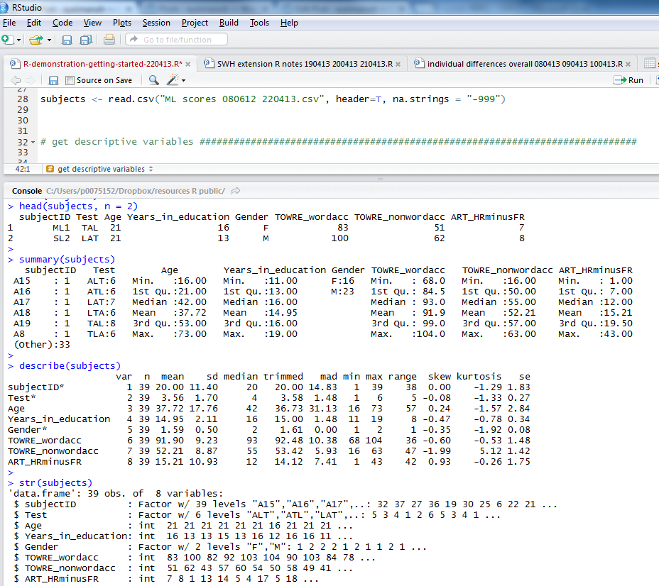
R-2-1-descriptives

Notice:

1. the head() function gives you the top rows, showing column names and data in cells; I asked for 2 rows of data with n = 2

2. the summary() function gives you: minimum, maximum, median and quartile values for numeric variables, numbers of observations with one or other levels for factors, and will tell you if there are any missing values, NAs

3. describe() (from the psych package) will give you means, SDs, the kind of thing you report in tables in articles

4. str() will tell you if variables are factors, integers etc.

If I were writing a report on this subjects data I would copy the output from describe() into excel, format it for APA, and stick it in a word document.

3. Plotting visualization of data distributions

These summary statistics will not give you the whole picture that you need. Mean estimates of the centre of the data distribution can be deceptive, hiding pathologies like multimodality, skew, and so on. What we really need to do is to look at the distributions of the data and, unsurprisingly, in R, the tools for doing so are excellent. Let’s start with histograms.

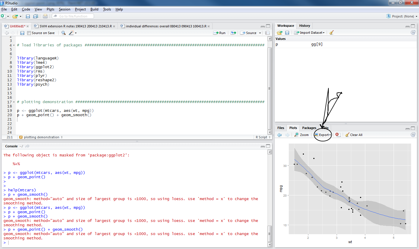
[Here, I will use the geom_histogram, see the documentation online.]

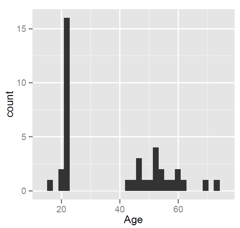
We are going to examine the distribution of the Age variable, age in years for ML’s participants, using the ggplot() function as follows:


pAge <- ggplot(subjects, aes(x=Age))
pAge + geom_histogram()

Notice:

— We are asking ggplot() to map the Age variable to the x-axis i.e. we are asking for a presentation of one variable.

If you copy-paste the code into the script window and run it three things will happen:

1. You’ll see the commands appear in the lower console window

2. You’ll see the pAge object listed in the upper right workspace window

R-2-1-rstudio-histogram

Notice:

— When you ask for geom_histogram(), you are asking for a bar plot plus a statistical transformation (stat_bin) which assigns observations to bins (ranges of values in the variable)

— calculates the count (number) of observations in each bin

— or – if you prefer – the density (percentage of total/bar width) of observations in each bin

— the height of the bar gives you the count, the width of the bin spans values in the variable for which you want the count

— by default, geom_histogram will bin data to the range in values/30 but you can ask for more or less detail by specifying binwidth, this is what R means when it says:

>stat_bin: binwidth defaulted to range/30. Use 'binwidth = x' to 
adjust this.

3. We see the resulting plot in the plot window, which we can export as a pdf:

R-2-1-histogram

Notice:

— ML tested many people in their 20s – no surprise, a student mostly tests students – plus a smallish number of people in middle age and older (parents, grandparents)

— nothing seems wrong with these data – no funny values

Exercise

Now examine the distribution of the other variables, TOWRE word and TOWRE nonword reading accuracy, adapt the code, by substituting the variable name with the names of these variables, do one plot for each variable:


pAge <- ggplot(subjects, aes(x=????))
pAge + geom_histogram()

Notice:

— In my opinion, at least one variable has a value that merits further thought.

What have we learnt?

The R code used in this post can be downloaded here. Download it and use it with the database provided.

In this post, we learnt about:

1. Putting data files into folders on your computer.

2. The workspace, the working directory and how to set it in R using setwd().

3. How to read a file into the workspace (from the working directory = folder on your computer) using read.csv().

4. How to inspect the dataframe object using functions like summary() or describe().

5. How to plot histograms to examine the distributions of variables.

Key vocabulary

working directory

workspace

object

dataframe

NA, missing value

csv

histogram

Posted in 5. Getting started - load data, getting started, rstats, workflow | Tagged , , , , , , , , , , , , | 3 Comments

Getting started – getting helped

As we get started, we will need help, let’s work on how and where to find that help, and also how to act on it.

We will need help

Most modern software applications strive to ensure we get what we want without thinking too much about either the ends or the means. An application might, as soon as we start it, ask us what we want or show us what we might want: to write a letter; to input data; to read our emails. We might need help, in R, to work out what we want.

— Think about the advantage of not having to think about what we want, now think about the disadvantage.

Most applications will present the options for getting what we want as choices in a menu. You usually have to learn where the appropriate menu is e.g. in SPSS, find the analysis menu then either the general linear model menu for ANOVA or the regression menu for regression. In R, you write commands (function calls) to get what you want.

— What if you want something not on the menu, what if, anyway, the option splits do not make sense (ANOVA is, actually, a special case of regression)?

Most applications will give you one way to do any thing. In R, you will usually have more than one (often, several) different ways to do a thing.

— Which way do you choose? This is a decision based on (for me) answers to the questions: does it work (now)? do I understand why it works?

R is a case-sensitive,  interpreted language.

— If you spell an object name incorrectly, if you get the syntax wrong, if you muddle letter case, you will get an error.

The error messages can be cryptic.

How and where to find help

As noted previously, there are plenty of places to get help. Here’s what I do:

1. Looking for a function, trying to work out what options to use with a function, use in-built help:

— type: ?[name of function] or help([name of function]) or ??[name of function]

where [name of function] from [ to ] inclusive is the name of the function you want help with e.g. help(ggplot)

2. google search something like this: “in R [name of function or text of error message]” will very often take you to a post on stackoverflow or some R blog where the error or problem and the solution or multiple alternate solutions (this is R) will be described or explained for you.

3. Use a book – there are several good ones

What to do with the help

Try it out. Learning how to use R involves some experimentation. Copy the code from a reported solution into a script, try running it and see if it works.

Every problem you ever have will already have been solved by someone else and, in R, the solution will be reported online.

What have we learnt?

You will need help in R, but there is a lot of it and you can just work on how and where to find it, then what to do with it.

Posted in 4. Getting started - help, getting started, help, rstats | Tagged | 1 Comment

Getting started – a quick word on destinations – plotting

A critical reason for learning to use R is the superior capacity that affords to visualize data. If you learn to plot data with R you are learning to plot data using the best tools now available.

There are four graphics systems in R

We will mostly use one, but it is worth noting the existence of the others:

— base graphic system, installed with R, written by Ross Ihaka

— grid graphics system, written by Paul Murrell

— lattice graphics, written by Deepayan Sarkar

— ggplot2, written by Hadley Wickham (2009, recently revised)

To access ggplot2 functions, you will need to install then load the package.

What will we be doing with our plots?

We will need to plot data:

— to check our data, to look for missing values, errors, and evaluate the need to transform variables

— to understand our data better, exploratory data analysis (EDA), to detect outliers, trends and patterns that warrant further consideration

— to present model predictions, examine model appropriateness

— to report results

Mastering the grammar of ggplot2

The theoretical basis of ggplot2 is the layered grammar of graphics (Wickham, 2009), based on Wilkinson’s (2005) grammar of graphics. A plot can be understood as a combination of:

— a dataset

— mappings from variables to aesthetics – the graphic properties like point position, size, shape and colour

— one or more layers, each composed of a geometric object, a statistical transformation, and a position adjustment – objects like points, lines and bars, statistical transformations like that used to translate between the raw data and the line (smoother) shown to indicate the predicted values of y on x, given the data

— a scale for each aesthetic mapping – functions that convert the data values e.g. car weight or engine size – to pixel position, colour specification etc.

— a coordinate system – we might need to make a choice over whether to use Cartesian, polar, spherical etc. coordinates

— faceting specification – describing which variables should be used to split up the data e.g. into small multiples showing subsets of the data

N.B. ggplot2 takes dataframes as input, the specification of aesthetics, scales, statistical transformations and geometric objects result in the production of plots

What have we learnt?

— R has four different graphics systems

— ggplot2, the one we will mostly use, is based on a grammar of graphics

— plots are seen as the products of combining data with aesthetic mappings via scale, and layering with objects

Posted in .Interim directions, plotting data, rstats | Tagged , , , , , , | Leave a comment

Getting started – R-Studio, ggplot, installing packages and loading them for use

Install R

Revise how to install R, as previously discussed here and here.

Installation

How do you download and install R? Google “CRAN” and click on the download link, then follow the instructions (e.g. at “install R for the first time”).

R-CRAN

Anthony Damico has produced some great video tutorials on using R, here is his how-to guide:

http://www.screenr.com/kzT8

And moonheadsing at Learning Omics has got a blog post with a series of screen-shots showing you how to install R with pictures.

Install R-studio

Having installed R, the next thing we will want to do is install R-studio, a popular and useful interface for writing scripts and using R.

If you google “R-studio” you will get to this window:

R-0-1-rstudio

Click on the “Download now” button and you will see this window:

R-0-2-rstudio

Click on the “Download RStudio desktop” and you will see this window:

R-0-3-rstudio

You can just click on the link to the installer recommended for your computer.

What happens next depends on whether you have administrative/root privileges on your computer.

I believe you can install R-studio without such rights using the zip/tarball dowload.

Having installed R and R-studio,  in Windows you will see these applications now listed as newly installed programs at the start menu. Depending on what you said in the installation process, you might also have icons on your desktop.

Click on the R-studio icon – it will pick up the R installation for you.

Now we are ready to get things done in R.

Start a new script in R-studio, install packages, draw a plot

Here, we are going to 1. start a new script, 2. install then load a library of functions (ggplot2) and 3. use it to draw a plot.

Depending on what you did at installation, you can expect to find shortcut links to R (a blue R) and to R-Studio (a shiny blue circle with an R) in the Windows start menu, or as icons on the desktop.

To get started, in Windows, double click (left mouse button) on the R-Studio icon.

Maybe you’re now looking at this:

R-rstudio-1-1

1. Start a new script

What you will need to do next is go to the file menu [top left of R-Studio window] and create a new R script:

–move the cursor to file – then – new – then – R script and then click on the left mouse button

or

— just press the buttons ctrl-shift-N at the same time — the second move is a keyboard shortcut for the first, I prefer keyboard short cuts to mouse moves

— to get this:

R-rstudio-1-2

What’s next?

This circled bit you see in the picture below:

R-rstudio-1-3-console

is the console.

It is what you would see if you open R directly, not using R-Studio.

You can type and execute commands in it but mostly you will see unfolding here what happens when you write and execute commands in the script window, circled below:

R-rstudio-1-3-script

— The console reflects your actions in the script window.

If you look on the top right of the R-Studio window, you can see two tabs, Workspace and History: these windows (they can be resized by dragging their edges) also reflect what you do:

1. Workspace will show you the functions, data files and other objects (e.g. plots, models) that you are creating in your R session.

[Workspace — See the R introduction, and see the  this helpful post by Quick-R — when you work with R, your commands result in the creation of objects e.g. variables or functions, and during an R session these objects are created and stored by name — the collection of objects currently stored is the workspace.]

2. History shows you the commands you execute as you execute them.

— I look at the Workspace a lot when using R-Studio, and no longer look at (but did once use) History much.

My script is my history.

2. Install then load a library of functions (ggplot2)

We can start by adding some capacity to the version of R we have installed. We install packages of functions that we will be using e.g. packages for drawing plots (ggplot2) or for modelling data (lme4).

[Packages – see the introduction and this helpful page in Quick-R — all R functions and (built-in) datasets are stored in packages, only when a package is loaded are its contents available]

Copy then paste the following command into the script window in R-studio:


install.packages("ggplot2", "reshape2", "plyr", "languageR",
"lme4", "psych")

Highlight the command in the script window …

— to highlight the command, hold down the left mouse button, drag the cursor from the start to the finish of the command

— then either press the run button …

[see the run button on the top right of the script window]

… or press the buttons CTRL-enter together, and watch the console show you R installing the packages you have requested.

Those packages will always be available to you, every time you open R-Studio, provided you load them at the start of your session.

[I am sure there is a way to ensure they are always loaded at the start of the session and will update this when I find that out.]

There is a 2-minute version of the foregoing laborious step-by-step, by ajdamico, here. N.B. the video is for installing and loading packages using the plain R console but applies equally to R-Studio.

Having installed the packages, in the same session or in the next session, the first thing you need to do is load the packages for use by using the library() function:


library(languageR)
library(lme4)
library(ggplot2)
library(rms)
library(plyr)
library(reshape2)
library(psych)

— copy/paste or type these commands into the script, highlight and run them: you will see the console fill up with information about how the packages are being loaded:

R-rstudio-1-4-library

Notice that the packages window on the bottom right of R-Studio now shows the list of packages have been ticked:

R-rstudio-1-4-library-packages

Let’s do something interesting now.

3. Use ggplot function to draw a plot

[In the following, I will use a simple example from the ggplot2 documentation on geom_point.]

Copy the following two lines of code into the script window:


p <- ggplot(mtcars, aes(wt, mpg))
p + geom_point()

— run them and you will see this:

R-rstudio-1-ggplot-point

— notice that the plot window, bottom right, shows you a scatterplot.

How did this happen?

Look at the first line of code:


p <- ggplot(mtcars, aes(wt, mpg))

— it creates an object, you can see it listed in the workspace (it was not there before):

R-rstudio-1-ggplot-point-2

— that line of code does a number of things, so I will break it down piece by piece:

p <- ggplot(mtcars, aes(wt, mpg))


p <- ...

— means: create <- (assignment arrow) an object (named p, now in the workspace)


... ggplot( ... )

— means do this using the ggplot() function, which is provided by installing the ggplot2 package then loading (library(ggplot) the ggplot2 package of data and functions


... ggplot(mtcars ...)

— means create the plot using the data in the database (in R: dataframe) called mtcars

— mtcars is a dataframe that gets loaded together with functions like ggplot when you execute: library(ggplot2)


... ggplot( ... aes(wt, mpg))

— aes(wt,mpg) means: map the variables wt and mpg to the aesthetic attributes of the plot.

In the ggplot2 book (Wickham, 2009, e.g. pp 12-), the things you see in a plot, the colour, size and shape of the points in a scatterplot, for example, are aesthetic attributes or visual properties.

— with aes(wt, mpg) we are informing R(ggplot) that the named variables are the ones to be used to create the plot.

Now, what happens next concerns the nature of the plot we want to produce: a scatterplot representing how, for the data we are using, values on one variable relate to values on the other.

A scatterplot represents each observation as a point, positioned according to the value of two variables. As well as a horizontal and a vertical position, each point also has a size, a colour and a shape. These attributes are called aesthetics, and are the properties that can be perceived on the graphic.

(Wickham: ggplot2 book, p.29; emphasis in text)

— The observations in the mtcars database are information about cars, including weight (wt) and miles per gallon (mpg).

[see

http://127.0.0.1:29609/help/library/datasets/html/mtcars.html

in case you’re interested]

— This bit of the code asked the p object to include two attributes: wt and mpg.

— The aesthetics (aes) of the graphic object will be mapped to these variables.

— Nothing is seen yet, though the object now exists, until you run the next line of code.

The next line of code:

p + geom_point()

— adds (+) a layer to the plot, a geometric object: geom

— here we are asking for the addition of geom_point(), a scatterplot of points

— the variables mpg and wt will be mapped to the aesthetics, x-axis and y-axis position, of the scatterplot

The wonderful thing about the ggplot() function is that we can keep adding geoms to modify the plot.

— add a command to the second line of code to show the relationship between wt and mpg for the cars in the mtcars dataframe:


p <- ggplot(mtcars, aes(wt, mpg))
p + geom_point() + geom_smooth()

— here

+ geom_smooth()

adds a loess smoother to the plot, indicating the predicted miles per gallon (mpg) for cars, given the data in mtcars, given a car’s weight (wt).

R-rstudio-ggplot-loess-export

[If you want to know what loess means – this post looks like a good place to get started.]

Notice that there is an export button on the top of the plots window pane, click on it and export the plot as a pdf.

Where does that pdf get saved to? Good question.

What have we learnt?

— starting a new script

— installing and loading packages

— creating a new plot

Vocabulary

functions

install.packages()

library()

ggplot()

critical terms

object

workspace

package

scatterplot

loess

aesthetics

Posted in 3. Getting started - install, getting started, GUI, rstats | Tagged , , , , , , | 1 Comment

Workflow concerns – how do you organize information?

Information you have to organize

1. articles from literature search – abstracts, results of literature searches, pdfs of articles you have access to, your notes on the articles:

— people print things out, write notes on paper, and file this stuff – in a cabinet or in stacks of paper

Is this successful?

— if you want find something, how long does it take you to find it?

— are you duplicating information?

— how easy it is to put information together?

My experience

— when accumulating paper my answers to the questions were these:

— in writing notes on literature — you can remember things better and you need to accumulate — facts, experiments, ideas

— writing notes is about entry into memory

— written notes are not useful for recollection — it was very hard to find previous thoughts — impressions, secondary evaluations

— google recommend search not sorting emails – there is evidence that you do keyword searches

— evernote allows you to search your information – use tags, you separate notebooks, you search by keyword

— experimenting with qiqqa as a way to handle pdfs – qiqqa allows keyword searches within pdfs

— your memory — best way to consolidate information — write a review

— you will need to organize — data collection – experimental information – analysis files – results – reports

–> things that belong stay together

— notes on a thing – your word document: item selection + excel file you’re doing it in + pdfs on the topic

you can do a search within a word document

— organization of information during analysis

Posted in productivity, workflow | Tagged , | Leave a comment

I recommend R in the sense that:

R-recommend-CC-gnatallica

[CC attribution: flickr user gnatallica –

http://www.flickr.com/photos/gnatallica/5120063269/]

Posted in rstats | Tagged | Leave a comment

Plot your data

I would start plotting my data almost from the beginning. You can get an impression of how powerful the visualization capacity of R is from this gallery.

There are multiple systems for doing graphics in R (cf. in SPSS where you have legacy (ugly) and chart builder (ugly that’s your fault)). I tend to use ggplot2 now, and there are plenty of tutorials as in here (a favourite), herehere, a bit more advanced here. Of course, there is the ggplot2 website.

R is built around the capacity to visualize data effectively and key authors in the R community – as well as many immigrants to the community – engage deeply with past and current thinking on why and how one should depict data. Do you think your choice should be between a 2-D and a 3-D bar plot? By ‘engage’, I do not mean ‘agree with’. Influential thinkers on how you should depict data include TufteTukeyCleveland, and Wilkinson, as discussed here by Hadley Wickham (author of ggplot2). In short, ask yourself what your purpose is when you graph data. Frank Harrell sums the concern succinctly:

The ability to construct clear and informative graphs is
related to the ability to understand the data.

— there is quite a bit of research on what human perception can do and good data visualization combines an understanding of perception with a purpose relating to the aims for your research report.

The modelling that we will do will tend to work interactively with plotting to make sense of data. You do not, typically, get one graph for your data and rest, as exemplified in the nice tutorial here, you work at it and understand your data better thereby. A handy guide once you get going on this is the R Graphics Cookbook by Winston Chang, see a review here. Overall, the message is that if we want to be useful, we will want our graphs to be useful and we would do well to consider Cleveland’s stipulation:

The important criterion for a graph is not simply how fast we can see a result; rather it is whether through the use of the graph we can see something that would have been harder to see otherwise or that could not have been seen at all.

— see discussions here and here. Think about the person looking at your graph.

The benefit in thinking like this is that your graphs will afford discovery. When I got started, I spent a lot of time appreciating the work of Diego Valle-Jones, for example:

R-graph-visualization-valle

I love this plot because it tells you an important thing very clearly: Holy shit! The war on drugs has been a bad idea for Mexico. I think that this is a fine example of a graph that does the job of communicating a headline observation. Andrew Gelman has interesting things to say about data visualizations (here and here) and how graphs vary in relation to variation in purpose. Some authors may require a differing effect, and produce graphs that work more as puzzles.

Posted in .Interim directions, plotting data, rstats | Tagged , , , | Leave a comment

Types of sums of squares

https://stat.ethz.ch/pipermail/r-help/2005-April/069923.html

http://psych.colorado.edu/wiki/lib/exe/fetch.php?media=labs:learnr:typeiortypeiiiss.pdf

http://cran.r-project.org/web/packages/fortunes/vignettes/fortunes.pdf

http://imaging.mrc-cbu.cam.ac.uk/statswiki/FAQ/sstypes

http://yihui.name/en/2010/04/rules-of-thumb-to-meet-r-gurus-in-the-help-list/

https://stat.ethz.ch/pipermail/r-help/2006-May/094765.html

https://stat.ethz.ch/pipermail/r-help/2006-August/111927.html

https://stat.ethz.ch/pipermail/r-help/2003-March/030705.html

https://stat.ethz.ch/pipermail/r-help/2008-February/153740.html

https://stat.ethz.ch/pipermail/r-devel/2000-May/020714.html

https://stat.ethz.ch/pipermail/r-help/2001-October/015984.html

http://www.stats.ox.ac.uk/pub/MASS3/Exegeses.pdf

http://mcfromnz.wordpress.com/2011/03/02/anova-type-iiiiii-ss-explained/

http://stats.stackexchange.com/questions/23197/type-iii-sum-of-squares-from-sas-and-r

http://stats.stackexchange.com/questions/6208/should-i-include-an-argument-to-request-type-iii-sums-of-squares-in-ezanova

Posted in Uncategorized | Leave a comment

Getting started in R – me and other people on how to get started

As noted previously, there are a huge number of resources on how to get started with R, available online. I will be making my own contributions to this genre but before I really get rolling with that, it is fair to list the ‘Getting started with R’ resources that other people have listed previously.

(In my experience, learning about something from a number of different angles can be very helpful.)

Getting started is best done through having an analysis you need to do, some data you will analyze, and a bit of time. There is no point reading the guides listed following without some data of your own that you want to make sense of. If you do not already have some data to analyse, I shall be providing some in following posts.

How I got started

I did research and published a couple of papers using R to do analysis with TINN-R as a text editor for writing the analysis scripts.

— I learnt a tremendous amount working through a combination of Harald Baayen’s book:

http://www.amazon.co.uk/Analyzing-Linguistic-Data-Introduction-Statistics/dp/0521709180

and the Quick-R website:

http://www.statmethods.net/

— NB that Kabacoff (In the Quick-R website) explains the perception of a ‘steep learning curve’ for R: no single tutorial will (or can) cover everything; you interact with R, you don’t use press a button and get the product.

— NB I migrated to R from SPSS and the book on that is by Robert Muenchen:

http://www.amazon.co.uk/SPSS-Users-Statistics-Computing-ebook/dp/B001Q3LXNI

— see also short introductions here and here.

How I would start now

I would install R, and R-Studio, to which I shall return, read in some of my data (maybe, preferably some data I had already analysed, say, in SPSS) and work through the tests I would want to do. My problem – when getting started – was that I needed to do mixed-effects modelling and, ultimately, because mixed-effects modelling is, essentially, *the* analysis approach now in psycholinguistics, learning R to solve that problem drove me to a place I’m now happy to reside in, permanently; I suppose you might come to R for a holiday (the graphs are nice) or a short-term stay (it’s sunnier back in SPSS-land).

I abandoned TINN-R for R-Studio for various reasons.

— There’s a list of reasons for using R-Studio here.

— A basic, immediate, reason, is that it provides a helpfully laid out editor.

— The in-my-future reasons include:

1. I want to be able to do my analysis and write my papers in the one editor, which R-Studio is designed to allow me to do: reproducible research using knitr, see here, here, herehere, here and here.

2. I am involved in many different projects, involving differing analyses, and I want to be able to control the flow of information efficiently: version control using git, see here.

I would then try to ground my understanding in the language, starting with the Try-R tutorial and moving on from there, using excellent books like:

Kabacoff – R in Action

Teetor – R Cookbook

— Working through tutorials e.g. those listed here by Pairach Piboonrungroj: I am kind of disappointed he stopped short of 100 [joking].

— and maybe going online to learn at venues like Coursera, in courses such as those presented by Jeff Leek, Drew Conway, and Roger Peng.

— NB I like the R Cookbook because it takes a format – have a need, find a recipe to fill that need – that is useful. I like R in Action because it is clear, concise, practical and pitched at  a good level.

I would look around the R-Bloggers aggregation of R blog posts for stuff that interests me e.g. here.

Of course, there are free books available online, accessible at the CRAN website, also here.

Plot your data

I would start plotting my data almost from the beginning. You can get an impression of how powerful the visualization capacity of R is from this gallery.

How others got started – or materials they provide to get started

— Roughly ordered starting with more immediately useful – to psychologists working with me.

Tutorials

If I were starting to use R now, I would start here: Try-R.

I use a bunch of the functions furnished in the psych package by William Revelle, and unsurprisingly the getting-started guide is helpful and clear; see the short and very short guides here along with a helpful set of notes.

This tutorial by ciclismo seems clear and helpful.

I have already mentioned the twotorials – they are helpful to those who’d rather watch and learn.

There is also a series of R podcasts, here, which look useful.

The R introduction is a must-read.

Here‘s a nice (short) essay on learning R by David Smith at revolutionanalytics.

The UCLA resources appear to be very comprehensive, and includes a nice set of introductory tutorial slides.

This tutorial will take you from start (install packages) to finish (SEM etc.) in a blog post.

Alastair Sanderson’s R blog is astronomy focused but the introduction, while sparsely explained (e.g. do you know what a vector is? it won’t explain – but then, if you’re an astronomer you would already know) is clear and comprehensively informative.

Lists of resources including tutorials

This post by Jeromy Anglin both provides some good advice and lists some very helpful resources, with a focus on psychology: in fact, check out the rest of his website; and his list of video tutorials.

— Lyndon Walker’s video tutorial is here (58 minutes).

— I am not sure if this is already listed in Jeromy Anglin’s list of video tutorials but here are some on getting started by Ed Boone.

I think this introduction, hosted by York University (Canada) provides a helpful list of resources, including tutorials.

This exchange on stackoverflow has many great links to resources as well as some helpful advice.

This list by Patrick Burns shows you where you can go to get more information, and here’s a version of his getting started tutorial.

Here’s Norm Matloff’s getting started, see some reviews of his R programming book here.

Andrew Barr – a paleoecology blog – refers to the Try-R introduction: I second that, it is very helpful.

inside-R round up some key resources.

Posted in 2. Getting started - How to, rstats | Tagged , , | Leave a comment

Getting started in R – other people on why R?

Why use R?

For inside-r, it’s because R is free, a language, a system with great graphics capabilities, a flexible toolkit, access to the cutting-edge, and a vibrant and supportive user community.

For Kevin Goulding, the reasons also include that the freeness ensures he can always use R (no licence expiry worries), the information is great, it works well with LaTeX, there is always more than one way to accomplish something …

For monkeysuncle, the reasons also include that training researchers on free R rather than expensive licensed software ensures their continuing ability to use the skills they learn (even if there is no money for licences), plus: R is used by most academic statisticians – benefitting from their innovation and attention; it is platform independent; the help resources are unrivalled; it is easier to teach writing code than menu button clicking …

For Alasdair Sanderson, the reasons also include that it is a mature, widely used, frequently updated, free and open-source application.

For Joshua Ulrich, the reasons also include that R allows you to integrate with other languages (C/C++, JavaPython) and enables you to interact with many data sources: ODBC-compliant databases (Excel, Access) and other statistical packages (SASStataSPSSMinitab).

A quick overview in the NYT quotes one of the co-creators of R on the ethos of R:

“R is a real demonstration of the power of collaboration, and I don’t think you could construct something like this any other way,” Mr. Ihaka said.

And here is a long list of praise for R.

Posted in 1. Getting started - Why R?, getting started, rstats | Tagged , | Leave a comment