
I would start plotting my data almost from the beginning. You can get an impression of how powerful the visualization capacity of R is from this gallery.
There are multiple systems for doing graphics in R (cf. in SPSS where you have legacy (ugly) and chart builder (ugly that’s your fault)). I tend to use ggplot2 now, and there are plenty of tutorials as in here (a favourite), here, here, a bit more advanced here. Of course, there is the ggplot2 website.
R is built around the capacity to visualize data effectively and key authors in the R community – as well as many immigrants to the community – engage deeply with past and current thinking on why and how one should depict data. Do you think your choice should be between a 2-D and a 3-D bar plot? By ‘engage’, I do not mean ‘agree with’. Influential thinkers on how you should depict data include Tufte, Tukey, Cleveland, and Wilkinson, as discussed here by Hadley Wickham (author of ggplot2). In short, ask yourself what your purpose is when you graph data. Frank Harrell sums the concern succinctly:
The ability to construct clear and informative graphs is
related to the ability to understand the data.
— there is quite a bit of research on what human perception can do and good data visualization combines an understanding of perception with a purpose relating to the aims for your research report.
The modelling that we will do will tend to work interactively with plotting to make sense of data. You do not, typically, get one graph for your data and rest, as exemplified in the nice tutorial here, you work at it and understand your data better thereby. A handy guide once you get going on this is the R Graphics Cookbook by Winston Chang, see a review here. Overall, the message is that if we want to be useful, we will want our graphs to be useful and we would do well to consider Cleveland’s stipulation:
The important criterion for a graph is not simply how fast we can see a result; rather it is whether through the use of the graph we can see something that would have been harder to see otherwise or that could not have been seen at all.
— see discussions here and here. Think about the person looking at your graph.
The benefit in thinking like this is that your graphs will afford discovery. When I got started, I spent a lot of time appreciating the work of Diego Valle-Jones, for example:
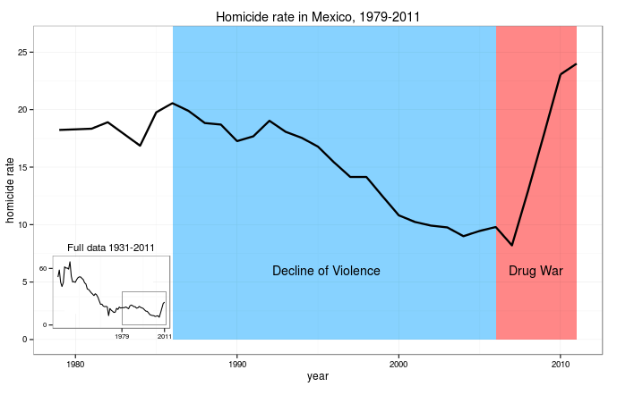
I love this plot because it tells you an important thing very clearly: Holy shit! The war on drugs has been a bad idea for Mexico. I think that this is a fine example of a graph that does the job of communicating a headline observation. Andrew Gelman has interesting things to say about data visualizations (here and here) and how graphs vary in relation to variation in purpose. Some authors may require a differing effect, and produce graphs that work more as puzzles.
